1. Choose a theme;
2. Click on the corresponding plot;
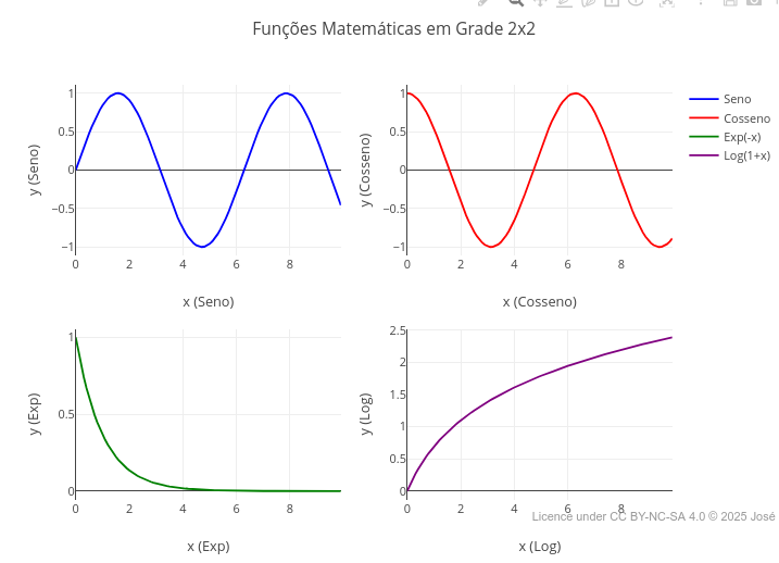
3. Click on "add";
4. Use the mouse for interactivity and/or edit the code.
Reminder: the editor uses infinite undo/redo in the code (Ctrl+Z / Shift+Ctrl+Z) !Interactive Simulations with JSPlotly
To illustrate the potential use of JSPlotly for Biochemistry and related areas, some examples follow for plots, simulations, data analysis, and applications, whose contents are frequently found in textbooks and technical-scientific sources. For better use of each theme, try to follow the code Suggestions for each object.
General instructions
1 Simulations
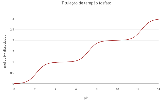
1.1 Acid–base equilibrium and buffer system
Context:
The example illustrates the addition of base in a system containing a weak acid and its conjugate base. The titration equation refers to a triprotic acid, phosphoric acid of the homonymous buffer, but it would equally serve for many others, such as those present in the Krebs cycle (citrate, isocitrate).
Equation:
\[
fa= \frac{1}{1 + 10^{pKa1 - pH}} + \frac{1}{1 + 10^{pKa2 - pH}} + \frac{1}{1 + 10^{pKa3 - pH}}
\] Where, fa = acid fraction (protonable groups)
Suggestion:
"A. Converting the phosphate buffer curve (triprotic) to bicarbonate buffer (diprotic)"

1. Change the pKa values to those of the bicarbonate buffer: pKa1 =      6.1, and pKa2 = 10.3;
2. Set a very large value for pKa3 (e.g., 1e20).
3. Click on "add plot".

Explanation: pKa is a term that represents the logarithm of a dissociation constant (-log[Ka]). With an extreme value, the denominator also becomes immense, nullifying the term that carries pKa3. In JavaScript and other languages, "e" represents the notation for power of 10.

"B. Converting the bicarbonate buffer curve to acetate"

1. Just repeat the procedure above, with pKa1 = 4.75, and eliminating pKa2.
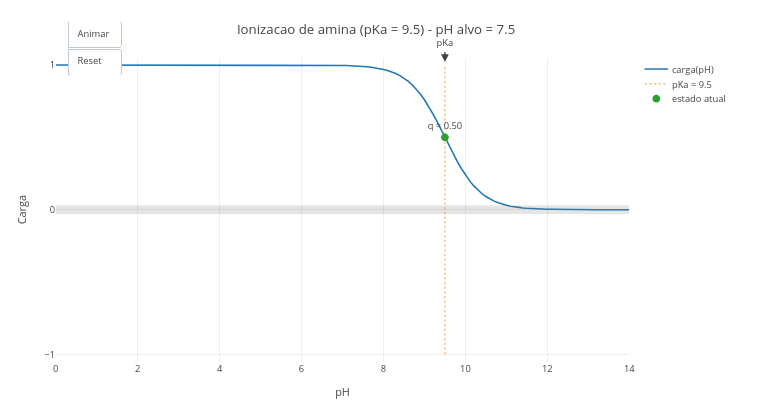
1.2 Ionization state of chemical groups of biomolecules
Context:
JSPlotly also allows the observation of some concepts facilitated by animation-based learning together with graphical representations obtained by mathematical functions. In the example that follows, the interactive object illustrates the protonation state for the main chemical groups found in biomolecules.
Instruction
After clicking the corresponding image below, click on “add” and observe the generated acid–base titration plot. The abscissa axis (x-axis) has an extensive range of pH values, and the ordinate axis the charge that the molecule with ionization potential manifests at each pH, and as a function of its pKa value;
Click on “Animate” to observe the displacement of a small ball along the titration curve, up to a pH value pre-defined in the simulator script, and as a function of its pKa;
Modify in the script the type of ionizable group (in “let grupo_edit =”) and/or the desired final pH (“let pH_final_edit =”), to evaluate the ionization state of a new group;
Click on “Reset” and “Animate”, to observe the new animation.
Suggestion:
1. Change the pH and the type of group that is intended to be observed;
2. Simulate the ionization state of different molecules, such as drugs with carboxylic acid (e.g., acetylsalicylic acid... aspirin), at blood pH and in the gastric cavity;
3. Create a new ionizable group and predict its ionization state. For this, just change the information in 3 constants at the beginning of the script: groups, pKas, and types.
  a.
1.3 Net charge network in peptides
Context:
The code refers to the net charge network present in any sequence of amino acid residues. Here angiotensin II is illustrated, an important peptide for regulation of blood pressure and electrolyte balance, and whose converting enzyme is associated with the mechanism of cellular invasiveness by SARS-CoV-2.
Equation:
For this simulation there is no direct equation, since the algorithm needs to decide the charge as a function of the basic or acidic nature of the residue at a given pH value (observe the script). Thus:
\[
q =
\begin{cases}
-\dfrac{1}{1 + 10^{pK_a - pH}} & \text{(acid group)} \\
\dfrac{1}{1 + 10^{pH - pK_a}} & \text{(basic group)}
\end{cases}
\]
Where,
- pKa = value of the base-10 antilogarithm for the equilibrium constant of acid dissociation, Ka (or log[Ka]).
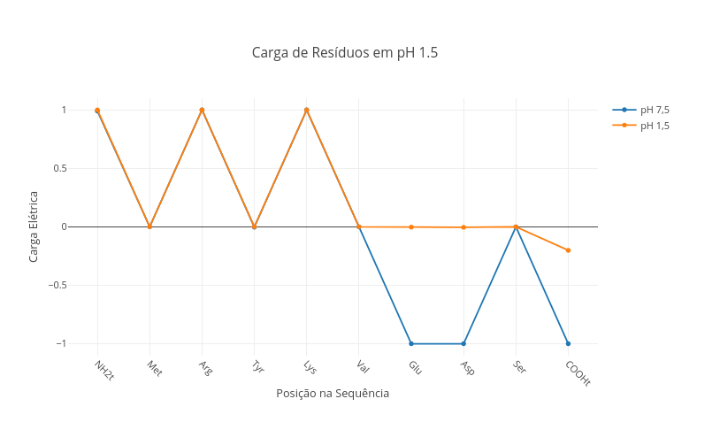
Suggestion:
1. Select the peptide sequence below, and observe the charge distribution:

"Ala,Lys,Arg,Leu,Phe,Glu,Cys,Asp,His"

2. Simulate the stomach pH condition ("const pH = 1.5"), and verify the change of charges in the peptide.

3. Select a physiological peptide (oxytocin, for example), observe its charge in blood (pH 7.5), and reflect on its potential for electrostatic interaction with cellular components.

"Cys,Tyr,Ile,Gln,Asn,Cys,Pro,Leu,Gly"  - oxytocin
1.4 Charge, pH, pKa & pI of amino acids (animation)
Context:
This object addresses a different potential for JSPlotly, namely, animation-based learning. To illustrate this approach, an animation follows for observing the charge of an amino acid based on the value of its pKa, and on the information of its pI, the isoelectric point of the compound (pH value at which the species has zero net charge).
To visualize the charge value q (“current state”), click the “add” button followed by “Animate”. For another animation, just select the amino acid (“let aa_edit =”) and the final pH at which you wish to observe its charge (“let pH_final_edit =”). The animation also allows comparing the charge of a free amino acid with that of the corresponding residue in a polypeptide chain (option “let contexto_edit =”). Note that the animation provides a legend informing the pKa value of the compound for its ionizable groups.
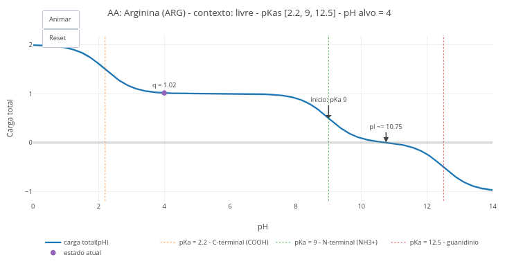
Suggestion:
1. Simulate the condition of an amino acid at blood pH and at stomach pH;
2. Compare the pH values of a free amino acid, with that of its residue in a chain;
3. Change the boolean option in "const showSites", to observe the curves of each ionizable group.
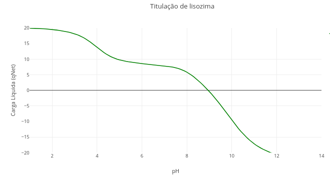
1.5 Isoelectric Point in Proteins
Context:
The script for this simulation is based on the distribution of the net charge network for a polyelectrolyte, and the identification of the pH value at which this network is null, that is, the isoelectric (or isoeionic) point, pI. The example uses the primary sequence of lysozyme, a hydrolase that acts in breaking the microbial wall.
Equation:
\[ q_{\text{net}}(pH) = \sum_{i=1}^{N} \left[ n_i \cdot q_{B_i} + \frac{n_i}{1 + 10^{pH - pK_{a_i}}} \right] \]
Where,
- qnet = total net charge;
- qB$_{i} = charge of the basic form for residue i (for example, +1 for Lys, 0 for Asp);
- n\(_{i}\) = number of groups of residue i.
Suggestion:
"Finding the pI for other proteins"

1. One can verify the titration of any other protein or peptide sequence by simply substituting the primary sequence contained in the code. An assertive way to perform this substitution involves:
  a. Search for the "FASTA" sequence of the protein in NCBI ("https://www.ncbi.nlm.nih.gov/protein/") - e.g.: "papain";
  b. Click on "FASTA" and copy the sequence obtained in 1a.;
  c. Paste the sequence into a site for residue quantification (e.g., "https://www.protpi.ch/Calculator/ProteinTool");
4. Substitute the sequence in the code.
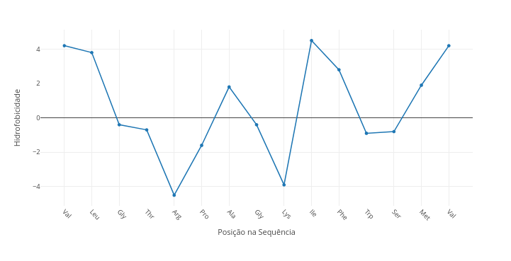
1.6 Hydrophobicity in amino acid sequences
Context:
Observing hydrophobicity levels of amino acids can be useful for the study and prediction of residue sequences, such as those found in the central portion of helices of transmembrane proteins, as for identification of specific sites in enzymes, such as clefts and hydrophobic pockets.
These levels are classified in a relative way, giving rise to some indices such as the Kyte–Doolittle scale, which assigns each amino acid a hydropathy value (hydrophobicity/hydrophobicity) estimated from experimental and observational data. Positive values indicate hydrophobic tendency (e.g., Ile, Val, Leu) and negative values indicate hydrophilic tendency (e.g., Asp, Glu, Lys, Arg). The index allows highlighting stretches prone to nonpolar environments, as well as regions exposed to the aqueous solvent.
Equation:
\[
\tilde{y}*i ;=; \frac{1}{w} \sum*{k=i-m}^{i+m} y_k,
\qquad w = 2m+1
\]
Where,
\[\begin{aligned} y_i &:; \text{hydrophobicity value at position $i$ of the sequence} \ \tilde{y}_i &:; \text{smoothed value (moving average) at position $i$} \ m &:; \text{half-window (number of neighbors on each side)} \ w &:; \text{total window width ($w=2m+1$)} \ i &:; \text{amino acid position in the sequence ($1 \leq i \leq N$)} \end{aligned}\]:;
m &:;
w &:;
i &:; \end{aligned}
Suggestion:
1. Try changing the sequence to a known one;
2. Compare a polar sequence with a nonpolar one by overlay ("add");
3. Transcribe a transmembrane helix sequence of a protein by accessing its data on the PDB site
1.7 Interaction of oxygen with myoglobin and hemoglobin
Context:
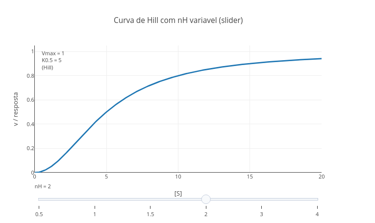
The oxygen molecule can combine with the heme group of myoglobin and hemoglobin in a distinct way, as a function of the cooperativity exhibited in the latter relative to its quaternary structure. The following model exemplifies this interaction, by use of the Hill equation.
Equation:
\[
Y= \frac{pO_2^{nH}}{p_{50}^{nH} + pO_2^{nH}}
\]
Where
- Y = degree of oxygen saturation in the protein;
- pO\(_{2}\) = oxygen pressure;
- p\(_{50}\) = oxygen pressure at 50% saturation;
- nH = Hill coefficient for the interaction;
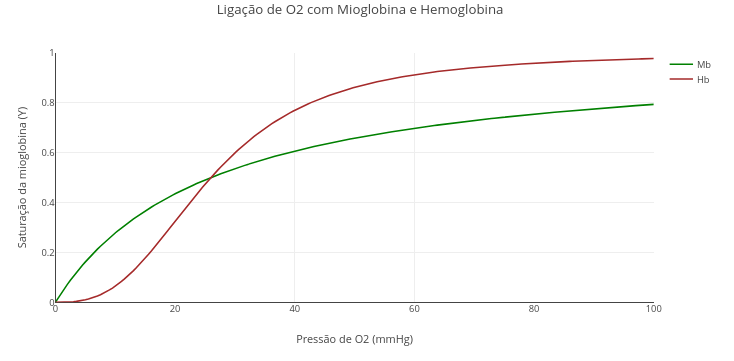
Suggestion:
1. Run the application ("add plot"). See that the value of "nH" of the Hill constant is "1", that is, without cooperativity effect.

2. Now replace the value of "nH" with the Hill coefficient for hemoglobin, 2.8, and run again !
1.8 Bohr effect in hemoglobin (pH)
Context:
Some physiological or pathological conditions can alter the binding affinity of oxygen with hemoglobin, such as temperature, some metabolites (2,3-BPG), and the hydrogen ion content of the solution.
Equation:
\[ Y(pO_2) = \frac{{pO_2^n}}{{P_{50}^n + pO_2^n}}, \quad \text{with } P_{50} = P_{50,\text{ref}} + \alpha (pH_{\text{ref}} - pH) \]
Where,
- Y = hemoglobin saturation,
- pO\(_{2}\) = partial pressure of oxygen (in mmHg),
- P\(*{50}\) = pressure of O\(*{2}\) at which hemoglobin is 50% saturated,
- P\(_{50,ref}\) = 26 mmHg (standard value),
- \(\alpha\) = 50 (intensity of the Bohr effect),
- pH\(_{ref}\) = 7.4,
- n = 2.8 = Hill coefficient for hemoglobin.
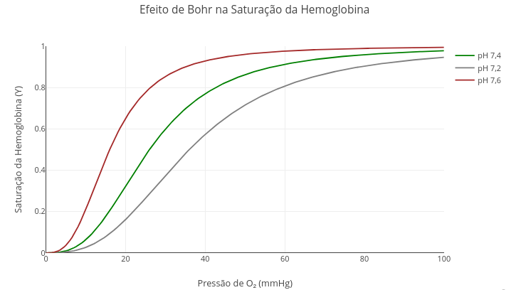
Suggestion
1. Try altering the reference pH for the interaction;
2. Simulate other allosteric models by changing the value of "n"
1.9 Catalysis and enzymatic inhibition
Context:
The simulation that follows aims to offer a general equation for enzymatic inhibition studies, which contemplates the competitive, uncompetitive and competitive (pure or mixed) models, also allowing the study of enzymatic catalysis in the absence of inhibitor.
Equation:
\[ v=\frac{Vm*S}{Km(1+\frac{I}{Kic})+S(1+\frac{I}{Kiu})} \]
Where
- S = substrate content for the reaction;
- Vm = limiting velocity of the reaction (in books, maximum velocity);
- Km = Michaelis–Menten constant;
- Kic = inhibitor dissociation equilibrium constant for the competitive model;
- Kiu = inhibitor dissociation equilibrium constant for the uncompetitive model
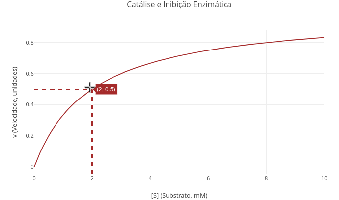
Suggestion:
"A. Enzymatic catalysis in the absence of inhibitor."
1. Just run the application with the general equation. See that the values for Kic and Kiu are high (1e20). In this way, with high "dissociation constants", the interaction of the inhibitor with the enzyme is irrelevant, returning the model to the classic Michaelis–Menten equation.
2. Try changing the values of Vm and Km, comparing plots.
3. Use the geographic coordinates feature of the icon bar ("Toggle Spike Lines"), to consolidate the mathematical meaning of Km, as well as observe the effect of distinct values of this on the visualization of the plot.

"B. Competitive inhibition model."
1. To observe or compare the michaelian model with the competitive inhibition model, just replace the value of Kic with a consistent number (e.g., Kic= 3).

"C. Uncompetitive inhibition model."
1. The same suggestion above serves for the uncompetitive model, this time replacing the value for Kiu.

"D. Pure noncompetitive inhibition model."
1. In this model, the simulation is given by equal values for Kic and Kiu.

"E. Mixed noncompetitive inhibition model."
1. For this model, just allocate distinct values for Kic and Kiu.
1.10 Linearization of kinetic data by Lineweaver–Burk
Context
One of the (many) difficulties in learning Biochemistry refers to literacy for interpreting plots. Among these, the hyperbolic nature of the michaelian model is alternatively treated by several transformations of the variables S and v, standing out in the literature the linearization by double-reciprocal, or Lineweaver–Burk transformation.
The example that follows illustrates the relationship between the dependent and independent variables of the original and transformed model, using another feature of the Plotly.js library: the possibility of cross-selection of points.
To observe this functionality, select a set of points in one of the subplots of the plot that follows, and observe their automatic selection in the other subplot.
1.10.1 Equation
The linear transformation of Lineweaver–Burk is given below:
\[
\frac{1}{v} = \frac{1}{S}*\frac{Km}{Vm} + \frac{1}{Vm}
\]
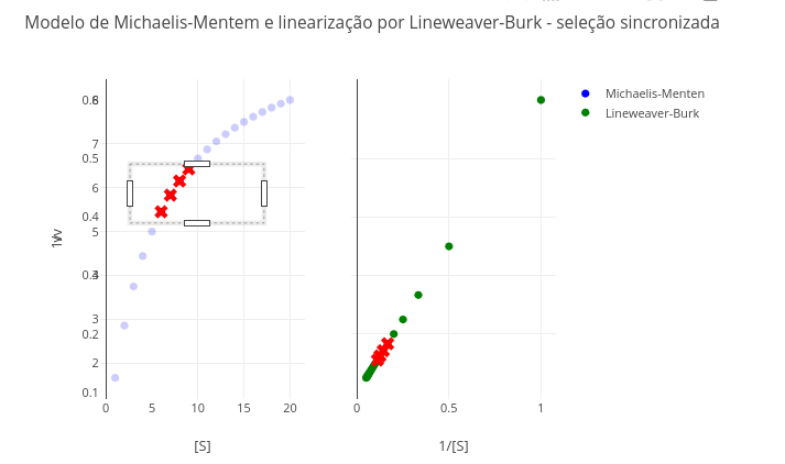
Suggestion
1. Try selecting the extremes of the Michaelis–Menten plot (hyperbolic curve), and observe the same points in the double-reciprocal. Which values are more reliable in the latter, the first or the last?

2. Research other forms of linearization (e.g., Eadie–Hofstee; "v/S" X "v"), and see how the transformation and point selection presents itself. For this, change the constants below:
    const invS = S.map(s => 1/s);
    const invV = V.map(v => 1/v);
1.11 Diagnosis of Enzymatic Inhibition (Michaelis–Menten and Lineweaver–Burk)
Context
As presented above and present in texts of the area, it is possible to linearize the Michaelis–Menten curve for a simpler observation for diagnosing enzymatic inhibition models. The object below proposes this interpretation. For this, keep the control enzyme without addition of inhibitor in the code (I=0). To seek an inhibition model, insert a value for I and change the inhibitor dissociation equilibrium constant(s), kic and/or kiu.
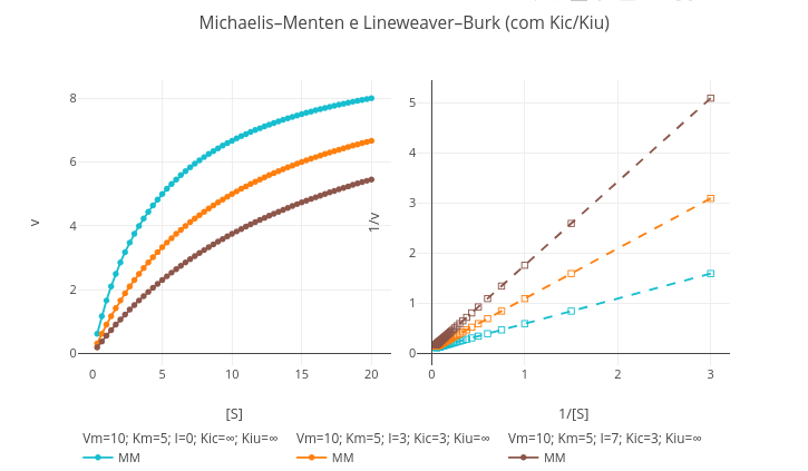
Suggestion
1. Simulate the conditions for a competitive inhibition, inserting a value for the inhibitor content ("I") and changing the value of "Km";
2. Do the same for an uncompetitive model, although changing the value of "Vm";
3. Try the pure noncompetitive model, changing "Km" and "Vm" to the same value;
4. Test mixed competitive inhibition, inserting distinct values for "Km" and for "Vm."
1.12 van der Waals equation for ideal gases
Context:
An adaptation that relates the thermodynamic quantities of pressure, volume and temperature for ideal gases, is the van der Waals equation. In this, coefficients are computed that estimate the existence of a volume and inter-particle interactions. Thus, the van der Waals equation corrects the ideal gas equation considering a term to compensate intermolecular forces (a/V\(^{2}\)) and the available volume, this discounting the volume occupied by the gas molecules themselves.
In the simulation an additional interactivity is offered by the presence of sliders (sliding controls) for temperature, and for the coefficients of finite volume (b) and interaction between particles (a).
Equation:
\[ P = \frac{RT}{V - b} - \frac{a}{V^2} \]
- P = gas pressure (atm);
- V = molar volume (L);
- T = temperature (K);
- R = 0.0821 = ideal gas constant (L·atm/mol·K);
- a = intermolecular attraction constant (L\(^{2}\)·atm/mol$^{2})
- b = excluded volume constant (L/mol)
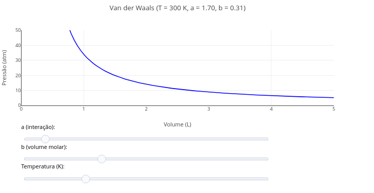
Suggestion:
1. Try varying the parameters of the equation by means of the "slider" for temperature, as well as for the coefficients "a and b".
2. Discuss which of the coefficients has the greatest effect on the curve profile, and the reason for this.
1.13 Equilibrium of ATP production from reagents, temperature, and pH
Context:
Intracellular ATP production involves the classic relationship of chemical equilibrium between reagents and products as a function of reaction temperature, and adjusted for a given pH value. By varying one and/or another reagent content, or physicochemical parameter, it is possible to quantify the product by the thermodynamic reaction that follows:
Equation:
\[ \Delta G = \Delta G^{\circ'} + RT \ln\left(\frac{[\text{ADP}] \cdot [\text{P}_i]}{[\text{ATP}]}\right) + 2{,}303 \cdot RT \cdot n_H \cdot \text{pH} \]
Where,
- \(\Delta\)G = Gibbs energy of the reaction (positive for spontaneously unfavorable synthesis, kJ/mol);
- \(\Delta\)G\(^{o'}\) = 30.5 kJ/mol biological standard Gibbs energy for ATP synthesis;
- R = 8.314 J/mol/K (general gas constant);
- T=310 K (physiological temperature);
- nH\(^{+}\) = 1 (number of protons involved in the reaction);
- [ADP], [Pi], [ATP] = molar concentrations of reagents and product
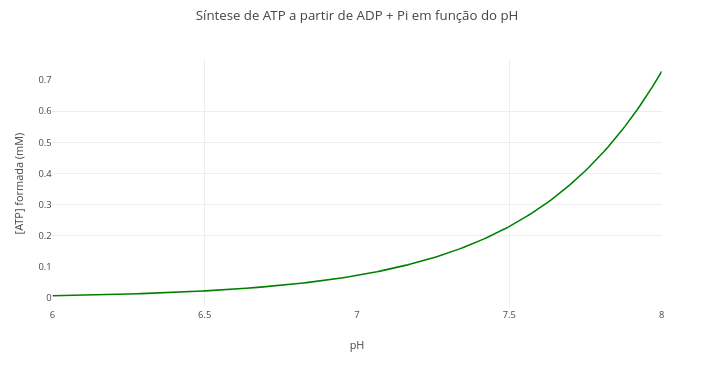
Suggestion:
1. Change the quantities involved in the expression, and compare with previous visualizations. For example, temperature, pH, and ADP and Pi contents.1.14 Variation of Gibbs energy with temperature
Context:
The Gibbs–Helmholtz relationship predicts that Gibbs energy varies in a non-linear way with temperature, in reactions that involve a change in the heat capacity of the system (\(\Delta\)Cp). This expanded form of the Gibbs equation for variable heat capacity is presented in several biochemical phenomena, such as in phase transition of biomembrane structure subjected to a compound challenge, or in the conformational change that accompanies protein structure under heating. \
Equation:
\[ \Delta G(T) = \Delta H^\circ - T,\Delta S^\circ + \Delta C_p \left(T - T_0 - T \ln\left(\frac{T}{T_0}\right)\right) \]
Where,
- \(\Delta\)G(T) = Gibbs energy of the reaction at each temperature value, kJ/mol);
- \(\Delta\)H\(^{o}\) = standard enthalpy of the reaction at T\(_{0}\), usually 298 K (J/mol);
- \(\Delta\)S\(^{o}\) = standard entropy of the reaction at T\(_{0}\);
- \(\Delta\)Cp = change in heat capacity of the reaction (J/mol·K), assumed constant with temperature;
- T = temperature of interest (K);
- T\(_{0}\) = reference temperature, generally 298 K.
- R = 8.314 J/mol/K (general gas constant);

Suggestion:
1. Try varying one or more parameters of the expression;
2. Test the behavior of the Gibbs curve at an elevated reference temperature (simulation for an extremophile organism);
3. Simulate the situation where the heat capacity change is null
1.15 Oxygen consumption by mitochondria
Context:
Oxygraphs are equipment that monitor the content of dissolved oxygen in solution. Different from oximeters, based on measuring hemoglobin oxygenation by a direct clip on the tip of a finger, oxygraphs are widely used in studies of living cells and suspensions of mitochondria.
The example that follows illustrates an animation for the content of \(O_{2}\) measured in an oxygraph for a suspension of mitochondria, and whose consumption rates are varied by the use of modifying metabolites (e.g., pyruvate, ADP, azide).
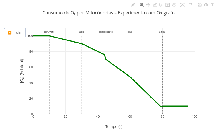
Suggestion:
1. Note that the appearance of metabolites and the resulting oxygen consumption rates are defined by the function "oxigenio". Try changing them and observe the effect in the animation;
2. Realize that the metabolites and their action, as well as the measured signal, O2 content, are easily adapted for any other metabolic measurement in the code. Try, for example, what the plot would look like in a simulation for the glycolytic pathway;
3. This code was designed for an animation. Go to the "Applications" section below, and try "FlowForces" for a similar purpose, although with full interactive adaptation.
1.16 Electrochemical impedance spectroscopy (EIS)
Context:
Electrochemical impedance spectroscopy (EIS) is an analytical technique that measures the response of an electrochemical system to a small-amplitude sinusoidal perturbation (e.g., 5–10 mV), applied over a wide frequency range (e.g., 100 kHz–1 mHz). EIS allows obtaining information about interfacial processes, such as charge transfer, ion diffusion and formation of passive films, through analysis of the complex impedance of the system. It is a non-destructive technique, widely used in areas such as corrosion, batteries, fuel cells, biosensors and protective coatings.
Equation:
An electrochemical impedance (EIS) model with typical equivalent-circuit components is the modified Randles: series resistor Rs, a resistor Rp in parallel with a CPE (Constant Phase Element), and a Warburg element. A common representation for EIS is the Nyquist plot, in which the real axis represents resistance (Zre) and the imaginary axis the negative reactance (−Zim). The formalism involved is in the equation below:
\[ Z_{\text{total}}(\omega) = R_s + \left[ \left( \frac{1}{R_p} + Q (j\omega)^n \right)^{-1} \right] + \frac{\sigma}{\sqrt{\omega}} (1 - j) \]
Where:
- Z\(_{total}\) = total impedance at a given frequency ;
- \(\omega\) = angular frequency (rad/s), \(\omega\)=2πf or \(\omega\)=2πf;
- R\(_{p}\) = ohmic resistance (resistance of the electrolyte solution, wires, contacts etc.) ;
- R\(_{p}\) = polarization resistance (associated with charge-transfer processes, such as electrochemical reactions);
- Q = constant associated with the constant phase element (CPE), replaces an ideal capacitor to represent non-ideal behaviors ;
- n = CPE exponent, between 0 and 1; defines the degree of ideality of the capacitive behavior (n = 1: ideal capacitor; n < 1: dispersion);
- \(\sigma\) = Warburg coefficient, associated with ion diffusion in the electrochemical system ;
- j = imaginary unit, j\(^{2}\) = −1;
An electrochemical impedance (EIS) model with typical equivalent-circuit components is the modified Randles: series resistor Rs, a resistor Rp in parallel with a CPE (Constant Phase Element), and a Warburg element. A common representation for EIS is the Nyquist plot, in which the real axis represents resistance (Zre) and the imaginary axis the negative reactance (−Zim).
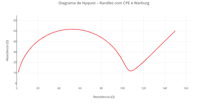
Suggestion
1. Check the effect of Rs on the plot, nullifying its value (solution resistance);
2. Observe the deformation of the semicircle by varying the values of the constant phase element (e.g., Q = 1e-3; n = 0.6 - dispersion of the capacitive behavior);
2. Try combining other values of the parameters in the code header, to highlight common situations in electroanalysis: Rs, Rp, Q, n, and sigma;
3. Reduce the Warburg-with-constant-phase-element model to a simple Randles model, formed only by 2 resistors in series, the second in parallel with an ideal capacitor, and without Warburg diffusion (sigma = 0; n = 1).
1.17 Cyclic voltammetry
Context:
Cyclic voltammetry (CV) is an electroanalytical technique for characterization of interfacial redox processes (electrode-solution). When a standard analyte in quantitative equilibrium between oxidized and reduced forms is used, the resulting plot acquires an unusual profile, named duck shape. This results from the peculiar format under a bidirectional potentiometric sweep over a set of electrodes by a potentiostat, resulting in oxidation cycles and subsequent reduction (application of positive potentials followed by negative ones). The shape, value and distance between the resulting peaks allow identifying and characterizing the analyte, as well as its redox processes involved in the experiment.
Equation:
Although the formalism for cyclic voltammetry is complex and involves solving ordinary differential equations (as do electroanalytical techniques in general), being far from the objective of this material, one can summarize the resulting current flow by the Buttler–Volmer equation that follows:
\[ j = j_0 \left[ \exp\left(\frac{\alpha n F (E - E^0)}{RT}\right) - \exp\left(\frac{-(1 - \alpha) n F (E - E^0)}{RT}\right) \right] \] Where:
- j = current density;
- j\(_{0}\) = exchange current;
- \(\alpha\) = charge transfer coefficient;
- E = potential applied to the electrode;
- E\(^{0}\) = standard electrode potential;
- n = number of electrons;
- F = Faraday constant (96485 C·mol⁻¹)
- R = general gas constant (8.314 J·mol⁻¹·K⁻¹);
- T = temperature
For a model of diffusion of electroanalyte and accumulation on the electrode surface, the general equation for the boundary condition where the redox conversion rate is proportional to the diffusion current, can be represented by the equation of the 2nd Fick’s law for mass transport:
\[ \frac{\partial C(x,t)}{\partial t} = D \frac{\partial^2 C(x,t)}{\partial x^2} \]
Where:
- C(x,t) = concentration of the electroanalytical species (mol/cm³), as a function of position x and time t;
- D = diffusion coefficient of the species (cm²/s);
- t = time (s);
- x = distance from the electrode surface (cm);
- \(\delta\) = notation for partial derivative.
The chemical equilibrium of the redox reaction is given by the ratio between the concentrations of oxidized and reduced form at the electrode/solution interface when the system is in equilibrium (or near-equilibrium), according to the Nernst equation:
\[ E = E^0 + \frac{RT}{nF} \ln \left( \frac{[\text{Ox}]}{[\text{Red}]} \right) \]
The resulting current is obtained by Faraday’s law:
\[ i(t) = n F A D \left. \frac{\partial C(x,t)}{\partial x} \right|_{x=0} \] Where:
- A = electrode surface area (cm²);
- i(t) = current at time t (A, Ampere).
Cyclic Voltammetry Simulator
To illustrate the potential of the JSPlotly/GSPlotly platform for the development of complex virtual experiments, a cyclic voltammetry simulator follows resulting from the procedures above (as well as from a few hours of prompt engineering!!).
The example illustrates a typical behavior in cyclic voltammetry (and the curious duck shape), and includes a diffusion and accumulation modeling of electroactive species near the electrode surface. The code uses a numerical solution to obtain current density over time, considering the effects of cyclic scanning of the applied potential, mass transport, and reaction kinetics.
In sum, it numerically solves Fick’s equation with a dynamic boundary condition, applies the Nernst equation at the boundary (electrode surface) to determine conversion between species, uses the finite-difference method or an explicit scheme to advance in time, and obtains the current by applying Faraday’s law, by the derivative of the flux at the interface.
Found it complex? Then how about: the code unites Fick (transport) and Nernst (local redox equilibrium) to accurately model the voltammogram shape, obtaining a physical simulation with significant realism for cyclic voltammetry.
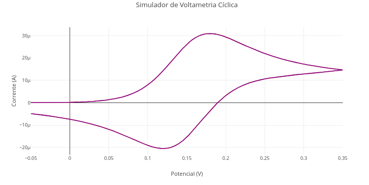
Suggestion:
1. Observe the number of values at the beginning of the code, tangible to a "parametric manipulation". Try to know what they represent, and try to vary their values consciously, aiming to add value to learning the simulation. This is the soul of "parametric manipulation" that involves "reproducible teaching" !!1.18 Diagrams and flowcharts
Context: Diagram
By the nature of the Plotly.js library, it is also possible to generate codes in JSPlotly without involving an equation, such as for representing diagrams and flowcharts, among others. The example below illustrates a representation of the Krebs cycle, and the next an experimental flowchart.
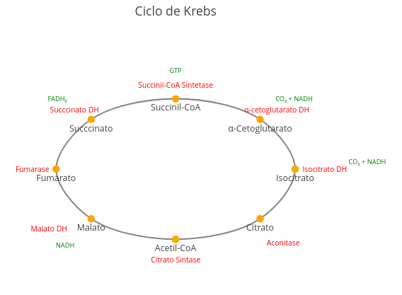
Suggestion:
1. Try repositioning enzymes and metabolites better, just by clicking and dragging the terms;
2. Try replacing the names that are in the code to produce another metabolic cycle, such as the urea cycle.
Context: Flowchart
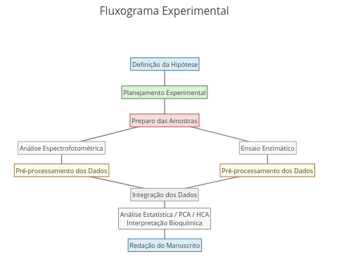
Suggestion:
1. Reposition terms and connectors by mouse dragging;
2. For a flowchart different in content, modify the terms in the code;
2. For a flowchart different in format, change the font and connector characteristics in the "annotations" constant.
2 Construction of plots
Although a large part of representative plots involves only lines and/or points on a plane, the
Plotly.js library is prodigious in elaborating a significant set of varied types, as represented in its version for the R language on the developer site. In addition, even for a simple plot of points and/or lines, it is possible to have a large number of distinct configurations and interactive widgets, some of which are represented below.
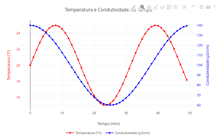
2.1 Plot with 2 y-axes
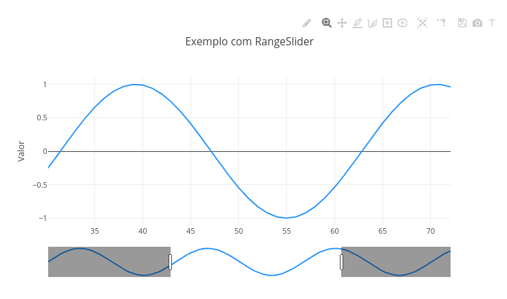
2.2 RangeSlider
2.3 Subplots
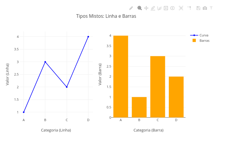
2.4 Subplots with different types
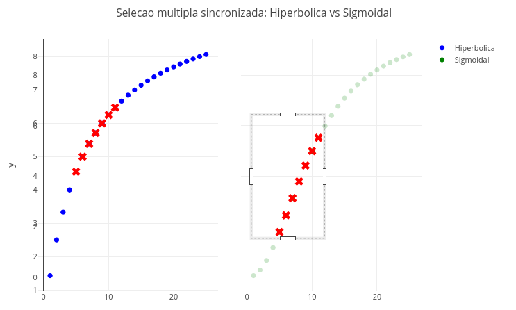
2.5 Synchronized multiple selection
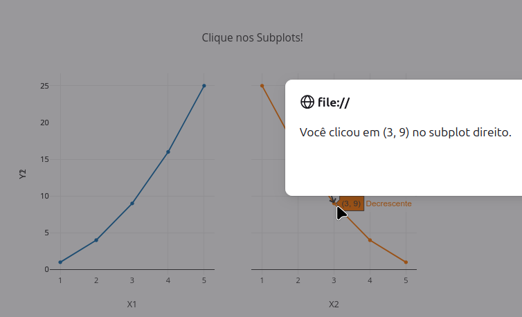
2.6 Click event & message
2.7 Menu for selecting types
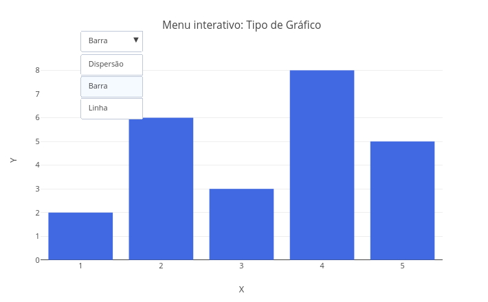
2.8 Slider control
3 Data analysis
3.1 User data entry
Context
Sometimes it is useful to work with one’s own discrete data, seeking a trend relationship—mathematical or simply visual—for the relationship between variables. Below is an example of an interactive plot with user data.
Suggestion:
1. Try changing the inserted data, overlaying the plot or not;
2. Try changing the data representation in "mode" and "type", to points, lines, points+lines, bars.
3.2 Loading a file for analysis
Context - CSV file
Sometimes, there is a need to analyze results referring to a dataset present in a spreadsheet. For this situation, the following example illustrates loading two data vectors from a CSV (comma separated value) file, a format commonly used for export/import in electronic spreadsheets, and its resulting plot.
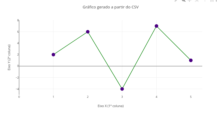
Instructions:
- 1 Click add plot and select a CSV file using the upper browse button that is shown. Note: variable X in the 1st column of the file, and variable Y in the 2nd column;
- Click add plot again to view the resulting plot.
Suggestion
1. Try other CSV files;
2. Vary aspects of the plot, such as type, color, marker size, etc.
3.3 Linear fitting of data
Context:
In many situations in experimental research, it is necessary to correlate the data of a dependent variable with a predictor variable, according to the equation below.
Equation:
\[ y = \alpha x + \beta + \varepsilon \]
Where:
- y = dependent variable;
- x = independent variable;
- \(\alpha\) = slope of the fitted line (slope);
- \(\beta\) = intercept of the fitted line;
- \(\epsilon\) = measurement error.
The parameters slope and intercept can be obtained by some procedures, such as least squares, matrix algebra, or by simple summations. In the latter case, the computation of parameters and error can be calculated as follows:
\[ \alpha = \frac{n \sum x_i y_i - \sum x_i \sum y_i}{n \sum x_i^2 - \left( \sum x_i \right)^2} \]
\[ \beta = \frac{\sum y_i - \alpha \sum x_i}{n} \]
\[ \hat{y}_i = \alpha x_i + \beta \]
\[ \varepsilon_i = \left| y_i - \hat{y}_i \right| \]
A representation for linear fitting with arbitrary data is provided below:
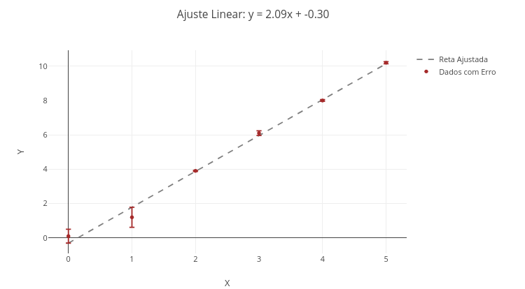
Suggestion:
1. Show the points overlaid or not with the fitted line. For overlay, choose "mostrarPontos = true" and "mostrarReta = true";
2. Change the data and perform a new fit, to obtain other line parameters.
3.4 Polynomial regression
Context:
In some situations, the linear fit does not provide an adequate trend for modeling experimental data, which calls for the use of other models, such as exponential, hyperbolic, logarithmic, power, and polynomial. Polynomial trends are common in natural phenomena, with mathematical treatment of the data occurring through different methods, such as simple summations, least squares, or linear algebra. Below is an example of polynomial regression with degrees adjustable in the code.
3.4.1 Equation
Error minimization for the polynomial curve is obtained by a generalized least-squares regression, and application of the Vandermonde matrix, as follows.
Let the vectors x=[x\(*{1}\),x\(*{2}\),…,x\(*{n}\)] and y=[y\(*{1}\),y\(_{2}\),…,y\({_n}\)], and we want to fit the polynomial:
\[ y = \beta_0 + \beta_1 x + \beta_2 x^2 + \cdots + \beta_g x^g \] | Thus, the Vandermonde matrix is built as:
\[ X = \begin{bmatrix} 1 & x_1 & x_1^2 & \cdots & x_1^g \\ 1 & x_2 & x_2^2 & \cdots & x_2^g \\ \vdots & \vdots & \vdots & & \vdots \\ 1 & x_n & x_n^2 & \cdots & x_n^g \end{bmatrix} \]
To find the coefficients \(\beta\) that minimize the squared error, the linear system is solved in sequence:
\[
\boldsymbol{\beta} = (X^T X)^{-1} X^T \mathbf{y}
\]
Where:
- T represents the transpose matrix
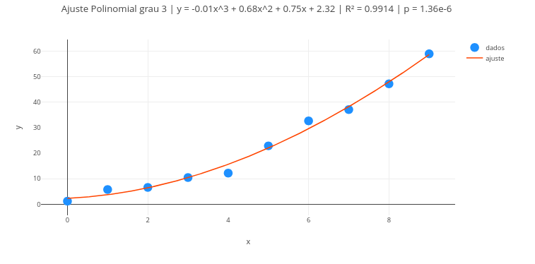
Suggestion:
1. Try degree 1 for the polynomial, i.e., reduce the treatment to a linear fit;
2. Change the formatting of labels, colors, sizes, etc., in the code;
3. Overlay some fits, edit and reposition the legend;
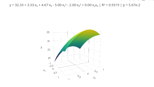
4. Test the code with another data vector.3.5 Multiple linear regression
Context:
Multiple linear fitting is very useful when one wants to predict a behavior as a function of two or more predictor variables. The procedure involves a design matrix (or projection operator) similar to the Vandermonde matrix.
Equation:
The analytical solution for the design matrix involves solving a coefficient matrix \(\beta\) for a set of predictor values of the response vector y, as follows:
\[ y_i = \beta_0 + \beta_1 x_{1i} + \beta_2 x_{2i} + \cdots + \beta_p x_{pi} + \varepsilon_i \]
\[ \mathbf{y} = \mathbf{X} \boldsymbol{\beta} + \boldsymbol{\varepsilon} \]
\[ \hat{\boldsymbol{\beta}} = (\mathbf{X}^\top \mathbf{X})^{-1} \mathbf{X}^\top \mathbf{y} \]
Where:
- \(\beta\) = vector of coefficients;
- y = response vector;
- X = design matrix;
- \(\epsilon\) = random noise
Thus, predicted values and associated error are obtained by:
\[ \hat{\mathbf{y}} = \mathbf{X} \hat{\boldsymbol{\beta}} \] \[ \mathbf{e} = \mathbf{y} - \hat{\mathbf{y}} \]
Obviously, the graphical representation for a multiple linear fit is limited to two independent variables, x1 and x2, in addition to the response variable (3D plot), although the matrix calculation allows multiple predictor variables (hyperdimensional space). With respect to the first situation, an example follows.
Instructions
Note that there is a boolean flag (mostrarAjuste) at the beginning of the code: false for data only, and true for the fit;
You can click add plot to view the data with the flag set to false, followed by another add plot with the flag set to true.
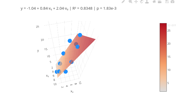
Rotate the plot and observe the surface around the points. Unlike a linear fit, the points are distributed non-continuously in space.
Suggestion:
1. QSAR ("Quantitative Structure-Activity Relationship") results use multiple linear fitting analysis to identify the strength of predictor variables. Search online for a dataset that has 2 variables (e.g., concentration, pH, compound A, B, etc.)
2. For more predictor variables, see the code that follows !!
3.6 Multiple linear fitting with 3 or more predictor variables
Context
Although JSPlotly was designed for producing interactive plots and maps using the Plotly.js library on the shoulders of the JavaScript language, it extends the possibilities of application beyond graphical representations. An example of this is the code below, for a multiple linear fit for a situation with 4 predictor variables.
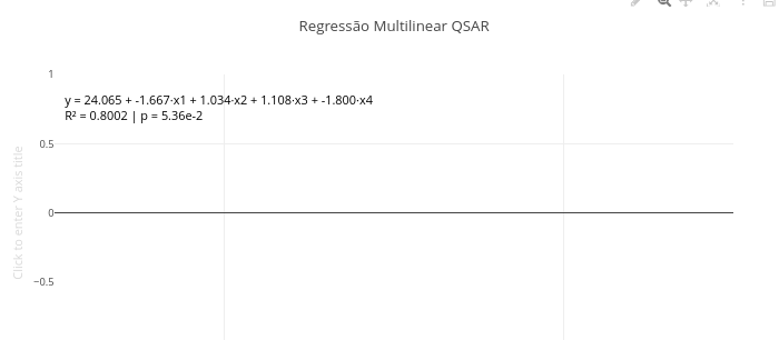
Suggestion:
1. Try varying the number of predictors (xi). To do this:
  a. If you want to reduce, just remove the desired vector(s), and correct their quantity in the line: "const X = x1.map((_, i)";
  b. If you want to increase, add a new vector in the corresponding line, and update the quantity in the mapping of "const X = x1.map((_, i)".
3.7 Response Surface Methodology (RSM)
Context
A variation of multiple linear fitting involves response surface methodology, commonly linear (plane) or quadratic (curvilinear), applied in modeling and optimization of experimental processes with multiple independent variables. Its goal is to fit a mathematical equation that represents the relationship between experimental factors and the response variable, allowing prediction of behaviors and identification of optimal conditions.
For experiments with two factors, a second-order quadratic model is commonly used, which allows representing surfaces with curvature. The central idea of the experiment is to select values and their codes (-1,0,1), representing, respectively, a quantity below, a medium quantity, and one above, for a given predictor variable.
Equation:
The general quadratic model for 2 factors is represented by:
\[ y = \beta_0 + \beta_1 x_1 + \beta_2 x_2 + \beta_{11} x_1^2 + \beta_{22} x_2^2 + \beta_{12} x_1 x_2 + \varepsilon \]
With the matrix form of the model represented by:
\[ \mathbf{y} = \mathbf{X} \boldsymbol{\beta} + \boldsymbol{\varepsilon} \]
And estimation of the coefficients \(\beta\) by least squares, similarly to multiple linear fitting, by:
\[
\hat{\boldsymbol{\beta}} = (\mathbf{X}^\top \mathbf{X})^{-1} \mathbf{X}^\top \mathbf{y}
\]
Suggestion:
1. As suggested earlier, try using data from the literature or another source whose responses are already known, replacing the respective vectors at the beginning of the code. This allows comparing the effectiveness of using the presented tool.3.8 Data smoothing - Spline and Savitzky-Golay filter
In experimental research, signal detection occasionally occurs in the presence of significant levels of noise, as happens in continuous spectral scanning under variation of wavelength, or in electrical signal detection over time. In this case, there is no analytical equation that describes the behavior of the signal, although some digital processing tools can produce a trend curve in data treatment, significantly reducing the noise level, such as by a spline curve and Savitzky-Golay filter.
Context - Cubic spline
A very common interpolation technique refers to using cubic spline by degree-3 polynomials interconnecting data windows. The treatment consists of applying the polynomial functions in subintervals of the points, promoting smoothing between the data windows.
Equation
Mathematically, the spline is applied such that:
\[ S_i(x) = a_i + b_i(x - x_i) + c_i(x - x_i)^2 + d_i(x - x_i)^3 \]
Where:
- S\(_{i}\)(x) = cubic spline function in the interval [xi,xi+1];
- a\(*{i}\), b\(*{i}\), c\(*{i}\), d\(*{i}\) = coefficients specific to segment i;
- x\(_{i}\) = starting point of the interval;
- x = independent variable.
Context - Savitzky-Golay filter
The Savitzky-Golay smoothing technique applies a local polynomial regression to a moving window, by least squares and a predetermined degree, preserving signals of peaks, valleys, and bands. Unlike cubic spline, the filter produces a global continuous curve, not a set of interconnected curves.
Equation
Mathematically:
\[ \tilde{y}*i = \sum*{j=-m}^{m} c_j \cdot y_{i+j} \]
Where:
- y\(_{i}\) = smoothed value at position i;
- y\(_{i+j}\) = real series values within the window;
- c\(_{i}\) = filter coefficients derived from a polynomial regression;
- m = number of points on each side of the central window.
Below is an example of code for JSplotly that illustrates the use of both interpolation methods.

Instructions:
- The code has two true/false flags, one for “usarGolay” and another for “usarSpline”;
- View the raw data adopting false for both flags;
- To overlay a cubic spline, change its constant to true;
- To overlay the Savitzky-Golay filter, change its constant to true;
- To tune the filter, modify its parameters in the constants janela (moving window) and/or grau (polynomial degree).
Suggestion:
1. Compare the smoothing effects of the two polynomial interpolation treatments;
2. Apply only the filter, tuning moving-window and polynomial-degree parameters;
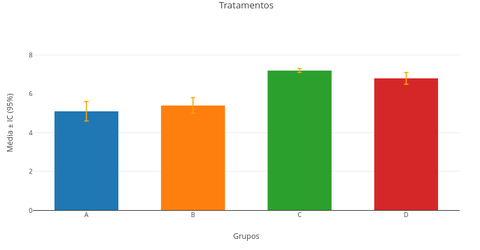
3. Try interpolation with other raw data in the code, replacing the constants "x_values" and "y_raw" with numeric vectors;3.9 ANOVA and Tukey-HSD test
Context:
In research, it is common to analyze a dataset by comparing the variance between groups with that obtained within each group, i.e., Analysis of Variance (ANOVA). Once the statistical information is obtained that there is a difference between groups greater than the internal variance, a post-hoc test is performed for comparison of means, such as the Tukey-HSD (Honest Significant Difference) test.
Equation:
The equation that characterizes a Tukey-HSD test is provided below (correction for unbalanced groups):
\[ \text{HSD}*{ij} = q*{\alpha} \cdot \sqrt{\frac{\text{MS}_{\text{within}}}{2} \left( \frac{1}{n_i} + \frac{1}{n_j} \right)} \]
Where:
- HSD = minimum value of the difference between two means for it to be considered significant;
- q\(_{\alpha}\) = critical value of the studentized q distribution (Tukey distribution), depending on the number of groups and the significance level \(\alpha\);
- MS\(_{within}\) = mean square within groups (error) obtained from ANOVA;
- n: number of observations per group (i and j if there are groups of different sizes).
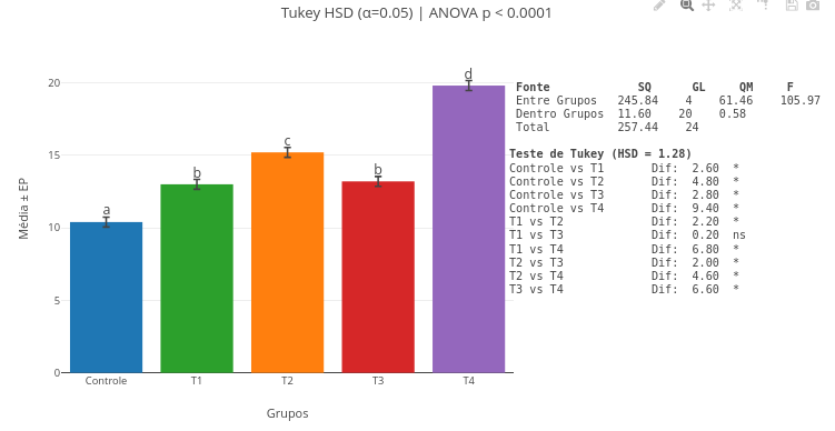
Suggestion:
1. You can click and drag the minimum-difference markers (a,b,etc) above the plot for better visual adjustment, as well as the ANOVA table and the statistical test result;
2. Change the vector values, redo the analysis and the plot simultaneously, and notice the difference in the obtained values. Note that, as stated on the lower border, it is necessary to refresh the site page to clear previous data retained in cache memory;
3. Enter other data in the respective vectors, yours or from another source;
4. Insert new data vectors, or delete one, for a customized calculation and plot.
3.10 Nonlinear fitting of data
Modeling is an area of common use in the natural sciences, when one wants prediction or mathematical correlation of experimental data. Models may be linear or nonlinear. When nonlinear, they may be applied empirically to the data (e.g., quadratic, logarithmic, exponential, or power functions), or based on an explanatory mathematical function of the model.
In this case, techniques are used for nonlinear fitting of the data to the model, such as Simplex, Gauss, Newton-Raphson, Levenberg-Marquadt, or least squares, for example. Whatever the method, nonlinear fitting differs from linear fitting in assumptions and data treatment (see a quick explanation here.
Context: Ligand-protein interaction (grid search algorithm)
The following example illustrates applying a nonlinear fit to molecular interaction data by a Langmuir model, and treating it by minimizing squared error by manual scanning. In this treatment, the sum of squared errors (RMSE) is computed for combinations of a and b, selecting the pair with the lowest computed error. In this case, for simplification, although JSPlotly works with more specific libraries, the nonlinear regression is done by least squares, but performed by grid search, not by classic iterative methods. Thus, a set of values is tested for the pair (a, b) on a previously defined grid (combination table), allowing identification of the parameters that best describe the experimental data according to the minimum-error criterion.
Equation:
The Langmuir equation is represented below:
\[ Y = \frac{aX}{K_d + X} \] Where:
- Y = fraction of occupied sites;
- X = concentration of free ligand;
- a = saturation value (sites of the same affinity fully occupied);
- Kd = equilibrium dissociation constant of the complex.
In this case, the nonlinear least-squares function is:
\[ SSR(a, K_d) = \sum_{i=1}^n \left( y_i - \frac{a x_i}{K_d + x_i} \right)^2 \]
Where:
SSR = sum of squared residuals (inversely proportional to fit quality)
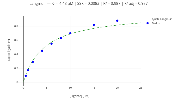
Suggestion:
1. As in the previous example, alternatively show the points and the fitted curve using the boolean operation ("mostrarPontos = true/false"; "mostrarCurva = true/false");
2. Change the data and perform a new fit, to obtain other equation parameters (Kd, SSR, R², adjusted R²). Note: adjusted R² corresponds to the R² value corrected for the number of model parameters (in this case, "2"), directly affecting the "degrees of freedom" for the fit.
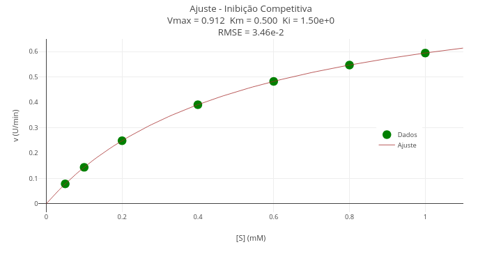
Context - Competitive inhibition in enzyme kinetics (Gauss-Newton algorithm)
The Gauss-Newton method iteratively fits nonlinear models to experimental datasets. It is especially efficient when the model is almost linear with respect to the parameters and the residuals are moderately small. The goal is to find the parameters \(\theta\) that minimize the sum of squared residuals between the observed data yi and the predicted values by the model f(xi,\(\theta\). Unlike the full Newton-Raphson method, Gauss-Newton avoids explicit calculation of the Hessian, using an approximation based on the Jacobian of the residuals.
Equation:
This approximation results in a linear system that can be solved at each iteration to update the model parameters. The central formula of the method consists of multiplying the transposed Jacobian JT by the Jacobian itself J, forming a symmetric matrix that approximates the Hessian. The residual vector r is then used to determine the update direction \(\Delta\theta\), with the following equation:
\[ \theta_{k+1} = \theta_k + \left(J^T J\right)^{-1} J^T \cdot r \]
To illustrate the potential of the app in iterative nonlinear fitting, an example follows for enzyme kinetics using a competitive inhibition model.
The code allows fitting the seeds, tolerance, and number of iterations, and provides the plot (points/fitted line, manually), and statistical regression parameters.
Instructions
- Notice that the code has a true/false flag in the constant ajuste. Leave it false for representing the data only (vectors x and y, or S and v);
- In the code’s Plot area, set the constant trace so that it uses the data vectors as well;
- Click add plot to view the experimental points;
- To overlay the fitted curve, update the constants ajuste and trace (vectors S_fit and v_fit), and choose lines in mode.
4 Applications
4.1 prot.Id - Simulated experimentation for characterization of amino acids and chains
Context:
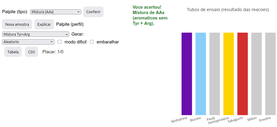
JSPlotly makes it possible to work with a set of interactions not necessarily tied to equations and their graphical representations. The example below illustrates its potential for simulating a classic Biochemistry experiment: the characterization of amino acids, peptides, and proteins through chromogenic reactions in test tubes. Since the scope of this material is to present and enable the use of varied OIERs (interactive objects for reproducible teaching), users are encouraged to seek information sources related to the reactions briefly described below.
Simulator instructions
The simulator offers two options: a) discover the nature of a sample or b) discover the reaction color pattern for a selected sample.
Option A: discovering the nature of a sample:
Here it is possible to “play” to check whether you are facing a protein/peptide (chain) sample, an amino acid (AA), a specific mixture of AAs, or AA(s) present in a chain. To do that:
Click the image below and press “add”. A set of 7 colored bars will be generated, representing the colors obtained in test tubes for 7 distinct reactions used for protein characterization: ninhydrin, biuret, Pauly, xanthoproteic, Sakaguchi, Millon, and sulfur (Cys);
Determine the sample type based on the color pattern presented, making a guess. The guess must be by type (in the “Guess (type)” menu—AA, chain, or AA mixture) and by profile (in the “Guess (profile)” menu—random, specific AA(s) or specific mixture);
After selecting both menus, click “Check”. If correct, a “Scoreboard” right below will count the number of correct guesses/number of samples “played”;
If you miss, try again or look for the explanation of the color pattern in “Explain”;
There are two other possibilities: “Hard mode”, which hides the reaction names while keeping their sequence, and “Shuffle”, which changes the order of the tubes;
For a new sample, just click “New sample”;
Option B: discovering the reaction color pattern for a selected sample:
- Select a sample in “Generate”, and click “New sample”. A set of tubes will be generated with the expected reaction pattern for that sample.
Suggestion:
1. Try clicking "New sample" to see how often possibilities occur;
2. Try both operating options of the "game" (yes, it is a game...after all, it has a scoreboard!);
3. Try "hard mode" (without reaction labels in sequence) or "shuffle" (permutes the reaction order). Obviously, however, avoid using both at the same time!
4.2 ZeMol - 3D viewer for molecular models
Context:
Due to the combined characteristics of using JavaScript and the Plotly.js library, it is possible to extend the potential applications of JSPlotly to the construction of true HTML applications. A clear example of this reach is shown below: a molecular viewer similar in nature to some pre-existing tools used in teaching and research (Jmol, Pymol, etc.).
Although it is obviously much smaller in functionality compared to other applications, the so-called “ZeMol” uses less than 70 kB of memory and provides features such as:
- models loaded online from the PDB or PubChem sites;
- models loaded from the device’s physical storage (PDB, MOL, SDF, XYZ, TXT formats);
- identification information for the PDB file (or PubChem file name);
- header containing counts of chains, ligands, ions, and disulfide bonds;
- identification of only the \(\alpha\) carbons of each residue in the polypeptide backbone, facilitating model visualization;
- automatic visualization of disulfide bonds;
- identification of residues, ligands, and ions by mouse hover over the model;
- checkbox to show protein secondary structure (helix, \(\beta\)-sheet);
- checkbox for residue polarity index;
- sliders for CA carbon size (PDB) or atoms in general, and model opacity (useful to highlight clefts, secondary structure, carbon chain, ligands, ions);
- hide/show distinct parts of the model by clicking its legend (chain, ions, helices/sheets, ligands);
- highlighting amino acids (single, range, all of one type, predefined groups in the script);
- self-contained HTML when saving, “freezing” the model in the characteristics you want to present;
- Zoom on mobile devices (one finger fixed on the screen and another dragging the model) and Pan (moving the model with two fingers on the screen)—actions also present in the icons above the model;
- optional adjustments in the script itself (sizes, colors, thicknesses, AA groups, line type and thickness, for example).
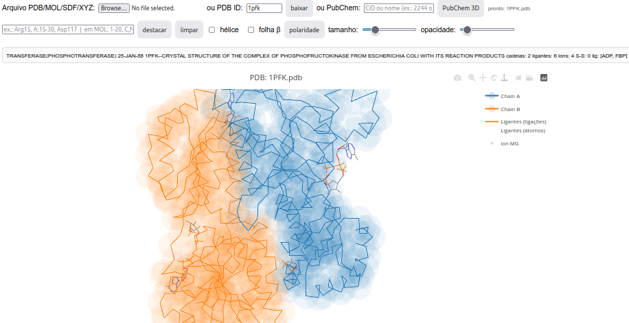
Suggestion:
1. Load a model with a PDB code, or a molecule from the PubChem site;
2. If it is a protein, try the separate and combined effects of the sliders for CA size and opacity;
3. Observe residue polarity in the polarity checkbox;
4. Try zooming in/out or moving it on the screen with the mouse, or doing it on a smartphone as instructed above;
5. Show or hide each chain or all chains, ligands, and ions by clicking the corresponding legend terms;
6. Select residues of interest in the model, such as a catalytic site, coenzyme-binding site, or regulatory residues. To do this, type in the corresponding field and click "highlight". Some suggestions:
  a. Single: Arg15, ASP117, 15, A:15, A:ARG15;
  b. Ranges: 15-30, A:15-30, Arg15-Asp30;
  c. Multiple separated by commas: "Arg15, Asp117";
  d. Groups: "aromatico", "polar", "apolar", "basico", "acido", "small".
4.3 carbo.Id - Simulated experimentation for carbohydrate characterization
Context:
As presented for amino acid and chain characterization above, here is a simulated experimentation for carbohydrate characterization. The logic is the same: given the chromogenic results for specific reactions in test tubes (bar chart), the user tries to characterize the carbohydrate. This is done with respect to the reactions of:
Molisch test – detects carbohydrates (purple ring); reaction with \(\alpha\)-naphthol producing furfural or hydroxymethylfurfural;
Lugol test (I\(_{2}\)/KI) – detects polysaccharides (dark blue tube);
Benedict test – detects reducing monosaccharides (and also lactose); tube with dark orange/brick precipitate;
Seliwanoff test (resorcinol) – differentiates ketoses (red tube) from aldoses (faint pink tube);
Barfoed test – differentiates mono (tube with red precipitate – cuprous oxide) from oligosaccharides (yellowish tube).
Simulator instructions
Option A: discovering the nature of a sample:
To discover the nature of a sample, proceed as in the amino acid and chain characterization app above. To do that:
Click the image below and press “add”. A set of 5 colored bars will be generated, representing the colors obtained in test tubes for the 5 distinct reactions used for carbohydrate characterization: Molisch, Lugol, Benedict, Seliwanoff, and Barfoed.
Determine the sample type based on the tube color pattern presented, making a guess. The guess must be by type (in the “Guess (type)” menu—monosaccharide, di-oligosaccharide, polysaccharide, water) and by profile (in the “Guess (profile)” menu—reducing, non-reducing, aldose, ketose, monosaccharide, di-oligosaccharide, and polysaccharide);
After selecting both menus, click “Check”. If correct, a “Scoreboard” right below will count the number of correct guesses/number of samples “played”;
If you miss, try again or look for the explanation of the color pattern in “Explain”;
There are two other possibilities: “Hard mode”, which hides the reaction names while keeping their sequence, and “Shuffle”, which changes the order of the tubes;
For a new sample, just click “New sample”;
Option B: discovering the reaction color pattern for a selected sample:
- Select a sample in “Generate”, and click “New sample”. A set of tubes will be generated with the expected reaction pattern for that sample.
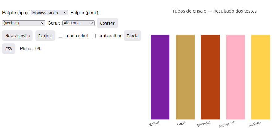
Suggestion:
1. Try clicking "New sample" to see how often possibilities occur;
2. Try both operating options of the "simulator/app/game");
3. Try "hard mode" (without reaction labels in sequence) or "shuffle" (permutes the reaction order). Obviously, however, avoid using both at the same time!
4.4 FlowForces
Context:
The name above alludes to the Nobel laureate Ilya Prigogine and self-organizing processes, such as those found in living cells. In this case, the quantities of certain reactants and products configure the forces, while their transformations point to the flows.
With respect to both, it is sometimes interesting to study the effect of a modifier, such as an activator or inhibitor, in a metabolic pathway or any biochemical reaction—both in isolation and in an organelle, cell, or even the organism. In this sense, the application simulates such effects in a biological system where the user enters metabolites into a continuous logging flow for an arbitrary signal.
For example, the addition of metabolic modifiers to a cell suspension can be monitored by the oxygen level of the sample, as measured by an oxygraph, and simulated below.
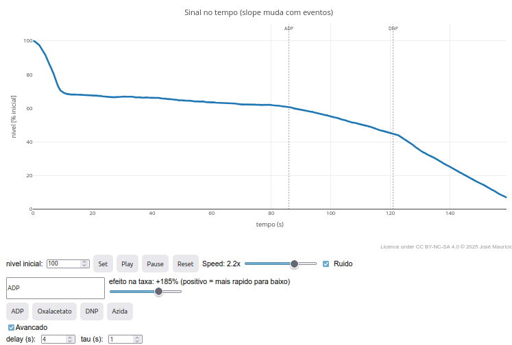
Suggestion:
1. Try changing one or more compounds with biochemical justification, for example for a metabolic pathway;
2. Test variations of "delay" for the appearance of a modifier effect by clicking the "Advanced" checkbox;
3. Try increasing the noise in "const noise", raising it 100x:
    "const noise = noiseOn ? (Math.random()-0.5)*20"
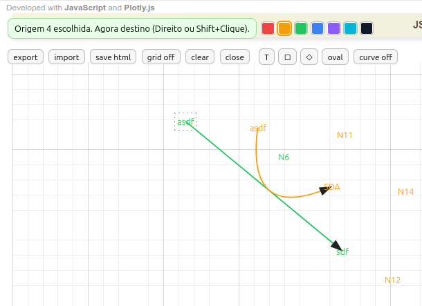
4.5 MentMapa - editor for mind map and diagrams
In the same line of customizing JSPlotly as done above for the digital board, the program also allows building a diagram or mind map elaborated by mouse clicks, and as an independent application.
The Mind Map Editor illustrated in the figure below allows building diverse structures, and fundamentally by combining terms and arrows. There are various functionalities for the facilitated creation of a map or diagram, including a help banner in the upper left corner for several of the actions.
Instructions for MentMap
- Creating terms. Click with the left mouse button and type a term; press Esc to exit;
- Deleting terms. Click Ctrl+right mouse button;
- Frame on terms. Click on a frame on the bar (square, diamond, oval);
- Connecting terms by arrow. Right-click the 1st term, followed by right-click on the 2nd term;
- Curved arrow. Click curve on. Then, right-click the 1st term, followed by left-click on a point between the two terms, and finish with right-click on the 2nd term. To adjust the arrow curvature, click the little ball and drag it to touch a term or an arrow;
- Drag terms and arrows. Just click and drag.
- Drag a group of terms/arrows. Press Shift and draw the area you want to encompass the group with the left mouse button;
- Colors for terms and arrows. Select one of the 7 colors available on the top bar, and click an existing term, or a new one. Obs: the arrow color follows that of the terms;
- Grid for more precise positioning. Just click grid on (it is not saved in the final diagram);
- Saving the map (save html). Different from the usual html button, storing the interactive map is done by its own html button, on the icon bar;
- Importing maps (import). The application allows importing an already ready map in json format to continue its editing;
- Exporting maps (export). The application also allows exporting the map in json format for future study or simple keeping.
Suggestion:
1. The editor allows creating mind maps, diagrams, flowcharts, and other representations...so now the suggestion is yours !!
4.6 Gizz - Digital chalkboard
Context:
The nature of the object below needs no introduction. It is yet another among many applications that simulate a chalkboard or digital whiteboard. Unlike its competitors, however:
- It can be exported as a self-contained HTML file via a button on the board itself, allowing sharing of the generated image and continued editing;
- It allows customization of the code that produces it, making it possible to insert/change pens, thicknesses, and different actions not provided in the source code.
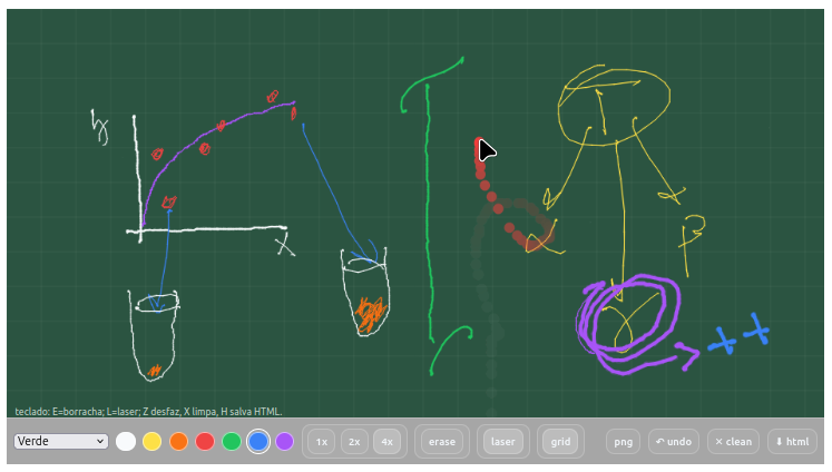
In terms of its features, the digital board allows:
- Writing with 7 colors and 3 different thicknesses;
- Accessing 4 background planes with different coloration;
- Overlaying the background with a grid;
- Using an eraser (erase);
- Using a laser pointer to transiently locate what you want to point out;
- Saving the image as PNG, indicating date and time;
- Commands for undo (undo) and cleaning (clean) the board;
- Keyboard shortcuts: E=eraser; L=laser; Z undo, X clear, H save HTML
Suggestion:
1. You can change pen thickness in "var baseWidth = 1;" ;
2. The 1x, 2x, 4x buttons are multipliers; edit the button creation lines to change label/multiplier (e.g., "addSize('3x', 3, true)").
5 Toolkits
JSPlotly can operate as a complete application for simulation in varied situations. The “toolboxes” below illustrate interactive panels (dashboards) for simulated experimentation and analysis in biophysical chemistry, focusing on themes of kinetics, interaction, and stability for protein targets. Each toolkit allows an appreciation of methods used, applications, modeling, and parameter interpretation. As a whole, the toolkits enable an integrated study of kinetics and thermodynamics for application in biotechnology, biocatalysis, and drug discovery.
Important notes:
The Toolkits contain internal code for styles and panel assembly that can interfere with the Bootstrap of the web page builder used for Bioquanti (the Quarto package for R). In this sense, the clickable images for each panel point to the individual scripts for loading each Toolkit into JSPlotly.
Each panel is displayed below the JSPlotly plotting screen. This is necessary to maximize the area available for displaying the panels.
Individually, the toolkits include:
- EK-Toolkit - modeling in enzyme kinetics and inhibition;
- LeadHunt - lead-compound prospecting via enzyme inhibition;
- LB-Toolkit - analysis of ligand–protein interaction;
- GH-Toolkit - thermodynamic stability of biopolymers;
- mTherm-Toolkit - stability under perturbing conditions;
- ThermStab-Toolkit - enzyme thermostability;
- Biocel-Toolkit - microbial fuel cell performance
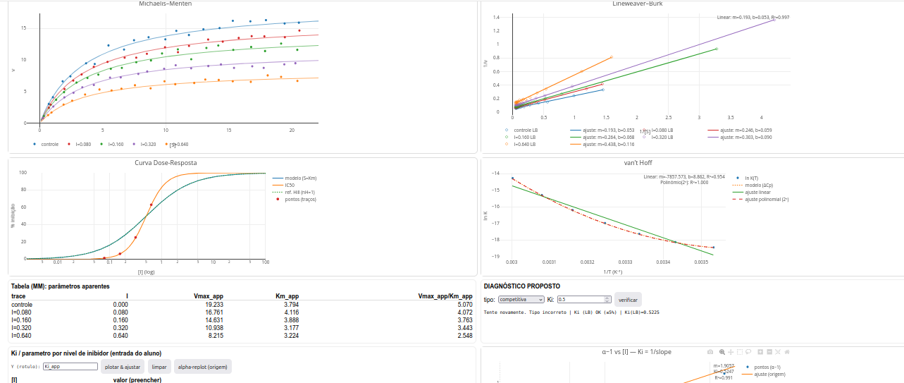
5.1 EK-Toolkit
General instructions
The EK-Toolkit is a toolbox for simulating enzyme kinetics and inhibition using diagnostic plots. The kit generates three graphs side by side:
- Michaelis–Menten: v × [S];
- Lineweaver–Burk (LB) — 1/v vs 1/[S];
- Replot - LB slope or intercept, or Dixon ordinate (1/v)
Additional features include HTML export, CSV export and load, editable annotations, draggable windows, and model comparison (A/B).
Features
- Models: Michaelis–Menten; Substrate excess; Irreversible inhibition; Competitive inhibition; Non-competitive inhibition (pure); Mixed inhibition; Uncompetitive inhibition; Bi-substrate (Random Sequential, Ordered Sequential, Ping-Pong); Hill (cooperativity); Enzyme activation (Vmax-up); User (free equation);
- Synchronized plots: v×[S], LB (1/v vs 1/[S]) and Replot (slope, intercept or Dixon 1/v vs modifier);
- A/B comparison with consistent color palettes across plots;
- Panels: models, equations, parameters (range of [S], number of simulated points, error, modifiers, parameters;
- Configurable Replot with editable X-axis label.
- Fits: weighted linear fit in LB and replots - WLS (weighted least squares, weight: 1/y²); OLS (ordinary least squares) in Dixon.
- Ki estimation in Dixon; vertical marker at (x = -K_i).
- HTML export with interactive plots and equations; PT-BR CSV (‘;’ separator, ‘,’ decimal).
- CSV load to reconstruct plots and diagnostics; ‘Clear CSV’ to return to simulation.
- Draggable modals; clickable/editable annotations; global legend ON/OFF.
Models
Michaelis–Menten \[ v = \dfrac{V_{max} S}{K_m + S} \]
Substrate excess \[ v = \dfrac{V_{max} S}{K_m + S + \dfrac{S^2}{K_{is}}} \]
Irreversible inhibition \[ v = \dfrac{V_{max}(1-f) S}{K_m + S} \]
Competitive \[ v = \dfrac{V_{max} S}{K_m \left(1 + \dfrac{I}{K_i}\right) + S} \]
Non-competitive (pure) \[ v = \dfrac{V_{max}}{1 + \dfrac{I}{K_i}} \cdot \dfrac{S}{K_m + S} \]
Mixed \[ v = \dfrac{V_{max}}{1 + \dfrac{I}{K_{i2}}} \cdot \dfrac{S}{K_m \left(1 + \dfrac{I}{K_{i1}}\right) + S} \]
Uncompetitive \[ v = \dfrac{V_{max} S}{K_m + S\left(1 + \dfrac{I}{K_i}\right)} \]
BiBi Random Sequential \[ v = \dfrac{V_{max} A B}{K_a K_b + K_a B + K_b A + A B} \]
BiBi Ordered Sequential \[ v = \dfrac{V_{max} A B}{K_a K_b + K_b A + A B} \]
BiBi Ping-Pong \[ v = \dfrac{V_{max} A B}{K_b A + K_a B + A B} \]
Hill (cooperativity) \[ v = \dfrac{V_{max} S^n}{K^n + S^n} \]
Activator (Vmax-up) \[ v = \dfrac{V_{max}\left(1 + \dfrac{A}{K_{aA}}\right) S}{K_m + S} \]
Note:
- a (intercept): value of 1/v when 1/[S] = 0.
- b (slope): LB line slope = (K_m/V_{max}).
- K_i: inhibition constant (Dixon: (x = -K_i)).
Suggestion
1. Try comparing the pure non-competitive model to the mixed model; for this, simply set the inhibition constants equal (pure) or not equal (mixed);
2. Try a user-introduced model ("user"). To do this, select Models --> User, enter the equation, the parameters and their values. Example (partial uncompetitive activation):

  Equation: (alfa*Vmax*S)/(Km+S*(1+I/Ki))
  Parameters: alfa;Km;Vmax;Ki
  Values: 1.7;2;10;5
Models → User, enter Equation (JS), Parameters (names;) and Values (;).
- Marangoni, Alejandro G. Enzyme kinetics: a modern approach. John Wiley & Sons, 2003.
- Purich, Daniel L. Enzyme kinetics: catalysis and control: a reference of theory and best-practice methods. Elsevier, 2010.
- Leone, Francisco A. Fundamentos de cinética enzimática. Editora Appris, 2021.
- Segel, Irwin H. Enzyme kinetics: behavior and analysis of rapid equilibrium and steady state enzyme systems. Vol. 115. New York: Wiley, 1975.
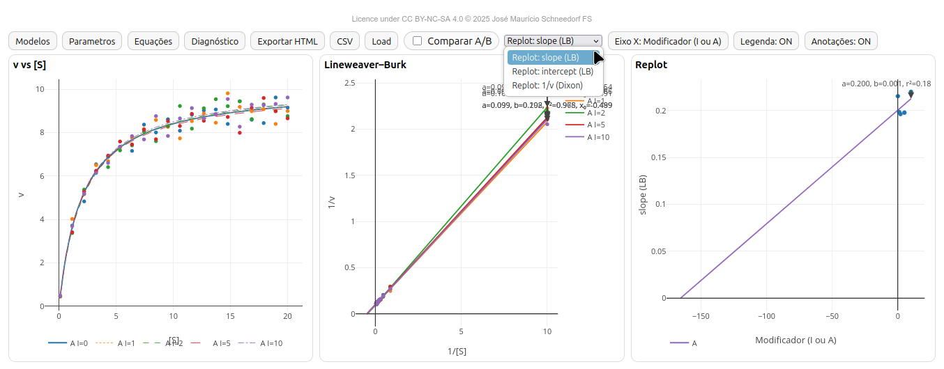
5.2 LeadHunt-Toolkit
The example shown refers to the use of JSPlotly as a dashboard for simulated prospecting of the potential of a fictional screening molecule, aiming at selecting a lead compound as an inhibitor of an enzyme target.
General instructions
- At the top of the app there are 4 buttons:
- reset - renews the simulation with new data and plots;
- html - saves the plots and data as an interactive file;
- diagnostic - opens a popup window with inhibition model diagnosis and parameter values;
- parameters - opens a window for simulation based on user parameters.
- There are two study modes for LeadHunt: entering kinetic and thermodynamic parameters to observe the outputs in graphs (parameters button), or characterizing parameters from the graphs (diagnostic button).
The plots simulate results for the Michaelis–Menten, Lineweaver–Burk, dose–response curve, and van’t Hoff plot.
Parameters
Regardless of the mode, to identify the compound potential, the parameters are:
- Ki, inhibitor dissociation equilibrium constant (desirable < 10\(\mu\)M);
- Vmax, limiting enzyme reaction rate;
- Km, Michaelis–Menten constant;
- \(\Delta\)H, enthalpy change upon inhibitor binding;
- \(\Delta\)S, entropy change upon inhibitor binding;
- \(\Delta\)Cp, heat capacity change upon inhibitor binding;
In addition to these, the fictional molecule has some descriptors, namely:
- MW, molecular weight;
- HAC, number of heavy atoms (all except hydrogen);
- HBD, number of hydrogen bond donors;
- HBA, number of hydrogen bond acceptors;
- logP, logarithm of the partition coefficient
These descriptors allow computation of other criteria for lead selection:
LE, ligand efficiency:
\[ LE = \frac{\Delta G}{HAC}; \]
\[
LE = 1.37 \frac{pIC_{50}}{HAC}
\]
Where pIC\(*{50}\) = -log(IC\(*{50}\));
- LLE, lipophilic ligand efficiency (values >5 are considered good),
\[ LLE=pIC_{50}-logP \]
- BEI, binding efficiency index,
\[ BEI=\frac{pIC_{50}}{MW} \]
Where: MW, kDa; typical ranges by Lipinski’s “rule of five”: MW<=500, HBD<=5, HBA<=10, cLogP<=5. Also LE >= 0.3; LLE >= 5.
The inhibitor dose–response curve also allows determination of:
- IC\(_{50}\), inhibitor concentration giving 50% response (adequate when < 10\(\mu\)M);
- nH, Hill constant (midpoint slope; cooperativity index)
Using LeadHunt to identify a lead compound
From the visualization of plots and descriptors of the fictional molecule, it is possible to determine:
The type of reversible inhibition (competitive, uncompetitive, pure non-competitive, mixed non-competitive);
The Ki value by constructing various secondary plots from the parameter-entry table (Ki table)—plot inhibitor concentration I versus apparent Km, Vmax, or Km/Vm. Alternatively, plot I against (\(\alpha\)-1), where \(\alpha\) represents “1+I/Ki”;
The IC\(_{50}\) value and nH (midpoint slope) from the dose–response curve (cooperativity estimate);
The \(\Delta\)H and \(\Delta\)S values from the van’t Hoff plot. If the plot is curvilinear, also the \(\Delta\)Cp value;
The LE and LLE values;
Evaluate the candidate against Lipinski’s rules.
Thus, LeadHunt can be used for a meaningful simulation of screening an inhibitor as a lead compound for an enzyme target.
Suggestion
1. Compare enzyme inhibition types by visual inspection of the Michaelis–Menten and Lineweaver–Burk plots, emphasizing whether "Km" and "Vmax" do or do not change between them;

2. Compute "Ki" by different methods using the field for "replot" by inhibitor level (table of "Apparent parameters"):
    a) by obtaining "1/Ki" from the I x (alpha-1) plot (line slope) via the "alpha-replot" button;
  b) by intercept "-Ki" from plots of I x Vmax_app, Km_app, or Km/Vm_app (depending on the inhibition model);
  c) by "slope" or "intercept" from replots of Lineweaver–Burk against I

3. Try the "parameters" mode with an "nH" value different from 1 (e.g., 2.8) to evaluate dose–response curve behavior under cooperativity effects;

4. Try the "parameters" mode with a non-zero heat capacity value (e.g., -2000) to evaluate the possibility of secondary binding effects as a function of temperature, such as enzyme conformational transition;

5. Test curvature of the van’t Hoff plot for a heat-capacity change by providing positive (e.g., 2000) and negative values (e.g., -2000): if concave up, negative heat-capacity change; if concave down, positive heat-capacity change.
References:
- Marangoni, Alejandro G. Enzyme kinetics: a modern approach. John Wiley & Sons, 2003.
- Copeland, Robert A. Evaluation of enzyme inhibitors in drug discovery: a guide for medicinal chemists and pharmacologists. John Wiley & Sons, 2013.
- Copeland, Robert A. Enzymes: a practical introduction to structure, mechanism, and data analysis. John Wiley & Sons, 2023.
- Leone, Francisco A. Fundamentos de cinética enzimática. Editora Appris, 2021.
5.3 LB-Toolkit
General instructions
The LB-Toolkit is an interactive panel for analyzing ligand–receptor binding assays (protein, enzyme, nucleic acid, glycan). It allows visualization and fitting of classic binding curves (Binding, Scatchard, Benesi–Hildebrand, and Hill), and supports interactive HTML export of data and plots.
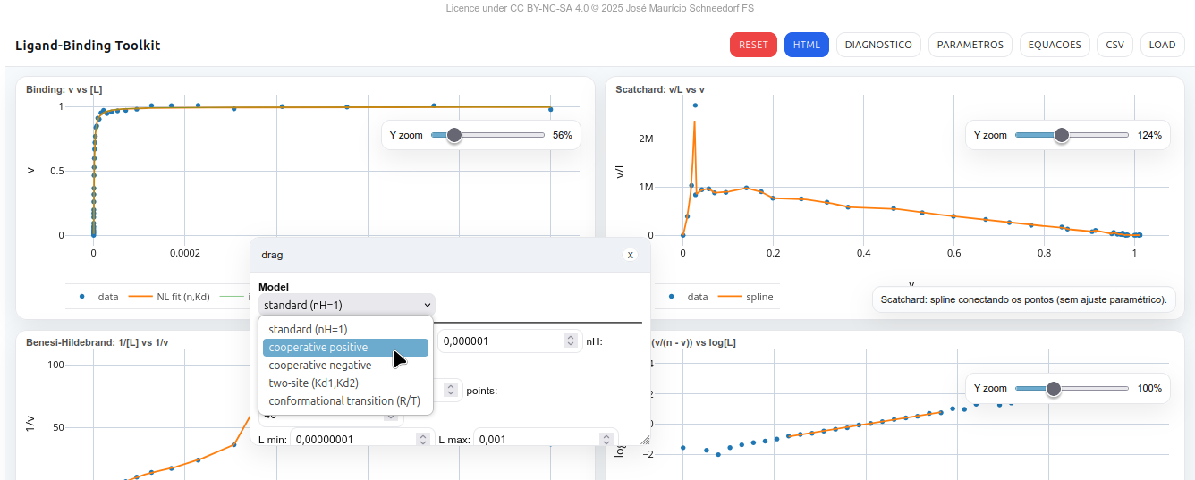
Features
The LB-Toolkit enables study and graphical visualization of a 2 × 2 panel representing classic bimolecular interaction models: Langmuir, Hill (positive and negative cooperativity), site heterogeneity (two-site), and conformational transition (R/T). HTML export is self-contained, and CSV import/export uses
L,v vectors. The main functions of the top bar are: RESET (restore default values), HTML (export standalone viewer), DIAGNOSTIC (show model summary), PARAMETERS (open control panel), EQUATIONS (show formulas), and CSV/LOAD (export or import data as
L,v.Adjustable parameters
n,Kd,nH,sigma error,points,Lmin,Lmax- Two-site:
n1,n2,Kd1,Kd2 - Conformational (R/T):
Kt,KdR,KdT - Toggles: draw model only, results below, Hill 10–90%, zoom sliders, autoplot
Models
Langmuir
\[
v = n,\frac{[L]}{K_d + [L]}
\]
Hill
\[ v = n,\frac{[L]^{n_H}}{K_d^{n_H} + [L]^{n_H}} \]
Linearization:
\[
\log!\left(\frac{v}{n - v}\right) = n_H \log[L] - n_H \log K_d
\]
Two-site (site heterogeneity)
\[
v = n_1,\frac{[L]}{K_{d1} + [L]} + n_2,\frac{[L]}{K_{d2} + [L]}
\]
Conformational (R/T)
\[
v = n,\frac{L/K_{dR} + K_t L/K_{dT}}{1 + L/K_{dR} + K_t(1 + L/K_{dT})}
\]
Classic linearizations
Fits are displayed as smooth spline lines, because polynomial regression parameters do not have direct physical meaning.
Scatchard
\[
\frac{v}{[L]} = \frac{n}{K_d} - \frac{1}{K_d} v
\]
Benesi–Hildebrand
\[ \frac{1}{v} = a,\frac{1}{[L]} + b \]
Fits and estimates
- Binding (n,Kd): non-linear fit (Gauss–Newton).
- Scatchard and Benesi: illustrative spline interpolation.
- Hill: linear regression on the 10–90% range.
5.3.0.1 Plots
- Binding: v vs [L] – theoretical curve + experimental points.
- Scatchard: v/L vs v – spline line fit to data.
- Benesi–Hildebrand: 1/[L] vs 1/v – illustrative spline.
- Hill: log(v/(n–v)) vs log[L] – linear regression with display of nH and Kd.
Suggestion
1. Use the slider (zoom bar) to enlarge/reduce the plots;
2. Try customizing the graphical representations. For example, click the "Parameters" button and change the model to negative cooperativity with two sites, assigning distinct values to them (optional).
References
- Carey, Jannette. Ligand-Binding Basics: Evaluating Intermolecular Affinity, Specificity, Stoichiometry, and Cooperativity. John Wiley & Sons, 2025.
- Roque, Ana Cecília A. “Ligand-Macromolecular interactions in drug discovery.” Clifton, NJ 2010; p 572 (2010).
- Mannhold, Raimund, Hugo Kubinyi, and Gerd Folkers. Protein-ligand interactions: from molecular recognition to drug design. John Wiley & Sons, 2006.
- Klotz, Irving. Introduction to biomolecular energetics: including ligand–receptor interactions. Elsevier, 2012.
5.4 GH-Toolkit
General instructions
This toolkit presents some Gibbs–Helmholtz and van’t Hoff relationships observed in the study of protein thermodynamics and macromolecular interactions involving folding, unfolding, and ligand-binding with constant (ΔC_p) (and a simple variant with (ΔΔC_p)). It includes useful forms for simulation from parameters at (T_0) or at (T_m), as well as diagnostic linearizations for direct parameter reading.
The simulator lets you work with fundamental equations (forms in (T_0) and centered at (T_m)) with constant (ΔC_p) and a linear-variation variant. Interpretation of the fits (regressions) is shown graphically from the selected Parameters. It also includes some Scenarios (mesophile, psychrophile, thermophile) and Presets for thermodynamic quantities. The app can simulate (ΔG(T)) directly from ((T_m,,ΔH_m,,ΔC_p)), and exports plots and data (CSV/HTML) in selectable units (kJ/mol ↔︎ kcal/mol; J/mol/K ↔︎ cal/mol/K).
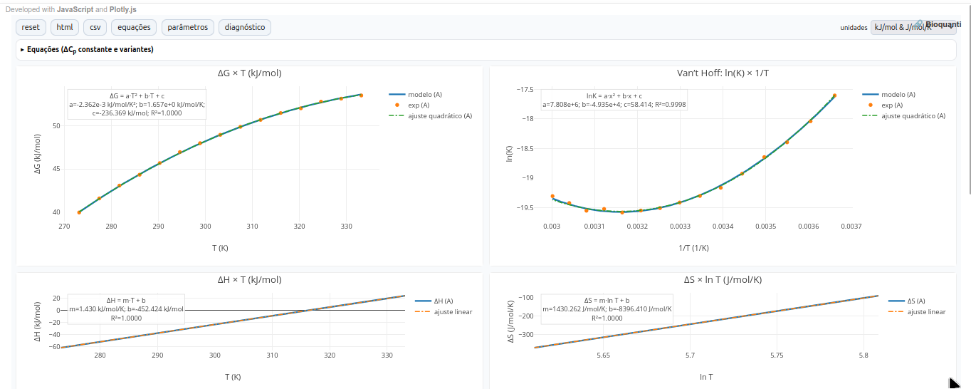
Parameters
1. Reference form at (T_0) (integrals with constant (ΔC_p))
Enthalpy \[ ΔH(T)=ΔH^\circ + ΔC_p,(T-T_0) \]
Entropy \[ ΔS(T)=ΔS^\circ + ΔC_p\ln!\left(\frac{T}{T_0}\right) \]
Gibbs energy (integrated Gibbs–Helmholtz) \[ ΔG(T)=ΔH^\circ - T,ΔS^\circ + ΔC_p\Big[(T-T_0)-T\ln!\left(\frac{T}{T_0}\right)\Big] \]
Equilibrium constant \[ \ln K(T)= -\frac{ΔG(T)}{R,T} \]
2. Form centered at (T_m) (stability curve via (ΔH_m) and (ΔC_p))
This form is convenient when the equilibrium temperature (T_m) (where (ΔG=0)), the enthalpy change at (T_m) ((ΔH_m)), and (ΔC_p) are known:
\[ ΔG(T)=ΔH_m!\left(1-\frac{T}{T_m}\right) + ΔC_p\Big[(T-T_m)-T\ln!\left(\frac{T}{T_m}\right)\Big]. \]
From this expression it is possible to recover parameters at (T_0) consistent with the curve:
\[\begin{aligned}
ΔH^\circ(T_0) &= ΔH_m + ΔC_p,(T_0-T_m),[4pt]
ΔS^\circ(T_0) &= \frac{ΔH_m}{T_m} + ΔC_p\ln!\left(\frac{T_0}{T_m}\right).
\end{aligned}\]
In the app, the button “generate by Eq. (T_m)” applies these relations.
3. Heat capacity with linear variation (term (ΔΔC_p))
To explore small linear variations of heat capacity around a reference (T_r):
\[ C_p(T)=C_{p,r}+ΔΔC_p,(T-T_r). \]
In the app, checking “Compare two proteins (use (ΔΔC_p)” plots protein B with (ΔC_{p,B}=ΔC_{p,A}+ΔΔC_p) and shows the consequence on the curvature of (ΔG(T)) and the shift of (T_m).
Scenarios
The Scenario chooses the nature of the modeled process and initializes coherent signs and magnitudes:
- Exothermic folding: (ΔH^<0); enthalpy-dominant stabilization at (T_0).
- Endothermic folding: (ΔH^>0) and (ΔS^>0) (entropy gain compensates).
- Unfolding: inverts folding signs.
- Exothermic / endothermic binding: typical settings for ligand–receptor interaction.
Suggestion
1. Note: T_m occurs when ΔG=0. In that case, a dashed vertical line is shown in the ΔG x T plot;
2. Choose a didactic "Preset" and compare its effect on stability curves:
  - None: coherent random draw.
  - term ↑ΔG global: makes ΔS more negative (raises ΔG globally).
  - term ↓ΔC_p: flattens curvature in ΔG(T).
  - psychro ↑ΔC_p: accentuates curvature.
  - binder ΔC_p<0: uses negative ΔC_p (cases of reduced hydrophobic binding etc.).
3. Curvature of ΔG(T) grows with |ΔC_p|; thus, compare A vs B, and see the difference in the graphical profile ("shape") and T_m shift;
4. Note that:
  - the van’t Hoff representation recovers ΔH and ΔS (when ΔC_p = 0).
  - slopes/intercepts serve as consistency checks between plots
  - from ΔH x T: slope gives ΔC_p.
  - from ΔS x ln T: slope gives ΔC_p, and intercept is compatible with ΔS and T_0.
References
- Atkins, Peter William, et al. Physical chemistry for the life sciences. Oxford University Press, 2023.
- Hammes, Gordon G. Thermodynamics and kinetics for the biological sciences. John Wiley & Sons, 2000.
- Cooper, Alan. Biophysical chemistry. No. 24. Royal Society of Chemistry, 2011.
- Creighton, T. The Biophysical Chemistry of Nucleic Acids & Proteins. Helvetian Press, 2010.
5.5 mTherm-Toolkit
General instructions
This toolkit is an educational app to simulate protein denaturation profiles (e.g., urea, GdnHCl), with support for multimeric proteins and an empirical term for osmolytes. Data are plotted as a function of an experimental signal (absorbance/fluorescence), followed by the calculation of conformational fractions and effective Gibbs energy as a function of denaturant. The simulator also allows comparison between proteins or experimental conditions (A/B).
The app uses a two-state model between a “native” set (F) and a “denatured” set (U). The denaturant effect is linear on the standard free energy of the monomer (LEA – Linear Extrapolation Assumption). To simulate an osmolyte effect (stabilizing or not), an empirical multiplicative term is applied to the slope (m).
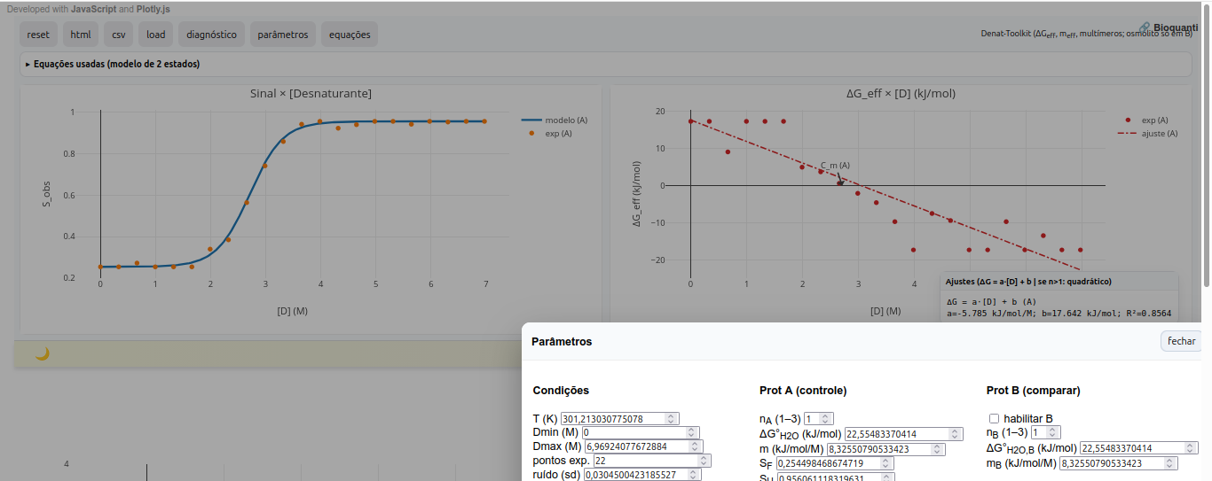
In addition, the simulator allows export of interactive figures and diagnostics (HTML), CSV export of denaturant, signal, and energy data together with diagnostics, as well as JSON interface presets for scenarios (save/load).
Parameters
Standard free energy vs. ([D]) — monomer (LEA)
\[ \Delta G^\circ(D)=\Delta G^\circ(\mathrm{H_2O})-m,D \tag{2.1} \]
Multimer (F_n nU) — mass action (solve (f_U))
\[
\Delta G^\circ + RT\ln!\left(\frac{n,f_U^{,n}}{P_t^{,n-1}(1-f_U)}\right)=0
\tag{2.2}
\]
- (n): number of monomers in (F_n);
- (P_t): monomer-equivalent concentration (in M);
- Eq. (2.2) is solved numerically (bisection) for (0<f_U<1) at each (D);
Effective free energy
\[ \Delta G_{\mathrm{eff}}(D)=-RT\ln!\left(\frac{f_U}{1-f_U}\right) \tag{2.3} \]
Effective slope (m_{}) (dependent on (D))
\[ m_{\mathrm{eff}}(D) = \frac{m}{,n + (1-n), f_U(D),}\quad \left(\approx \frac{m}{n}\ \text{on the native side; } \approx m \text{ on the denatured side}\right) \tag{2.4} \]
Effective intercept in water (approximation for multimers)
$$ G_{}()
n
RT!(1-1n)!P_t $$
Osmolytes
Osmolytes tend to increase stability against denaturant challenge. The simulator allows observation of the effect of compatible osmolytes (e.g., glycine, sorbitol, sucrose, betaine) on the resulting plots. In the app, a simple empirical effect is modeled as a scaling of the slope:
\[ m_{\mathrm{eff}} = m ,\bigl(1 + k_{\mathrm{osm}},[\mathrm{osm}]\bigr) \tag{6.1} \]
where (k_{}) is an adjustable strength parameter (typically 0.05–0.2 M\(^{-1}\)). This term shifts the curve without imposing a specific mechanism, enabling didactic exploration.
Fits and parameters
- Temperature (T) (K) and (P_t) (µM, monomer equivalent);
- Energy in water (()G\(^{H_2O}\)) and slope (m);
- Multiplicity (n): (1 n ) for A and, independently, for B;
- Baseline signals (S_F, S_U) and noise;
- A/B comparison: second protein can have different (n), (m), ()G\(^{o}\), and osmolyte settings.
Suggestion
1. Observe curvature in the ΔG x [D] plot. Values of n>1 suggest a multimeric state for the biopolymer;
2. Note that the midpoint C_m, where f_U is approximately 0.5, is marked in the diagnostic for reference;
3. Compare osmolyte effects by comparing proteins or conditions A and B, changing osmolyte concentration and its empirical constant "k_osm".
References
- Park, Chiwook, and Susan Marqusee. “Analysis of the stability of multimeric proteins by effective ΔG and effective m‐values.” Protein science 13.9 (2004): 2553-2558.
- Holthauzen, Luis Marcelo F., et al. “Protein stability in the presence of cosolutes.” Methods in Enzymology. Vol. 492. Academic Press, 2011. 61-125.
- Scholtz, J. Martin, Gerald R. Grimsley, and C. Nick Pace. “Solvent denaturation of proteins and interpretations of the m value.” Methods in enzymology. Vol. 466. Academic Press, 2009. 549-565.
5.6 ThermStab - Toolkit
General instructions
This toolkit is presented as an interactive didactic panel to explore thermokinetic stability parameters related to enzyme activity. It covers some Michaelis–Menten (MM), Eyring, Arrhenius relations, and half-life curves (t\(*{1/2}\)). Like the other kits, it supports two proteins (A/B), exports HTML with plots and CSV of the state, and also allows estimation of Km and k\(*{cat}\) values by non-linear fitting.
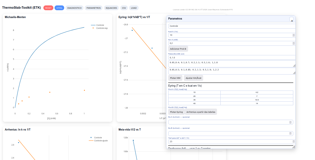
Parameters
Michaelis–Menten (MM)
\[ v = \frac{V_{\max}[S]}{K_m + [S]} \]
\[
V_{\max} = k_{\text{cat}} \cdot E_0 \qquad (E_0 = 1.0\ \mu\text{M})
\]
Associated thermodynamic relations:
\[ \Delta G^{\ddagger}_{ES} = -RT \ln \left(\frac{1}{K_m}\right) \]
\[ \Delta G^{\ddagger}*{ET} = -RT \ln \left(\frac{k*{\text{cat}}}{K_m}\right) \]
Eyring equation
\[ \ln \left(\frac{k h}{k_B T}\right) = -\frac{\Delta H^{\ddagger}}{RT} + \frac{\Delta S^{\ddagger}}{R} \]
\[
\Delta G^{\ddagger} = \Delta H^{\ddagger} - T\Delta S^{\ddagger}
\]
Arrhenius equation
\[
\ln k = -\frac{E_a}{RT} + \ln A
\]
Enzyme half-life
\[
t_{1/2} = \frac{\ln 2}{k_d}
\]
Binding equilibrium
\[
K_d = \frac{[E][S]}{[ES]}
\]
\[ \ln K_d(T) = -\frac{\Delta H^\circ}{RT} + \frac{\Delta S^\circ}{R} \]
Kinetic relations
\[
K_m \approx \frac{k_{-1} + k_{\text{cat}}}{k_1}
\]
\[
K_d \approx \frac{k_{-1}}{k_1}
\]
\[
k_{-1}(T) \approx k_1,K_d(T)
\]
Relation between stability and catalysis
\[
k_d(T) \approx k_1 K_d(T) - k_{\text{cat}}(T)
\]
\[
t_{1/2}(T) = \frac{\ln 2}{k_d(T)}
\]
Didactic approximation
\[
\ln t_{1/2} \approx \frac{\Delta H^\circ}{R}\left(\frac{1}{T}\right)* \frac{\Delta S^\circ}{R} + \text{constant}
\]
Suggestion
1. Use the RESET button and discuss the shape of the MM curve and the influence of Km and kcat;
2. Explore Eyring and Arrhenius relations to obtain ΔH‡, ΔS‡, ΔG‡ and Ea from slopes and intercepts of the plots;
3. Explore the effect of temperature and compare with free mode (t₁/₂) in class.
References
- Bhatti, Haq Nawaz, et al. “Effect of aniline coupling on kinetic and thermodynamic properties of Fusarium solani glucoamylase.” Applied microbiology and biotechnology 73.6 (2007): 1290-1298.
- Lonhienne, Thierry, Charles Gerday, and Georges Feller. “Psychrophilic enzymes: revisiting the thermodynamic parameters of activation may explain local flexibility.” Biochimica et Biophysica Acta (BBA)-Protein Structure and Molecular Enzymology 1543.1 (2000): 1-10.
5.7 Biocel-Toolkit
General instructions
This toolkit covers a simulator that visualizes the operation of a microbial fuel cell (MFC) under a simplified Thevenin model. Its goal is to help understand the physical and thermodynamic performance of a fuel cell (MFC, or a simple battery) from the relationships between voltage, current, power, and the cell’s internal resistance.
The simulator also includes the impact of biochemical modifiers and experimental variations such as biofilm maturation, substrate depletion, and overshooting observed under real operating conditions.
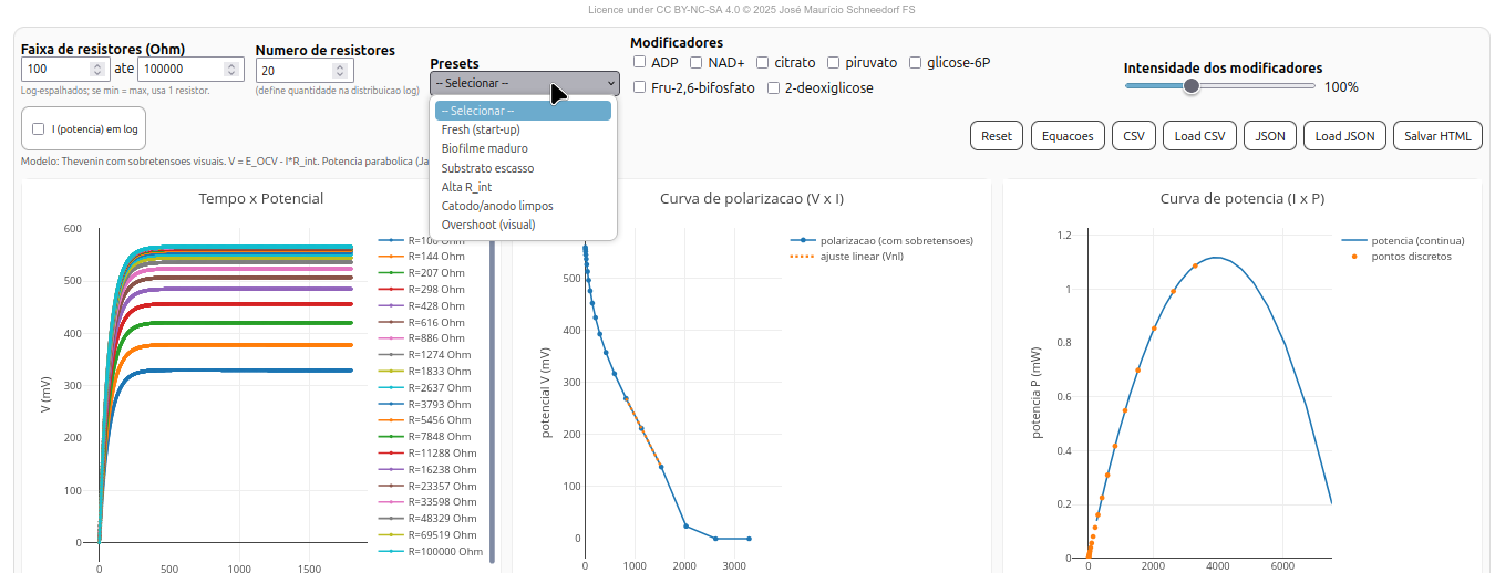
As with the previous toolkits, part of the simulator’s interactivity allows exporting and reimporting experimental data (CSV/JSON), generating a self-contained file with interactive plots and diagnostics (Save HTML), and reinitializing to a new configuration (Reset).
Parameters
Thevenin model
The equivalent circuit of the microbial cell is modeled as a voltage source (E_{OCV}) (open-circuit voltage) associated with an internal resistance (R_{int}) and an external resistance (R_{ext}), according to Thevenin’s theorem.
Current (I) and the voltage across the load resistor (V) are given by:
\[
I = \frac{E_{OCV}}{R_{int} + R_{ext}}, \qquad
V = I , R_{ext}
\]
Electrical power and maximum condition
The instantaneous power dissipated in the load is:
\[
P = E_{OCV} , I - R_{int} I^2
\]
Substituting (I) from the Thevenin model:
\[
P = \frac{E_{OCV}^2 , R_{ext}}{(R_{int} + R_{ext})^2}
\]
The maximum power point occurs when (R_{ext} = R_{int}), known as the Jacobi condition, yielding:
\[
P_{\text{max}} = \frac{E_{OCV}^2}{4 R_{int}}
\]
Activation and concentration overpotentials
To represent electrochemical activation and mass-transport phenomena, the observed potential (V_{pol}) is reduced by two loss terms:
\[ V_{pol} = V_{lin} - \eta_{act} - \eta_{conc} \]
where:
\[
\eta_{act} = A \ln!\big(1 + \frac{I}{I_0}\big), \qquad
\eta_{conc} = C , \frac{(I/I_{lim})^2}{1 - I/I_{lim}}
\]
These relations simulate voltage drops associated with electrochemical kinetics and limitations in transport of ions and substrates.
Time dynamics
During operation, the cell shows changes in potential and internal resistance over time, represented by:
\[
E_{OCV}(t) = E_{\max}\big(1 - e^{-k_{act}t}\big) s(f)
\]
\[
R_{int}(t) = R_0 \big(1 + \beta (1 - f)\big)
\]
Where:
\[ s(f) = 0.40 + 0.60f, \quad f = \frac{Q}{Q_{theor}} \]
These functions describe progressive biofilm activation and resistive modulation due to substrate depletion.
Charges and efficiencies
The theoretical charge available in the biocell is:
\[
Q_{theor} = n_{\text{gluc}} , n_e , F
\]
Where: (F) is Faraday’s constant and (n_e = 24) is the number of electrons per mole of glucose.
Charge efficiency ((_Q)) and energy efficiency ((_E)) are:
\[ \eta_Q = 100 \times \frac{\int I,dt}{Q_{theor}} \quad [%] \]
\[ \eta_E = 100 \times \frac{\int IV,dt}{Q_{theor} E_{\max}} \quad [%] \]
Interface and features
The BioFuelCell interface is divided into three plot panels and a parameter section:
- Time × Potential (t × V) — shows output potential evolution over time for each external resistor;
- Polarization curve (V × I) — shows voltage decay as a function of current, with or without overpotentials;
- Power curve (I × P) — computes power dissipated in the load and highlights the maximum power point.
Below the plots, automatically calculated parameters are displayed:
- (R_{int,lin}) — internal resistance by linear fit of the real curve;
- (R_{int,ideal}) — theoretical internal resistance (Thevenin model);
- (P_{}) and (R_{P}) — maximum power and corresponding resistance;
- (_Q) and (_E) — charge and energy efficiencies.
5.7.1 Parameters and modifiers
The user can adjust:
- Resistor range — minimum and maximum (R_{ext}) (in Ω), distributed logarithmically;
- Modifier intensity — from 0% to 300%;
- Log scale for power — toggles current axis to log scale;
- Experimental presets — predefined simulated operating conditions.
Suggestion
1. Observe the intersection point between the polarization curve and the ideal parabola. This point indicates the balance between electron supply and consumption;
2. Note the initial slope of the V×I curve, which represents the internal resistance (R_int) of the biocell;
3. Check the system’s internal efficiency by observing the position of the peak in the power plot;
4. Try some of the experimental "Presets" (mature biofilm, substrate excess, etc.) and evaluate how conditions affect the electrochemical performance shown in plots and results.

The potential vs time plot should appear.
References
- Logan, B. E. Microbial Fuel Cells. John Wiley & Sons, 2008.
- Bard, A. J., & Faulkner, L. R. Electrochemical Methods: Fundamentals and Applications. Wiley, 2022;
- Silveira, G., & Schneedorf, J. M. “Evaluation of kefir as a new anodic biocatalyst consortium for microbial fuel cell.” Applied Biochemistry and Biotechnology, 185(4), 1118–1131 (2018).
6 Arduino & Biocell
To illustrate the potential of JSPlotly beyond the virtual world, the example below presents an experimental application of JSPlotly adapted for data acquisition from a microbial fuel cell using microcontroller boards such as Arduino and ESP32, as virtually exemplified in the Biocel-Toolkit above.
Interfacing can be obtained via a WebSerial connection to an Arduino through a USB serial cable (below), as well as via IoT (“Internet of Things”) features through Bluetooth/Wi-Fi.
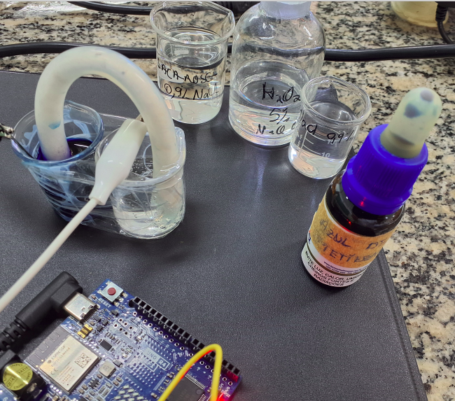
6.1 Serial cable
The code is adapted for standalone use: just connect the Arduino board with a USB serial cable to the notebook/PC, then press Connect. Below is the list of files needed to reproduce the experiment:
The procedures file details how to connect the Arduino by serial cable to notebook/desktop, both with Arduino firmware and with the HTML software, and also via Wi-Fi (Android/iOS).
"** QUICK TIP ** ":

  1. Connect the Arduino board;
  2. Open a CMD or Terminal and type:
   "python3 -m http.server" ;
  3. Upload the sketch;
  4. Open the software in Chrome (Firefox is problematic)
  5. Connect to the Arduino port in the software
6.2 Internet of Things - IoT
The experiment illustrated above can also be conducted using Bluetooth or Wi-Fi modules present on some microcontroller boards, allowing even broader practical applications of the simulator and the
Plotly.js library for tablets and phones. The image below illustrates an experiment conducted with a microbial fuel cell, interfaced via Wi-Fi to an Arduino Uno R4 WiFi board.
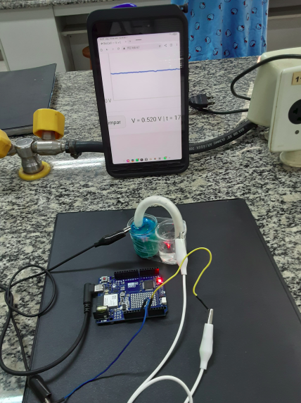
For Wi-Fi use, it is necessary to use this specific Arduino-WiFi sketch for the biocell.
"** QUICK TIP ** ":
  1. Connect the Arduino board;
  2. Upload the sketch;
  3. Open Serial Monitor;
  4. Optional: press Reset on the Arduino for ~2s;
  5. Access the specific network on the phone
   In Wi-Fi, choose Biocel_no.1
   Password: 12345678  ;
  6. Open the link http://192.168.4.1

The potential vs time plot should appear.