1. Choose a topic;
2. Click the corresponding image;
3. Click "add";
4. Use the mouse for interactivity and/or edit the code.

Reminder: the editor uses infinite undo/redo in the code (Ctrl+Z / Shift+Ctrl+Z) !JSPlotly at School
To illustrate the potential use of JSPlotly for elementary and high school education, below are some examples of simulations whose graphs are frequently found in textbooks and related content. For a better use of each topic, try to follow the suggestions for parametric manipulation in each code
If you prefer a more directed learning path, try accessing an initial material under construction, Living Books.
1 Graphs
1.1 Simple - UVM (Physics)
Code for uniformly varied motion (UVM), describing the position of a body as a function of time when acceleration is constant. By varying the model parameters in the code excerpt, the learner can explore the physical role of acceleration, understand the influence of initial conditions, and relate the mathematical expression of motion to real situations, such as the acceleration of a vehicle or the fall of an object.
BNCC: EF09CI03, EM13CNT204, EM13CNT101
Equation:
\[ S(t) = S_0 + v_0,t + \frac{1}{2} a t^2 \]
where:
- (S(t)) is the position at instant (t);
- (S_0) is the initial position;
- (v_0) is the initial velocity;
- is the constant acceleration;
- is time.
Optionally, velocity as a function of time is given by:
\[ v(t) = v_0 + a t \]
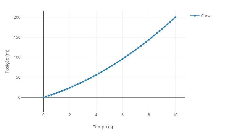
Suggestion:
1. Try replacing the acceleration value and overlay the graph: "const a = 5", followed by "add";
2. Keep the data, but replace the initial velocity value, "const v0 = 3", overlaying afterwards.
1.2 Selection in menu - Trigonometry (Mathematics)
BNCC: EM13MAT306, EM13MAT308, EM13MAT307
The following simulation aims to facilitate visualization for some concepts in trigonometry, sine, cosine and tangent. The code allows using a drop-down menu for each trigonometric function, as well as a slider to change the frequency in radians.
Equation:
1. Sine function:
\[ y = \sin(\omega x) \]
2. Cosine function:
\[ y = \cos(\omega x) \]
3. Tangent function:
\[
y = \tan(\omega x)
\]
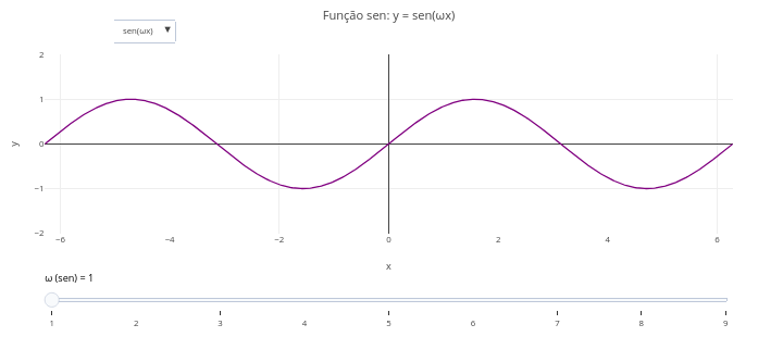
Suggestion:
1. Select, alternatively, the sine, cosine, and tangent function, using the "drop-down menu";
2. Try the effect of changing the frequency of the function in the slider ("slider");
3. Overlay a sine graph and a cosine graph to observe their differences;
4. Repeat the same for the tangent graph.
1.3 Use of selector and buttons in data fluctuation
BNCC: EF07MA21, EF07GE04, EM13MAT301, EM13CHS104, EM13CNT103
A button accesses a given situation, while a selector allows expanding a given range of values seeking to highlight a graphical information for a function or significant fluctuations. Both are illustrated below in a simulation for temporal fluctuation of values (expressed as a sine wave modified by random additions).
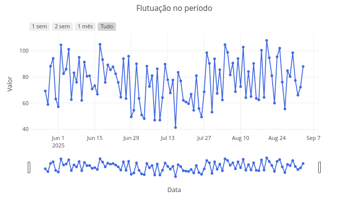
Suggestion:
1. Drag the end markers of the graph to view a more restricted limit;
2. Click the buttons with distinct periods;
2. One can change the random noise around the mathematical equation that defines the fluctuation above by simply modifying the code line in: "const valores = dias.map((_, i) => 50 + 10 * Math.sin(i / 10) + Math.random() * 50);" - change "50" to "5".
1.4 Slider for a function (Mathematics)
BNCC: EF07MA20, EF09MA20, EM13MAT302, EM13MAT304
It is possible with the app to simulate a frame-by-frame animation, aiming to improve the learning of a topic, by inserting a manual sliding control. The following example presents a simulator for manual animation for mathematical functions. To use it, simply slide the slider progressively to graphically visualize the result in face of the change of the predictor variable.
Obs: This didactic object has a trick…in fact, two! After clicking add, it is necessary to slide the slider first to visualize the graph. And to visualize an animation for another equation, it is necessary to refresh the page, as instructed in the lower margin of the graphic screen.
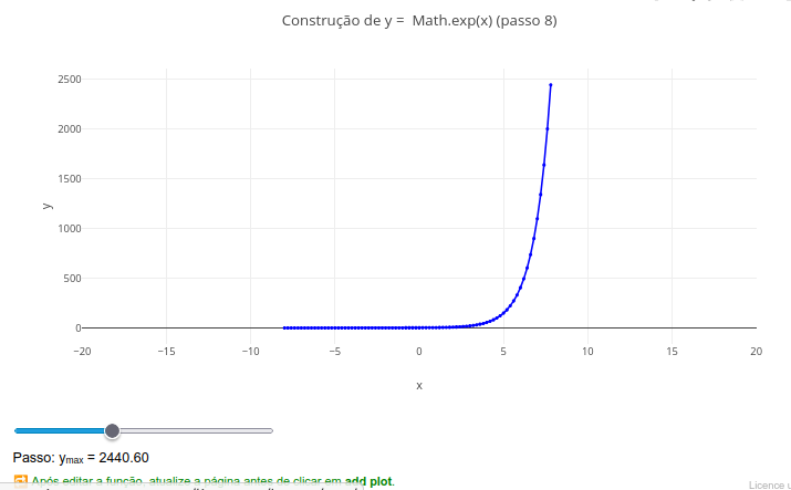
Suggestion:
1. Slide the control to evidence the manual animation;
2. Try replacing the model equation with another, and drag the slider control to observe the effect;
3. Change some parameters for the animation, for example, increasing the "frames" levels (slider.max = "50"; slider.value = 1);
4. Reload the page and change the mathematical function; ex: "let f = x => Math.sin(x);"
1.5 Multiple sliders for parabola (Mathematics)
BNCC: EF07MA20, EF09MA20, EM13MAT302, EM13MAT304
Simpler and more immediate than changes in the code, sliders (sliders) can contribute more immediately to understanding a problem, as follows for the example of the parameters of a parabola.
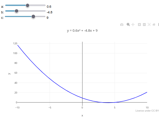
1. Drag any slider, and observe the presented trend, as well as the change in the equation parameters at the top;
2. As in the previous example, it is possible to change the mathematical function in the code, as well as the parameters for a new slider. Test this by changing the function "  y_values = x_values.map(x => a * x * x + b * x + c);
" to "  y_values = x_values.map(x => Math.sin(a * x * x + b * x + c));"
1.6 Fractal composition
BNCC: EM13MAT301, EM13MAT305, EM13MAT401, EM13ARM502, EF09MA10
Fractals constitute geometric objects with scale symmetry, forming patterns that repeat in smaller parts of the original object. The most common mathematical representations are Mandelbrot fractals and Julia fractals, and which combine Art and Mathematics in geometric figures with fractional dimensions that express the degree of complexity and space occupation. Originally conceived at IBM in the 80s, fractals are today witnessed from the cartographic contour of certain regions to the distribution of living cells in culture.
Equation
Julia fractals are formed on a complex Cartesian plane, by summation of the real and imaginary components. The basic formula for the Julia set is given by:
\[ z_{n+1}=z_{n}^{2}+c \]
Where:
z ∈ C: usually initialized as the point of the complex plane;
c ∈ C: fixed for each Julia set.
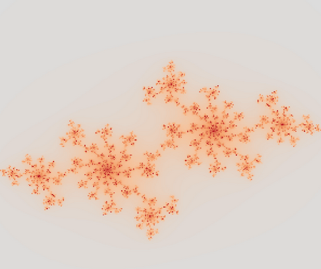
Suggestion
1. Try changing the Real and Imaginary components of the formula, to obtain distinct artistic patterns. Suggestions:
  c = 0 + 0i
  c = -0.4 + 0.6i
  c = 0.285 + 0i
  c = -0.8 + 0.156i
  c = 0.45 + 0.1428i
1.7 Fractal of Mandelbrot
Another interesting structure involves Mandelbrot fractals, represented by a different set of equations. The following example aggregates this fractal with a choice menu.
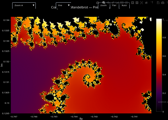
Suggestion
1. Select distinct colors and magnification levels ("zoom") in the two menus, for distinct visualizations;
2. Check where the equations that define the Mandelbrot profile are in the code, and make small changes to verify distinct results.
1.8 Normal distribution curve (Statistics)
BNCC: EM13MAT316, EM13MAT407, EM13MAT312
Sampling and population are common topics for data observation in analytical procedures. Statistical distribution curves for this involve the t-Student, F-Snedecor, Chi-square, and normal distribution. The normal distribution curve reflects the statistical behavior for natural phenomena in a given data population.
The example intends to illustrate the use of the z transformation, the calculation of critical values, and the interpretation of the area under the curve in the study of the normal distribution and statistical inference.
Equation
The density function of the normal (or Gaussian) distribution is given below?
\[ f(x) = \frac{1}{\sigma \sqrt{2\pi}} , e^{ -\frac{(x - \mu)^2}{2\sigma^2} } \]
Where:
- \(\mu\) = 0 (mean of the distribution);
- \(\sigma\) = 1 (standard deviation);
- x = continuous random variable; f = density function of the normal distribution
From the equation above one can extract z, the value of the standardized random variable for zero mean and unit standard deviation, representing the value on the abscissa axis:
\[ z = \frac{x - \mu}{\sigma} \]
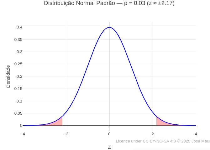
Suggestion:
1. Try changing the value of "p" and run the graph. This value represents the probability of observing, under the null hypothesis, a value as extreme or more extreme than the observed — that is, it measures the evidence against the null hypothesis. In the graph, it represents the area under the normal curve in the critical regions, indicating the chance of occurrence of the observed result by pure chance.
1.9 Compound Interest (Financial Mathematics)
BNCC: EF09MA05, EM13MAT303, EM13MAT402
Also known by the maxim “interest on interest”, compound interest adds value to capital over time, resulting in the growth of the final amount.
Equation:
\[ M = C \cdot (1 + i)^t \]
Where,
- M: final amount
- C: initial capital
- i: interest rate per period (in decimal)
- t: number of periods (ex: months)
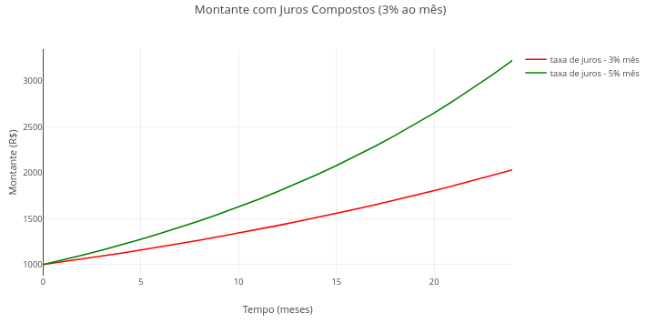
Suggestion:
1. Vary the contracting period, the monthly interest rate or the initial amount.
2. Try combining the parameters in the variation.
3. Evaluate the visual difference between an investment and a loan, inserting a positive initial capital value for the 1st and negative for the 2nd.
4. Observe the descending curve for a simulated loan with negative initial capital. The remaining values refer to the missing debt to pay off the loan.
1.10 Pitch, harmony and timbre of sounds (Physics)
1.10.1 BNCC: EF15AR06, EM13ARH402
The following example illustrates the concepts of pitch (frequency), harmony and timbre (pure waves and harmonics) for a graph of musical tones (diatonic scale).
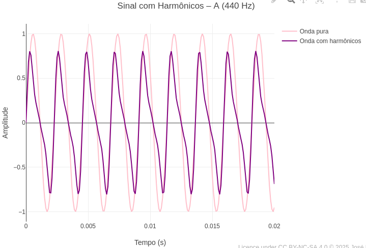
Suggestion:
1. Test other keys (C,G,D, etc), observing how the pure wave is presented by overlaying the graphs;
2. Evaluate the difference between a pure wave and that produced with musical instruments, involving natural harmonics. For this, change the boolean option from "false" to "true" in the variable "const ondaComposta".
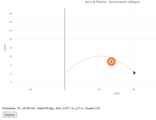
1.11 Oblique launch (Physics)
BNCC: EF09MA07, EM13CNT102, EM13CNT104, EM13CNT302
The following code illustrates the trajectory of an oblique launch with angle adjustable by a slider (slider), useful for exploring kinematics concepts.
Equation:
1. General equation
\[ y(x) = x \cdot \tan(\theta) - \frac{g}{2 v_0^2 \cos^2(\theta)} \cdot x^2 \]
Where:
- y(x): height as a function of horizontal distance;
- x: horizontal position (m);
- \(\theta\): launch angle relative to the horizontal (radians or degrees);
- v0: initial velocity of the projectile (m/s);
- g: acceleration of gravity (9,8 m/s²\(^{2}\))
2. Total flight time:
\[ t_{\text{total}} = \frac{2 v_0 \sin(\theta)}{g} \]
3. Horizontal position over time
\[
x(t) = v_0 \cos(\theta) \cdot t
\]
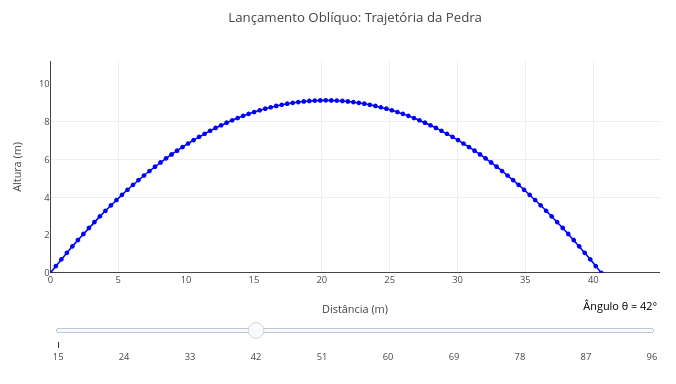
Suggestion:
1. See that there is a slider bar for initial angles in the simulation. Drag the bar to another angle and add the graph, comparing the effect of this modification.
2. Change the initial velocity in the code, and observe the effect on the graph.
3. Simulate a "lunar condition" for the trajectory, and whose gravity is around 1/6 of Earth's (~1.6 m/s²).
1.12 3D graph for absorption bands as a function of concentration (Chemistry)
BNCC: EF09CI04, EF09MA17, EM13CNT103, EM13MAT305
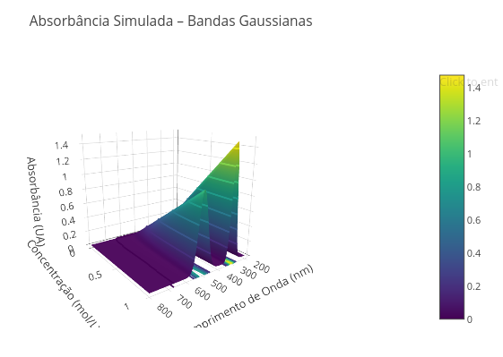
Suggestion
1. Try changing the graph pattern and its colors. Respectively: type: 'surface', colorscale: 'Viridis');
2. Change the wavelength range, separating the peaks; for this, change the min/max lambda variables: const lambdaMin = 450, lambdaMax = 600;
1.13 Heat Capacity (Physics)
BNCC: EF09CI06, EM13CNT104, EM13CNT203
The following simulation aims to observe the relationship between exchanged heat (Q), mass (m), heat capacity (c) and temperature variation (\(\Delta\)T).
Equation:
\[
Q = c \cdot m \cdot \Delta T
\]
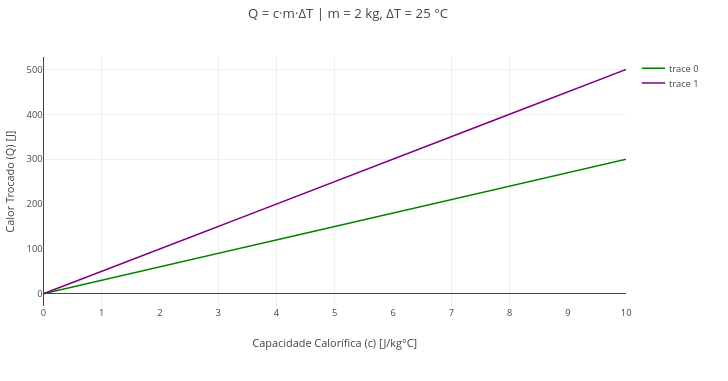
Suggestion:
1. Try varying the temperature initially, overlaying some graphs;
2. Also vary the mass in the code editor, for comparison.
1.14 3D graph for mixture of substances in exothermic reaction (Chemistry)
BNCC: EF09CI02, EM13CNT103, EM13CNT103
Simulations can be performed without necessarily involving a mathematical relationship, as in the experimental observation of two variables, such as time and concentration, simulating an exothermic chemical reaction. Below is an interactive 3D example.
In this case, the equation used in the editor involves a smooth temperature variation over time, using the sine function and an initial temperature (see the code).
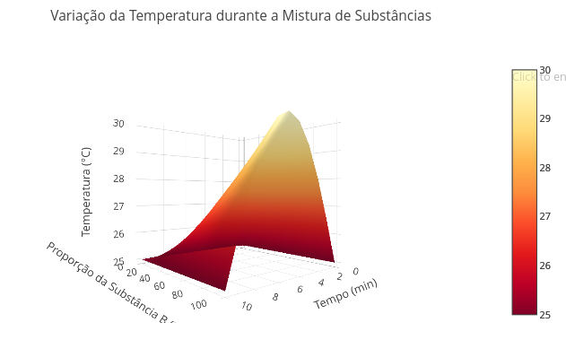
Suggestion:
1. Try varying the temperature initially, overlaying some graphs;
2. Also vary the mass in the code editor, for comparison.
1.15 Interactive panel (dashboard) for environmental measurements (simulated data)
BNCC: EF07MA21, EF09MA21, EM13MAT406, EM13LGG604
Currently it is frequent to present data in a panel containing different interactive information or data that complement each other in graphs and tables, for example. These panels allow a panoramic view of the addressed topic, as well as adjustments in contained parameters. Below is an example of a panel with simulated data for conductivity and temperature measurements in aqueous medium, and with parameters adjustable by a slider (a bit impractical, in fact, but illustrative of the app’s potential).
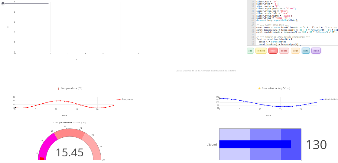
Suggestion:
1. Even though it is an object that only simulates data acquisition, one can obtain a different result by interfering in the code, such as:
  a. Changing the sliders: "slider.min = "0";slider.max = "24"; slider.step = "1" " ;
  b. Changing the equations that define the behavior of the displays:
    "const tempo = Array.from({ length: 25 }, (_, i) => i); // 0 a 24h
     const temperatura = tempo.map(t => 20 + 5 * Math.sin((t - 6) / 3)); // pico 12h
     const condutividade = tempo.map(t => 100 + 30 * Math.cos(t / 5)); "
1.16 Area of Brazilian biomes (Biology)
BNCC: EF05GE05, EF08GE08, EM13CNT301, EM13CNT304
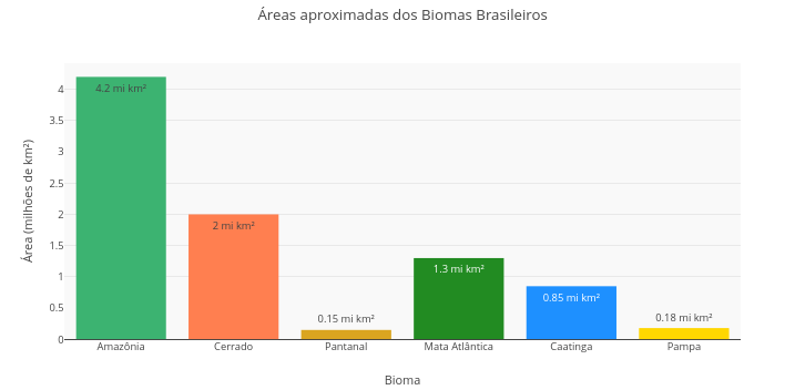
Suggestion
1. The presented data are only for simulation purposes. Wanting more robust data, safe sources are recommended (ex: MapBiomas Brasil - https://brasil.mapbiomas.org/)
2. This is a bar chart, only that. If you change the information present in the constants of the first 3 vectors ("const X = [...]"), you can convert the representation to a different topic.
1.17 Water cycle diagram (Biology)
BNCC: EF06CI03, EF06CI04, EM13CNT103, EM13CNT202
The app also allows the creation of other interactive didactic objects, without the need to insert equations, such as diagrams and flowcharts. Examples follow.
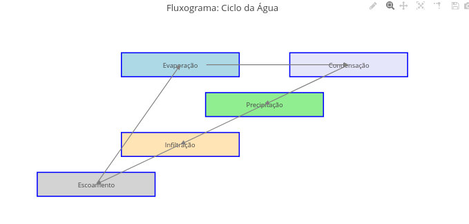
Suggestion:
1. As for diagrams above, try changing in the code the properties of arrows and the terms and fields involved in the flowchart;
2. Replace terms to form another flowchart;
3. Reposition objects in the graphic area (fields, terms, arrows) with the help of the mouse.
1.18 Flowchart of light and dark cycles of photosynthesis (Biology)
BNCC: EM13CNT101, EM13CNT103, EM13CNT201, EM13MAT405
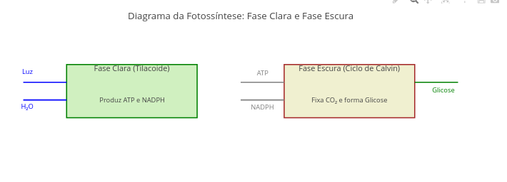
Suggestion
1. Try repositioning inputs and outputs (ex: Light, Glucose) by simple mouse dragging;
2. Replace the terms inside the boxes, or change other aspects of the diagram (color, fill, for example).
1.19 Population Growth Model with Lag Phase (Biology)
BNCC: EM13CNT102, EF06MA17, EF08CI06, EM13MAT301, EM13CNT201
This model presents a logistic function that simulates population growth (microorganisms, cells, for example), accompanied by a delay component. By varying the parameters in the editor, it is possible to estimate various population growth profiles.
Equation:
\[ N(t) = \frac{K}{1 + \left(\frac{K - N_0}{N_0}\right) \cdot e^{-r \cdot A(t) \cdot t}}, \quad \text{com } A(t) = \frac{1}{1 + e^{-k(t - t_0)}} \]
Where:
- K = environmental carrying capacity;
- N0 = initial population;
- r = intrinsic growth rate;
- A(t) = growth activation factor with delay (lag phase);
- t0 = midpoint of transition between lag phase and log phase;
- k = smoothing constant of the delay (fixed as 0.5 in the code)
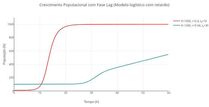
Suggestion:
1. Try varying the equation parameters, combining some, and comparing their effects on the graphs:
  a. Carrying capacity;
  b. Initial population;
  c. Growth rate;
  d. Delay (lag phase);
1.20 Energy efficiency and food chain (Biology)
1.20.1 BNCC: EF06CI02, EM13CNT202, EM13CNT203
Below is an example to portray the transferëncia of energy between different trophic levels of a food chain. Although there is not properly a mathematical function that describes it, one can apply the 10% law of ecological efficiency between the chain levels, which results in a logarithmic relationship of transfer.
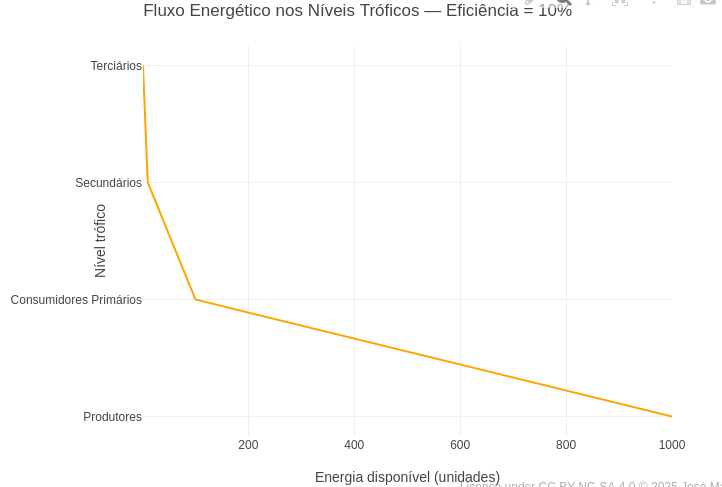
Suggestion
1. Lindeman's rule, outlined in the reference above, establishes a variation of 5-20% of energy efficiency in the ecosystem. Thus, try overlaying curves with such rates;
2. If you want to observe the logarithmic relation of energy transfer, add the command "type: 'log'," right below "title: 'Energia disponível (unidades)',".
1.21 Slang spoken in Brazil from 1980-2020 (Languages)
BNCC: EF89LP19, EM13LGG102
This simulation is directed to an estimate of the use of slang spoken in Brazil during the last 40 years. The representation is given in a pie chart, and the selection by decade in a drop-down menu.
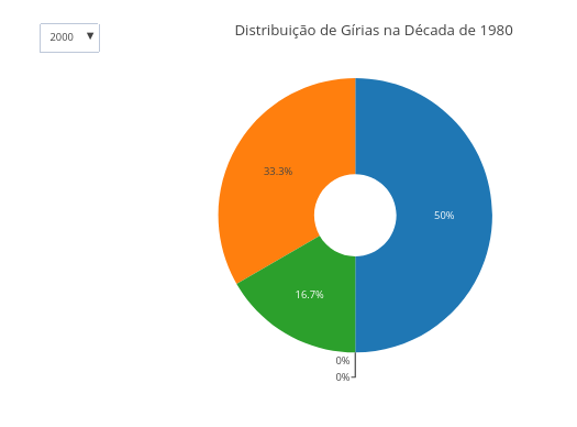
1. One can use mouseover to observe the "tip" presented for each data in the graph.
1.22 Word frequency in text (Languages)
BNCC: EM13LGG101, EM13LGG302, EM13LGG303
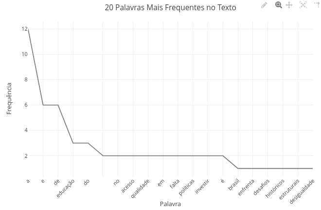
Suggestion
1. Try replacing the code text with another;
2. Try varying the number of most frequent terms in the variable "const entradas" (optionally, also vary in the chart title, to make sense);
3. Compare a text in Portuguese with its translation to English or another language.
1.23 Literary works and aesthetic movements (Languages)
1.23.1 BNCC: EF89LP47, EM13LP01, EM13LP02, EM13LGG201
The following example illustrates the use of interactive resources, button and selector, for a set of works of national literature.
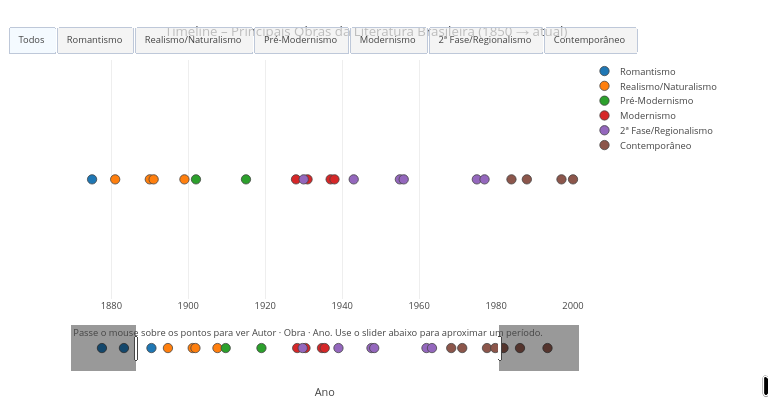
Suggestion
1. Drag the extreme markers to enlarge the focus on a specific period of literature;
2. Change the script adding other key works in "const obras =" and "const periodos ="
1.24 Creation of 3D objects (Art)
BNCC: EF09MA16, EF15AR06, EM13MAT405, EM13LGG604
Three-dimensional objects can be generated by mathematical functions in three-dimensional space, as illustrated below.
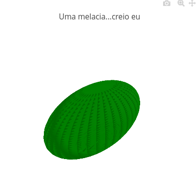
1. Try changing some values in the script, testing the result. For example, create a mat (or flattened watermelon) by changing the code in: "const zVal = L * (t - 0.5)"...to "const zVal = L * (t - 20.5);"
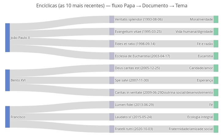
1.25 Interactive diagram about papal encyclicals (Religious Education)
BNCC: EF05ER01, EF09ER02, EM13ER04
Suggestion
1. To perceive the dynamism of the representation, try dragging any part of the flowchart, and observe the accommodation of the others;
2. As before, one can change the constant information in the flowchart, keeping its graphic and dynamic characteristics, simply by changing the constants used to generate the object ("const = ").
1.26 Music notation editor (Art)
BNCC: EF15AR06, EF69AR22, EM13ARH402
The following example illustrates the concepts of pitch (key) and duration for musical notes in diatonic scale. The legends represent the duration values, and the keys are presented in their frequency values
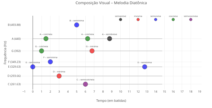
1. Try changing the melodic sequence in the corresponding vector in the code;
2. Try changing the duration figures in the corresponding vector
1.27 Distribution of enslaved people in the Americas in the period 1500–1888 (simulated data; History)
BNCC: EF08HI06, EM13CHS104, EM13CHS503
This simulation presents an interactive bar chart for period selection by drop-down menu, and related to the estimated quantity of enslaved Africans disembarked in the main regions of America. The data are approximate estimates to illustrate the app’s visualization potential, although serving as a starting point for more precise educational discussions. Consultable sources include Slave Voyages.
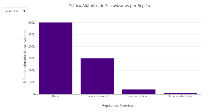
Suggestion:
1. Try switching between periods in the drop-down menu, comparing the estimates of slave traffic;
2. Select a period, create the graph, select another period, and add another graph. This allows comparing the quantity of enslaved people landed by the formed double bars, and mouseover each bar.
1.28 Timeline for events of the Middle Ages (History)
BNCC: EM13CHS101, EM13CHS102
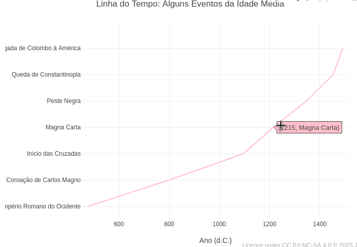
Source: Encyclopedia.com
Suggestion:
1. Try changing in the code events and periods, and intended for another period of human History.
1.29 Pottery wheel vase (STEAM)
BNCC: EM13MAT101, EM13MAT403, EM13CNT204, EM13AR01, EM13AR02
The platform also allows creations for integration in Science, Technology, Engineering, Arts, and Mathematics (STEAM). Below is an example of a simulation for ceramic turning and manual clay shaping, and that allows trying symmetric and rounded shapes, such as vases, bowls and pots, by adjusting some parameters and the trigonometric functions in the code.
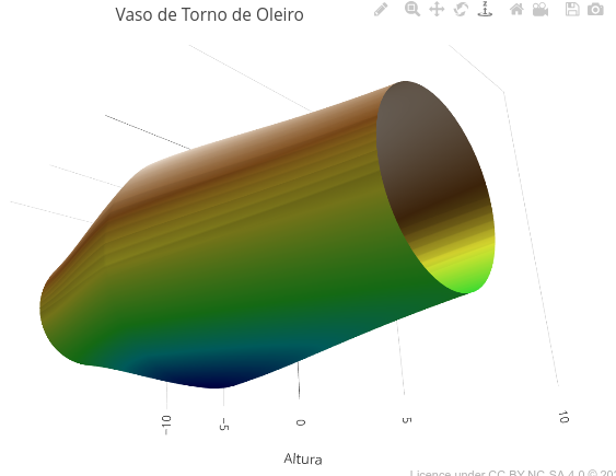
1. Change the vase height, its shape, and its colors, editing the code in the specific fields.1.30 Mini CAD (Computer-Aided Design- STEAM)
BNCC: EM13MAT301, EM13MAT503, EM13MAT402
Below is an example code for manipulating geometric shapes in 3D (curves or lines) in the elaboration of a mini CAD (Computer-Aided Design).
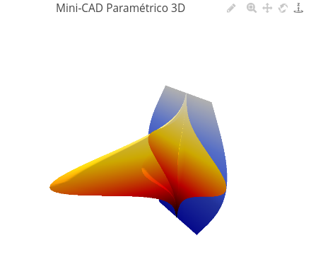
1. Try changing the base parameters, height and curvature of the code, also varying the sign of the values (positive, negative);
2. Change some trigonometric function (lineX or lineY, sine to tangent, for example), and overlay on the plot;
3. Overlay geometric figures with distinct color palette.
4. Create symmetric figures by overlaying a curve with positive parameter with one with the same negative parameter.
2 Maps
2.1 Map of Brazil and Capitals
BNCC: EM13CHS101, EM13CHS202, EM13CHS301
Not only of equations does JSPlotly “live”! With the Plotly.js library that composes it, it is also possible to produce interactive maps, such as the simulation that follows.
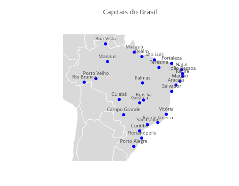
Suggestion:
1. Try using the mouse scroll button and the "pan" icon on the top bar, to interact with the map.
2.2 World map with some large cities
BNCC: EF06GE05, EF07GE06, EM13CHS101, EM13MAT502
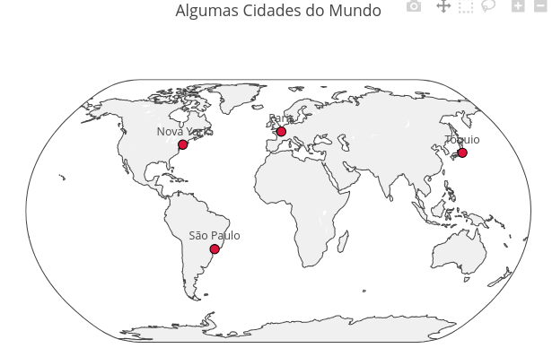
1. Try changing the script, inserting other cities with their respective geographic coordinates in "const data" (text, long - longitude, lat - latitude)
2.3 Map and GDP of the Middle East
2.3.1 BNCC: EF09GE03, EF08GE06, EM13CHS104, EM13CHS201
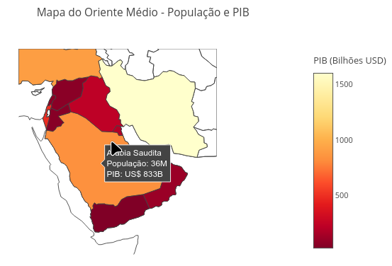
Suggestion:
1. Try using the mouse scroll button;
2. Click on a country to identify its name and approximate gross domestic product;;
3. Modify the code to update some data, or to modify the information (changing GDP to another data, for example).
3 Text Output
3.1 Training in JavaScript (Computer Science)
BNCC: EF09LP27, EF06MA20, EM13MAT503, EM13LGG701
Of special relevance to computational thinking and programming logic, the following example illustrates a metalanguage to JSPlotly, namely, an application in a specific programming language producing a script for learning the language itself.
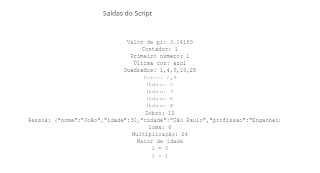
Suggestion:
1. Here the "sky is the limit"! There are countless possibilities for commands and functions in JavaScript, as well as for joint output of data, calculations and graphs.
4 Animations
4.1 Histogram (Statistics)
BNCC: EF09MA21, EM13MAT406, EM13MAT407
Statistical information is sometimes graphically represented, such as the distribution of values in box-and-whisker plots (box-and-whisker plot) or by histograms. The example below illustrates the potential for understanding a histogram aggregated to an animation resource.
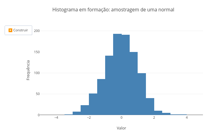
Suggestion:
1. Observe at the top of the script the various constants that can be changed for a distinct animation, and try changing them one by one to understand both the action of the object, and the statistical content it refers to:
  const mu = 0 (mean);
  const sigma = 1 (standard deviation);
  const n_frames = 50 (no. of frames);
  const sample_per_frame = 20 (sample rate/frame);
4.2 Elastic potential energy (Physics)
BNCC: EM13CNT102,EM13CNT202, EM13MAT402
The deformation of an elastic material is directly proportional to the force exerted on it, and limited to the properties of the material.
Equation
The behavior of an ideal spring is described by Hooke’s Law below:
\[ F = -k*x \]
Where:
- F = restoring force of the spring (N);
- k = spring elastic constant (N/m);
- x = deformation (m).
On the other hand, the elastic potential energy involved is described by the quadratic relationship that follows:
\[ E = \frac{1}{2}*k*x^2 \]
Where:
- E = elastic potential energy (J).
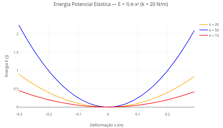
Suggestion:
1. Try changing the value of the spring elastic constant to evidence its effect, relating it to stiffer or less stiff springs;
2. Change the deformation limits of the spring in the "control structure" of the code (ex: "for (let x = -0.7)"), and observe the effect on maximum potential energy;
3. Note that, by the quadratic operation on the deformation value, the potential energy is always positive.
4.3 Cartographic changes over time
BNCC: EF08GE09, EF07GE05, EM13CHS102, EM13CHS104
It may be interesting to convey geographic and/or historical information over time in the representation of a map. Below is an example.
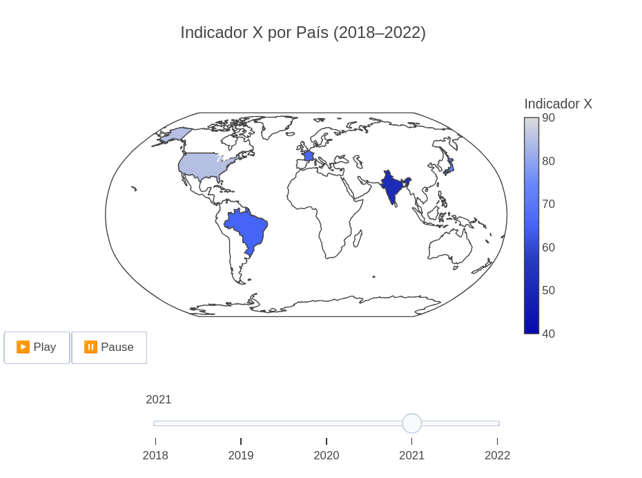
Suggestion:
1. One can change the formatting of the map in the code to colors ("lakecolor"), menu position ("updatemenus"), duration of transition between frames ("transition"), among others;
2. This example is generic; change the constants in "paises", "anos", and "valores", and obtain a new map for a specific topic.
4.4 Oblique launch
BNCC: EF09CI09, EF09MA20, EM13CNT103, EM13MAT304
As well as simulations, animations can help in understanding a specific topic (learning based on simulation or on animation). JSPlotly can work directly with animations with the Plotly.js library (insertion of frames, buttons, transitions, for example).
Below is an animation for parabolic launch of a projectile, described by the equations of the previous topic. Distinct from that one, however the insertion of an animation makes it possible to add value to the understanding of the phenomenon, by offering the possibility of parametric manipulation of the code associated with the animation itself.
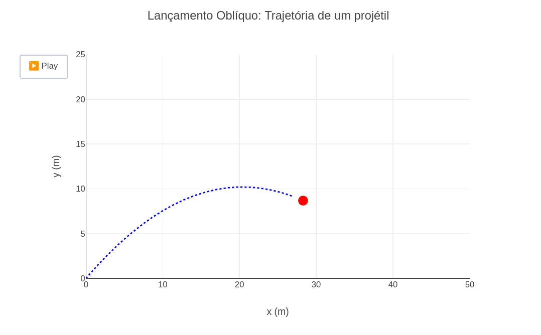
Suggestion:
1. As in the previous topic, try changing equation parameters, such as initial velocity and attack angle, and observe the effect of these changes.
4.5 Translation motion in solar system
BNCC: EF05CI08, EF07CI01, EM13CNT104, EM13CNT103
Dynamic representations for complex phenomena can help on the path to understanding them, regardless of the area of knowledge. In addition, simulations with approximate real data can also insert another imagery frame in the learner’s cognitive perception. The example below illustrates an animation for the translation movement of the planets of our solar system based on approximate data.
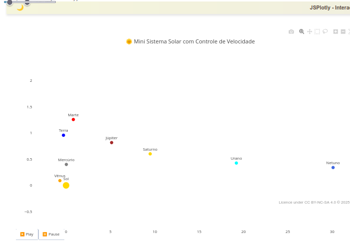
Suggestion:
1. Note that there is a slider at the top of the object; drag it to observe different speeds for the animation;
2. Note that the image was made possible by "zoom" on the graphic screen, to improve the visualization of the planets. In this sense, try using such resource during the animation;
2. See that there are 8 planets in the animation, not including the dwarf planet Pluto. This is not due to disregard to it, but because you can observe how slow the movement of the planets is as they move away from the Sun (see Neptune, practically static). In this sense, one verifies the potential of an animation with approximate data, bringing with it additional information not perceptible in textbooks on the subject.
4.6 Simple harmonic motion (Physics)
BNCC: EF09CI09, EF09MA18, EM13CNT104, EM13CNT203
Among various situations for analyzing physical properties of materials and systems, the linear relationship between applied mass and spring deformation is of significant importance. The equation that represents the position of the mass as a function of time is given below.
Equation
\[
x(t)=Acos(ωt+ϕ)
\]
Where:
- x(t) = the position of the mass at time t;
- A = amplitude of the motion, which is the maximum distance of the mass from the equilibrium position (in this case, x=0);
- \(\omega\) = angular frequency, which defines the oscillation rate. It is calculated by 2\(\pi\)/T, where T is the period (the time for a complete cycle);
- \(\phi\) = initial phase or phase constant, which defines the position of the mass at t=0
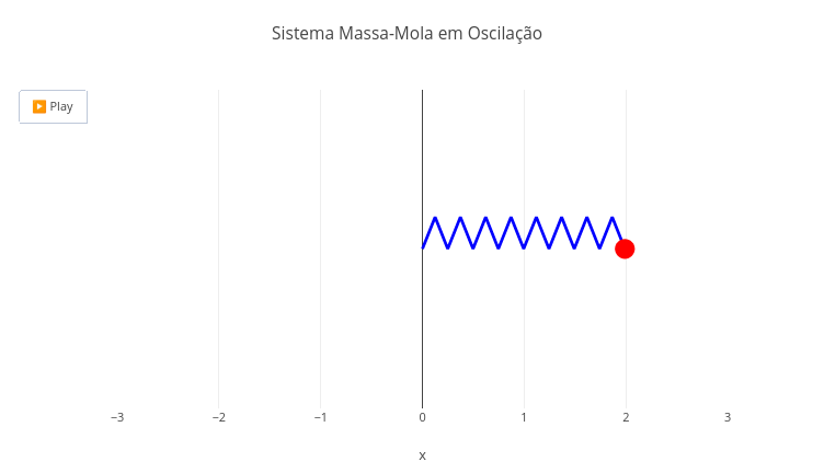
Suggestion:
1. Try changing some parameters of the motion equation, such as amplitude A and angular frequency;
2. Increase the angular frequency of the animation by reducing the denominator in "const w";
2. Try the "html" button and evidence that the animation is preserved in the export of the file;
3. Try the "clone" button and evidence that it is possible to share the object in the frozen configuration along with the modified code
4.7 Animated spirograph
BNCC: EF07MA18, EF09MA20, EM13MAT406, EM13LGG701)
A spirograph consists of a playful tool composed of toothed rulers and curves for drawing, aiming at the creation of complex geometric figures (trochoids). Below is an example of an animated spirograph, combining Art and Mathematics for the creation of such figures.
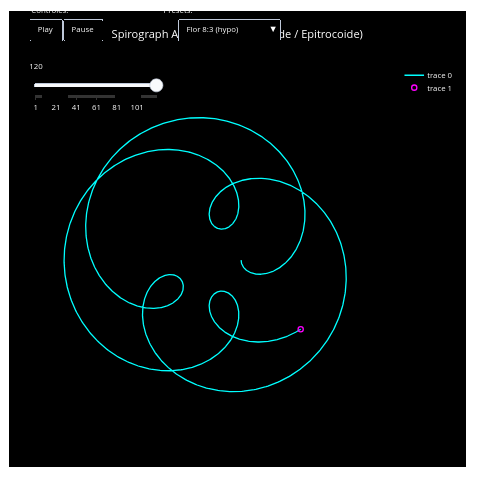
Suggestion:
1. The object allows changing the type of hypo or hypertrochoid by menu, as well as pausing the animation by button;
2. It is possible to change the trochoid pattern of the figures by modifying a mathematical relationship. As an example, look in the code for the line "Math.cos(t) + d*Math.cos(k1*t);", and change the second term to "Math.sin"
4.8 Pendular motion (Physics)
BNCC: EF09CI09, EF09MA18, EM13CNT104, EM13CNT203
Similar to the previous object, here we have an animation for the mechanical phenomenon of periodic motion of a pendulum. The equations that describe the position of a simple pendulum as a function of time, using the small oscillations approximation, are given below.
Equation
\[ θ(t)=θ_0cos(ωt) \]
\[ x(t)=Lsin(θ) \]
\[ y(t)=−Lcos(θ) \]
\[ ω=\sqrt{\frac{L}{g}} \]
Where:,
- θ(t) = angular position;
- x(t) = x coordinate;
- y(t) = y coordinate;
- ω = angular frequency
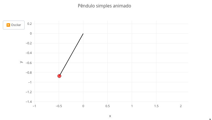
Suggestion:
1. As suggested for other objects, try the "parametric exploration" of the equation involved in the code, changing its parameters;
2. Observe an advantageous characteristic of simulations over real experiments: performing them under conditions impossible in practice. For this, try the simulation as if you were on the Moon, changing the value of gravitational acceleration to 1.62 m/s^2 (but with ".", and not "," - because it is programming syntax.
4.9 Action potential in neuron (Biology)
BNCC: EF08CI08, EF09CI01, EM13CNT202, EM13CNT302
Some natural phenomena are observed in time, although their didactic representation in books and the like is offered in a static way. In the following example, an animation for neuronal potential facilitates learning for depolarization/hyperpolarization/repolarization events that accompany nerve transmission.
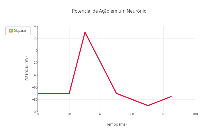
Suggestion:
1. Try changing the default values for the presented potentials in "function potencial(i)" of the code;
2. Altered values are present in some neurological conditions, such as epilepsy and multiple sclerosis.
4.10 Map of burned areas by biomes in Brazil
BNCC: EF07CI08, EF08GE08, EM13CHS101, EM13CNT201
The use of maps in Natural Sciences and Human Sciences finds a common point for environmental and socio-economic problems, such as illustrated by the following animation. In it, the area in square kilometers for burnings in each Brazilian biome is offered to the animation with period and area along the title of the interactive object, and with a temporal slider below. The data are fictitious and cover the period from 1955 to 2024.
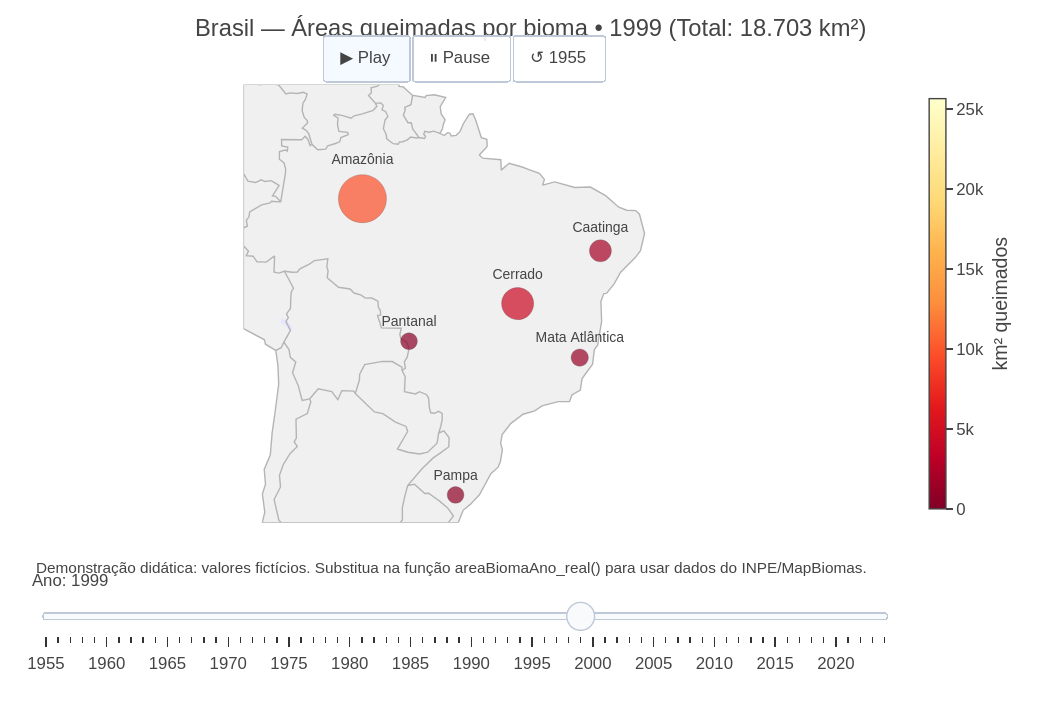
1. It is salutary to seek more precise sources of information on the addressed themes, since GSPlotly, as an AI assistant, does not guarantee the nature of the information. In the example, the "Programa Queimadas - INPE - Terrabrasilis" is suggested (https://terrabrasilis.dpi.inpe.br/queimadas/situacao-atual/situacao_atual/);
2. One can insert more precise data in the script itself, in the field "const usar_dados_ficticios = true; // change to false and fill areaBiomaAno_real()";
3. One can modify the theme of the animated map to any other, simply by changing the data in the constants of "General Control" of the script.
4.11 Displacement of flying rivers (Environmental Sciences)
Flying rivers address the transport of large volumes of water vapor from the Amazon to other regions of South America through atmospheric circulation. The animation represents moisture particles that move from the north of Brazil toward the south and southeast, with variable intensity over time. A deforestation factor is introduced in the second half of the animation, progressively reducing the intensity of transported moisture, which allows visualizing, in a qualitative way, the impact of loss of forest cover on the rainfall regime. The spatial and temporal representation of the moisture flow helps the learner relate vegetation, climate and water availability on a continental scale.
Suggestion:
1. Simulate the deforestation effect by reducing the associated empirical factor: "const desmatamento_fator = 0.01";
2. Simulate an increase in humidity in the animation: "const n_particulas = 1000";
3. Increase the dispersion of the water volume: " const x_final = x_inicial + (i / nFrames) * (Math.random() * 50 + 10);"
4.12 Conway’s Game of Life
BNCC: EF06MA20, EF09MA24, EM13MAT503, EM13CNT201
This object illustrates a version of a cellular automaton conceived in 1970 by J.H. Conway, and that simulates biological events such as birth, growth, reproduction and death, by the iterative and partially chaotic distribution of pixels on a screen. The Game allows a mathematical and visual approach for simple rules applied to complex phenomena.
The Game allows 4 distinct patterns (Glider, Blinker, Toad, Random), each one distributing events of birth, survival and death, as a function of mathematical relationships. One can pause to observe details of evolution.
Suggestion:
1. See at the top of the code that it is possible to change the grid size, time steps, and the probability of a cell being alive in "Random" mode.
4.13 Second Law of Kepler (Physics)
BNCC: EM13CNT101, EM13CNT201, EM13CNT204, EM13CNT206
The simulation exemplifies an interactive visualization for Kepler’s Second Law (Law of Areas), demonstrating that a planet sweeps equal areas in equal times along its elliptical orbit around the Sun.
Equation:
The orbit is described by a parametric ellipse defined by the major a and minor b semi-axes, with the Sun positioned at one of the foci, and whose focal distance is given by:
\[ c=\sqrt{a^2+b^2} \] | The planet position is calculated over time by means of the ellipse parametric equations, and the animation evidences the variation of orbital velocity: higher at perihelion and lower at aphelion. The parameter N controls the temporal resolution of the animation, while the increment dt allows visualizing, at each step, the area swept by the Sun–planet radius vector.
The simulation simultaneously highlights the orbital trajectory, the radius vector, the swept area sector and the characteristic points of the orbit, integrating geometric representation, motion and time. For a Kepler model, the dimensions of the elliptical orbit are defined by the maximum (aphelion) and minimum (perihelion) distances of the planet in relation to the Sun. The Sun does not occupy the center of the ellipse, but one of its foci.
The dynamic visualization allows understanding that, although the planet travels different distances in equal time intervals, the swept area remains constant, translating in an intuitive way the conservation of angular momentum in orbital motion.
Suggestion:
1. Observe that, although the planet travels different distances in equal time intervals, the swept area remains constant, translating in an intuitive way the conservation of angular momentum in orbital motion. This means that the planet's velocity varies, being faster at perihelion (near the Sun) and slower at aphelion (far);
2. Try running the simulation varying the axes "a" and "b" for Earth. A suggested approximation: 299200000 (major axis) and 299158000 (minor axis) km. If you do not observe anything, click "Autoscale" on the top bar;
3. See that the difference is only 21 thousand km, meaning Earth's orbit is 99.98% "circular", although the Sun is displaced from the center.
4.14 Prey-Predator Model (Biology)
BNCC: EM13CNT101, EM13CNT201, EM13CNT204
This simulation refers to a population ecology model, the Lotka–Volterra prey–predator model. It is a dynamic system that describes population oscillations caused by ecological interaction between two species: prey - x(t) and predators - y(t). The model considers exponential growth of prey in the absence of predators, reduction of prey by predation encounters and growth of predators proportional to prey availability, with natural mortality of predators.
The simulation starts with initial populations (x_0) and (y_0), and evolves in time in discrete steps of size (dt), for (N) iterations.
From the computational point of view, the code solves the system numerically by a simple explicit scheme (Euler method), updating (x) and (y) at each step based on the derivatives (dx/dt) and (dy/dt). The animation shows the prey and predator values over time as points in a graph, allowing observing typical patterns of the model, such as population cycles, time lag between prey and predator maxima and sensitivity to parameters and initial conditions.
Equation:
\[ \frac{dx}{dt} = \alpha x - \beta x y \]
\[
\frac{dy}{dt} = \delta x y - \gamma y
\]
Where:
- \(\alpha\) = prey growth rate;
- \(\beta\) = predation rate per prey–predator encounter;
- \(\delta\) = conversion/production efficiency of predators from predation;
- \(\gamma\) = predator mortality rate.
Suggestion:
1. Change some script parameters in isolation, and observe the effects on the animation:
  a. N: no. of points (simulation time)
  b. Initial prey and predator populations (x and y);
2. Try changing the predator rate to an extreme value: "const delta = 0.1"
5 Simulations
5.1 Vibrating string & sounds
BNCC: EM13CNT101, EM13CNT203, EM13CNT204, EM13CNT206
The script implements an interactive simulation of the fundamental frequency and harmonics of a tensioned string, based on the classic model of the ideal vibrating string. The simulation allows exploring how the vibration frequency depends on the string length, the applied tension, the linear mass density and the selected harmonic mode.
The graph presents the relationship f(L), that is, frequency as a function of string length, while a highlighted point represents a specific length selected by the user. The simulation includes the
tone.js library for sound playback of the verified effect. This allows hearing the corresponding frequency, reinforcing the connection between the physical model, the mathematical representation and auditory perception. Briefly:
- The tension controls the mechanical energy stored in the string;
- The linear density represents the inertia of the system;
- The length defines the boundary conditions;
- The harmonic mode determines the spatial pattern of the wave;
- The audible frequency connects the physical model to sound perception.
Equation:
Wave speed on the string
The propagation speed of a transverse wave on a tensioned string is given by:
\[ v = \sqrt{\frac{F}{\rho}} \]
where:
- is the wave speed (m·s(^{-1}));
- is the tension applied to the string (N);
- () is the linear mass density of the string (kg·m(^{-1})).
Frequency of the normal modes of vibration
For a string fixed at the ends, the frequency of the (n)-th harmonic mode is:
\[ f_n = \frac{n}{2L}, v \]
Substituting the speed expression:
\[ f_n = \frac{n}{2L}\sqrt{\frac{F}{\rho}} \]
where:
- f_n is the frequency of harmonic n (Hz);
- n is the harmonic mode number (n = 1, 2, 3);
- L is the vibrating length of the string (m);
- F is the tension (N);
- \(\rho\) is the linear density (kg·m\(^{-1}\)).
Functional dependence of frequency on length
Keeping (F), () and (n) constant, the frequency depends inversely on the string length:
\[ f(L) \propto \frac{1}{L} \]
This relationship is explicitly explored in the simulation by varying (L) within a defined range.
Wavelength of harmonics
The stationary modes satisfy:
\[ \lambda_n = \frac{2L}{n} \]
where (_n) is the wavelength of harmonic (n).
5.1.1 Fundamental relation between frequency, speed and wavelength
\[ f_n = \frac{v}{\lambda_n} \]
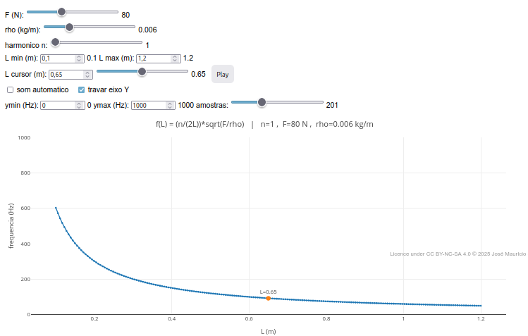
Suggestion:
1. Observe the variation of string length in "L" on the graph when dragging some slider;
2. Try clicking the "automatic sound" checkbox, and drag some slider;
3. Observe the effect when changing some of the parameters on the sliders, such as "F", "rho", and "harmonic";
5.2 Chemical reaction kinetics
BNCC: EF09CI07, EM13CNT204, EM13CNT205
A topic of uncomfortable assimilation for the student refers to the abstraction necessary to unveil the mathematical relationships that appear in chemical reaction kinetics. When dealing with the conversion of reactants into products, for example, there is an inherent learning barrier regarding reaction rates, inhibition and activation. To reduce the impact of this abstraction, below is an example of an animation for reaction kinetics, and whose object changes as a function of rate options and reaction modulators.
Equation:
\[ R(t)=\frac{R_0}{1+k_{efetiva}t} \]
\[ P(t)=R_0−R(t) \]
Where,
- \(R(t)\) = amount of reactant R at instant \(t\) (arbitrary units);
- \(P(t)\) = amount of product P (arbitrary units);
- \(R_{0}\) = initial amount of reactant at time \(t=0\);
- \(t\) = time (in seconds);
- \(k_{\text{cinética}}\) = base rate constant (in \(s^{-1}\));
- \(k_{\text{efetiva}}\) = effective constant after considering catalyst and/or inhibitor:
\[ k_{\text{efetiva}} ;=; k_{\text{cinética}} \times \begin{cases} f_{\text{cat}}, & \text{if catalyst on}[6pt] 1, & \text{if catalyst off} \end{cases} \times \begin{cases} \dfrac{1}{f_{\text{inh}}}, & \text{if inhibitor on}[6pt] 1, & \text{if inhibitor off} \end{cases} \]
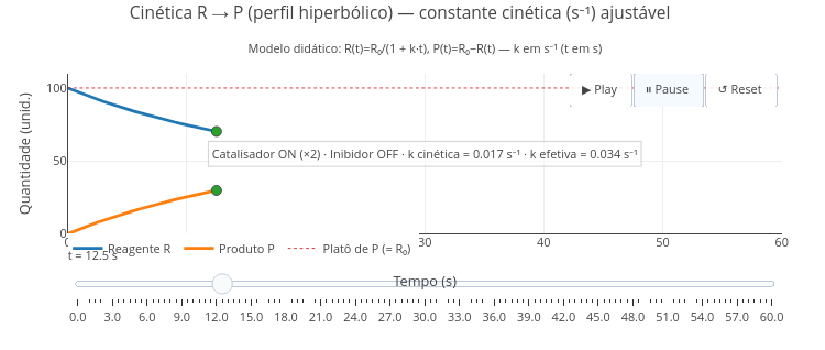
Suggestion
1. Try changing the constant "k_cinetica" at the top of the code (ex.: 0.008, 0.017, 0.05) and use Play/Reset to compare;
2. Try turning inhibitor and catalyst on/off;
3. Try changing the strength of the modulators above by editing their constants:
  a. const fator_catalise  = 2.0;
  b. const fator_inibicao  = 3.0;
6 Applications
6.1 Drawing board
BNCC: EF15AR06, EF09AR07, EM13LGG604, EM13LGG606
Not only of mathematics, graphs and maps does JSPlotly “live”. The example that follows intends to offer a board for drawings, with variation of colors and pen thickness, and geometric shapes.
Suggestion
1. Explore the script. Although simple, it allows selecting distinct colors, pen thicknesses, and geometric shapes;
2. As the other objects elaborated in JSPlotly, the board drawing can be stored preserving its interactivity by the "html" button, and even modified in the saved file itself ("play.html");
3. If you want to change colors, thicknesses, or want to add other functionalities, check the script variables;
4. Try the "clone" button, which allows cloning the board along with its code.
6.2 Gizz - Digital Blackboard
The nature of the object below needs no introduction. It is one more among the many applications to simulate a chalkboard, or digital pen board. Different from its competitors, however:
- It can be exported as a self-contained HTML file with a button on the board itself, allowing sharing of the generated image, as well as continuity of its editing;
- It allows customization of the code that produces it, allowing inserting/changing pens, thicknesses, and distinct actions not foreseen in the source code.
With respect to its facilities, the digital board allows:
- Write with 7 colors and 3 distinct thicknesses;
- Access 4 backgrounds of different coloration;
- Overlay the background with a grid;
- Use an eraser (erase);
- Use a laser pointer to locate what one intends to point out;
- Save the image as PNG, indicating date and time;
- Save the image as self-contained HTML (obs: html button on the board; the editor one does not work in this object);
- Undo command (undo) and cleaning (clean) of the board;
- Has keyboard shortcuts: E=eraser; L=laser; Z undo, X clean, H save HTML
Suggestion:
1. One can change the thickness of the pens in "var baseWidth = 1;" ;
2. The 1x, 2x, 4x buttons are multipliers; edit the button creation lines to change label/multiplier (ex.: "addSize('3x', 3, true)").
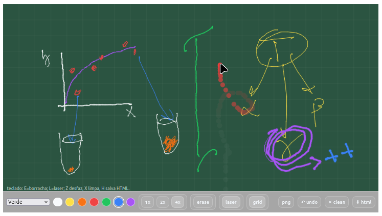
Obs: the functional button to reproduce the board is the one on the board itself, "html". The code editor button does not operate for the application.6.3 MentMapa - editor for mind map and diagrams
In the same line of customizing JSPlotly as done above for the digital board, the program also allows building a diagram or mind map elaborated by mouse clicks, and as an independent application.
The Mind Map Editor illustrated in the figure below allows building diverse structures, and fundamentally by combining terms and arrows. There are various functionalities for the facilitated creation of a map or diagram, including a help banner in the upper left corner for several of the actions.
Instructions for MentMap
- Creating terms. Click with the left mouse button and type a term; press Esc to exit;
- Deleting terms. Click Ctrl+right mouse button;
- Frame on terms. Click on a frame on the bar (square, diamond, oval);
- Connecting terms by arrow. Right-click the 1st term, followed by right-click on the 2nd term;
- Curved arrow. Click curve on. Then, right-click the 1st term, followed by left-click on a point between the two terms, and finish with right-click on the 2nd term. To adjust the arrow curvature, click the little ball and drag it to touch a term or an arrow;
- Drag terms and arrows. Just click and drag.
- Drag a group of terms/arrows. Press Shift and draw the area you want to encompass the group with the left mouse button;
- Colors for terms and arrows. Select one of the 7 colors available on the top bar, and click an existing term, or a new one. Obs: the arrow color follows that of the terms;
- Grid for more precise positioning. Just click grid on (it is not saved in the final diagram);
- Saving the map (save html). Different from the usual html button, storing the interactive map is done by its own html button, on the icon bar;
- Importing maps (import). The application allows importing an already ready map in json format to continue its editing;
- Exporting maps (export). The application also allows exporting the map in json format for future study or simple keeping.
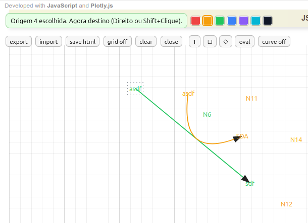
Suggestion:
1. The editor allows creating mind maps, diagrams, flowcharts, and other representations...so now the suggestion is yours !!
7 Card game
Because JSPlotly involves a programming language, JavaScript, it is plausible that it can offer a set of operations tangible to it, independently of building graphs (as in diagrams and flowcharts above).
In parallel to the richness that accompanies gamification as an active methodology, the creation of a game can stimulate the learner to another level, since strategy is sometimes already part of their daily life. Playing is one thing…creating a game can have a more prominent and recursive impact on computational thinking and logic, as well as on learning the programming language itself!
7.1 Memory Game
BNCC: EF06MA19, EF06MA16, EF07MA26, EF09MA19, EM13MAT401, EM13MAT102, EM13MAT403, EM13LGG701
The clickable image below directs to a classic Numeric Memory Game. The objective is to hit a pair of values after memorizing a numeric grid. To play, follow the instructions below:
Instructions for the Numeric Memory Game:
- In the upper field there are two boolean constants true/false, one to play (jogue) and another to check correctness (verificar), as well as a seed that fixes a certain random numeric grid;
- Start the game (jogue/false, verificar/false);
- Click the add button and a grid of numeric pairs for memorization will be displayed;
- Switch to jogue/true, click clean plot, and then add. The grid will now be displayed with only one value (other cells will show “?”);
- Choose verificar/true, click clean plot, and then add. A field will be presented to type the coordinates where you believe the other numeric pair is (Ex: A2);
- Click OK, and a pair formed by the initial value and the chosen value will be presented, to verify correctness.
To restart the game, clean plot, and boolean options false.
Have fun!!
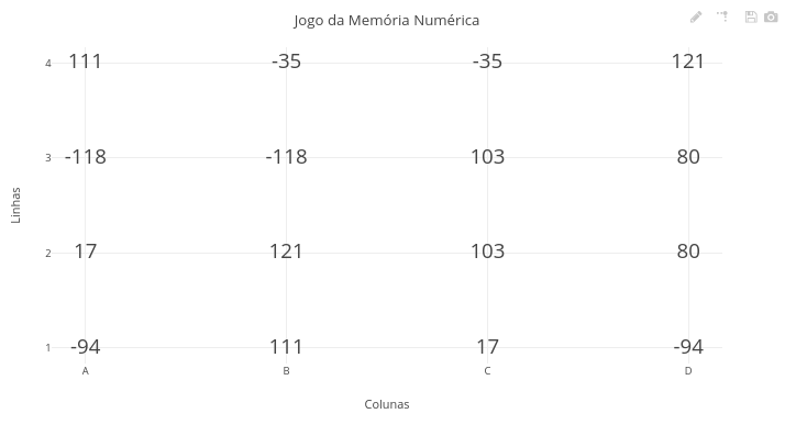
1. To play again changing the grid values, just change the *seed* constant to any number;
2. To vary between difficulty levels of the game, just change the number of rows and columns in the respective code constants.
8 Accessibility and inclusion
Through keyboard touches, font size adjustment, vibration on capacitive screens, it is possible to imagine the use of JavaScript with Plotly.js to serve an audience with specific accessibility needs.
Illustrating this possibility, and due to the use of audio resources by JavaScript libraries, it is possible to conceive JSPlotly objects intended for a student who is blind.
8.1 Equasons
BNCC: EF69LP27, EF69AR09, EM13MAT406, EM13LGG604, EM13LGG701
This object is simple. It is enough for the student with the disability to use the left and right arrows of a simple keyboard so that they hear sounds correlated to a mathematical function chosen by a supervisor. Thus, if the function grows, the sound will have progressively higher timbres and, when it decreases, lower ones.
In addition, it is possible to change the frequency on the slider bar, which allows sound perception for lower or higher frequencies.
Once exported by the HTML button of the object itself (and not the code editor), it can be shared while maintaining the interactivity and sonority of the function.
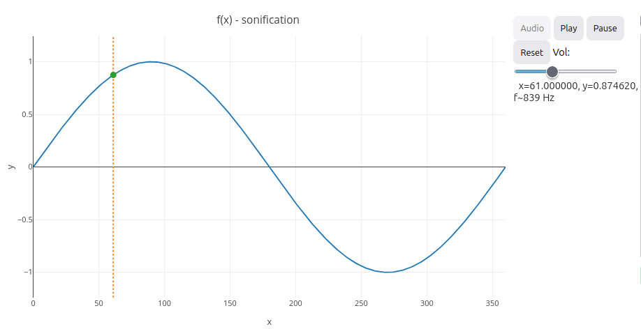
Suggestion:
1. One can edit the code for a specific function. For this, just change the line "var f = function(x){ ... }". Examples:
  a. return Math.sin(x*Math.PI/180); (degrees);
  b. return Math.sin(x); (radians);
  c. return Math.exp(-0.01*x)*Math.cos(0.2*x);
2. One can change the scrolling speed of the function by the function below, and whose value is given in milliseconds:
  "var PLAY_INTERVAL_MS = 100; "
9 Music education
The objects below introduce another potential for JSPlotly, namely, the possibility of working with audio. Among the possible libraries, the examples below illustrate the use of tone.js, both for a monophonic instrument (recorder), and for a polyphonic instrument (piano).
In parallel to the possibility of editing the code to improve and customize the object, both can be easily used as digital musical instruments standalone, since they can be exported by the “html” button preserving their interactivity by mouse or touch on capacitive screens of mobile devices.
9.1 FlautaDoce
BNCC: EF15AR05, EF69AR09, EM13LGG601, EM13LGG604, EM13LGG701

Suggestion
1. The recorder was conceived for tones (circle) and semitones (semicircles). You can "play" the recorder by clicking with the left mouse button on a hole or using your finger on a smartphone;
2. You can add or omit some hole in the recorder, just by changing the two lines of the variables "var naturais" and "var sustenidos";
2. You can turn your recorder into a "pífano", generally higher than the recorder, and quite common in northeastern tradition. For this, just replace the lines of the variables "var naturais" and "var sustenidos", changing the value of "5" to "6", as follows (add "add" afterwards - or "clean"/"add"):
    var naturais   = ["C6","D6","E6","F6","G6","A6","B6"];
    var sustenidos = ["C#6","D#6","F6","F#6","G#6","A#6","B6"];
3. In the reasoning line above, it is also possible to change the recorder pattern, low recorders and contrabass. For example, a German recorder (larger hole, soprano, used in Schools and represented in the script) or Baroque (smaller hole, lower tones).
9.2 Piano
BNCC: F15AR05, EF69AR09, EM13LGG601, EM13LGG604, EM13LGG701
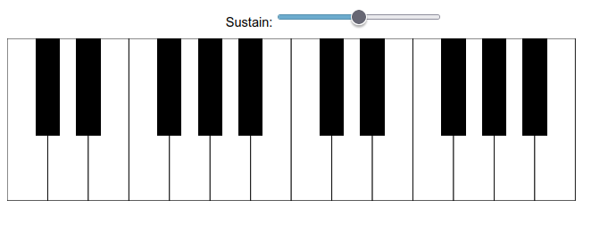
Suggestion
1. It is a small piano, but it is a piano (2 octaves)!! And as such, you can express your musical aptitude with the polyphonic instrument;
2. To prolong the sound of the keys raise the "sustain" bar;
3. As part of JSPlotly, the piano can be shared without the code, only as an instrument for music education or practice, since it is exported by the "html" button, preserving its interactivity and sonority by mouse or finger touch on a mobile device;
4. Also as part of JSPlotly, it is possible to share the piano with the codes for changes via the "clone" button;
10 Games
Although almost a translation, jogos refer to a broad variety, including cards and board games, while games more reflect electronic and digital games. Below are two games illustrative of the potential of JSPlotly for this purpose, Bow and arrow, which uses only animation, and Pong, a classic sports video game from 1972. Different from the first, Pong combines interactivity, animation, and sound.
10.1 Bow and Arrow Game
BNCC: EF09CI09, EF09MA18, EM13MAT302, EM13CNT104, EM13LGG701
Suggestion
1. Change the angle ("let theta_edit = 45") and/or the initial shot velocity ("let v0_edit    = 20") to adjust the parabola to the target;
2. Notice that the score is flexible: 5 points for proximity to the target, and 10 points when it hits it.
10.2 Pong Game
BNCC: EF69AR09, EF06MA20, EM13LGG604, EM13LGG701
For the reproduction of this classic game the additional library p5.js was used, aimed at interactive art, animations and data visualizations on the web.
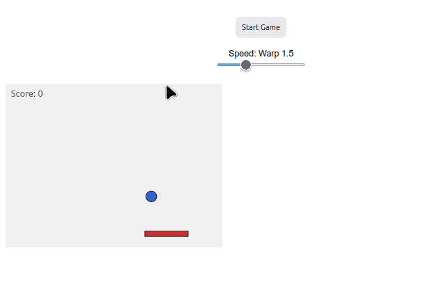
Suggestion:
1. If you think the game is slow, even at the maximum 'warp' speed, it is possible to change its value in "var base = Math.pow(1.5, warp);";
2. If you think the game is too hard or too easy, it is possible to change the paddle size in "paddle = { w: 80, h: 10,...";
3. If you want to increase the game area, modify the line below (width, height):
  "var cv = sk.createCanvas(400, 300).parent('jogoArea');"
11 Experimental Interface
11.1 Mobile - Sensor data acquisition
JSPlotly was initially conceived for the construction of interactive virtual learning objects. However, it is possible to integrate it with different interfaces for acquiring real-world data. The following example illustrates as a target the response for an accelerometer, a positioning sensor of a mobile device (accelerometer).
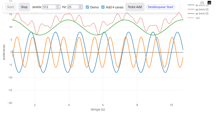
Suggestion:
1. As the app is for the "x, y and z" positioning of a mobile device, try changing the position of your phone/tablet in space.11.2 Arduino - Conductivity data acquisition
BNCC: EM13CNT201, EM13CNT308, M13CNT301, M13CNT302
The example below illustrates an application for real-time acquisition/control by browser for using an Arduino or ESP32 board, exponentially raising the application of JSPlotly for real experimentation and experimental STEAM projects.
The setup presents a data reading of conductivity in aqueous solution containing increasing NaCl contents (0 to 5% w/v). An Arduino Uno R3 board was used with Web Serial connection by USB to a notebook running an autonomous application for JSPlotly. Conductivity was obtained by a commercial TDS sensor (total dissolved solids) with excitation by square-wave alternating potential (PWM) to minimize polarization effects, and script adapted from the manufacturer. The TDS sensor operates in the range of 3.3 to 5.0 V (input) with output of 0 to 2.3 V, and current of 3 to 6 mA.
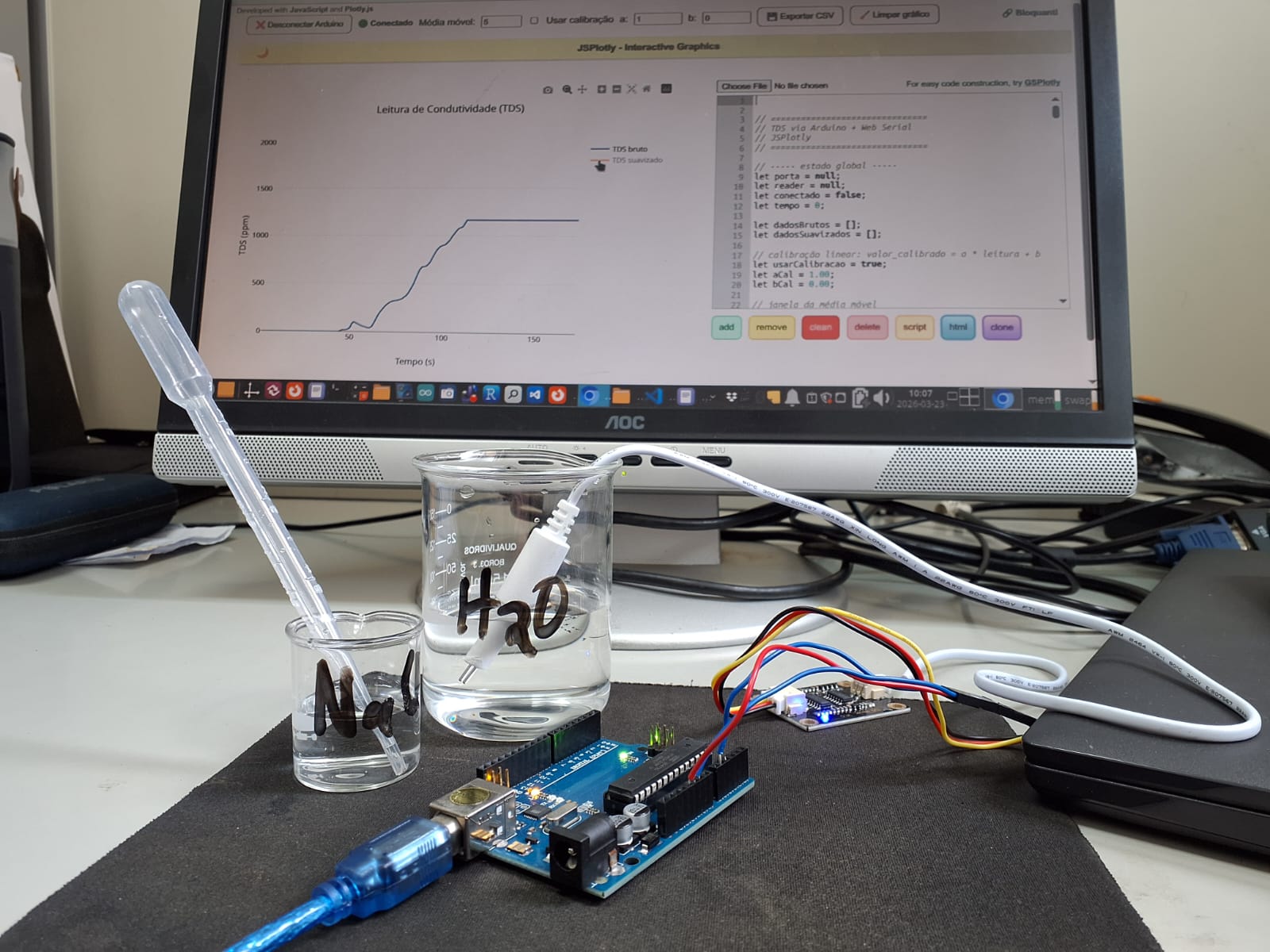 Example of JSPlotly application to interface with Arduino. The graph shows conductivity measurements in aqueous medium with a TDS meter for increasing NaCl contents (probe in the left corner). Click the image to obtain the standalone JSPlotly application for conductivity.
Instructions:
- For Web Serial connection it is necessary to install Python on the computer (Windows or Linux), and setup of a local server. For Windows download and install the official file for Python, remembering to click Add Python to PATH, and type the commands in CMD inside the standalone application folder. Below is the guidance for Linux:
- Connect the Arduino and components (TDS probe, container with water and salt);
- Close the Arduino IDE;
- Open a Terminal in the standalone application folder of JSPlotly for Arduino (condutiv_JSPlotly.html; click on the image);
- Type: python3 -m http.server
- Open the standalone circuit html in Chrome (never in Firefox);
The reading should start in moments. If it does not, check whether the transfer rate for the Arduino IDE matches that of the application (115200 baud).
Suggestion:
1. As the app is written in JSPlotly, it is possible to customize it for various situations, such as data transfer rate, traces (type, colors, thickness), chart type, among others.