Physics
1 Electric field and distance (EM13MAT305, EM13CNT302)
library(plotly)
# Constant k0 (approximately 8.99 × 10^9 N m²/C²)
k0 <- 8.99e9
# Distance values (avoiding d = 0 to avoid dividing by zero)
d <- seq(0.1, 10, length.out = 100)
# Function to calculate the electric field
calcular_campo <- function(Q, d) {
k0 * Q / d^2
}
# Initial values of Q
Q_inicial <- 1e-6 # Initial charge in Coulombs
# Interactive graph with slider to change Q
plot_ly(x = ~d, y = ~calcular_campo(Q_inicial, d), type = 'scatter', mode = 'lines') %>%
layout(
title = 'Electric Field (E) as a Function of Distance (d)',
xaxis = list(title = 'Distance (m)'),
yaxis = list(title = 'Electric Field (N/C)', type = 'log'),
sliders = list(
list(
active = 0,
currentvalue = list(prefix = "Charge (Q): "),
steps = lapply(seq(1e-7, 1e-5, length.out = 10), function(Q_value) {
list(
label = sprintf("%.1e", Q_value),
method = "restyle",
args = list('y', list(calcular_campo(Q_value, d)))
)
})
)
)
)Suggestions:
Try modifying the graph, using/replacing the commands below in the code snippet:
xaxis = list(title = 'Distance (m)', range = c(0, 10)), # Define the range for the X axis
yaxis = list(title = 'Electric Field (N/C)', type = 'log', range = c(1e3, 1e12)), # Adjust the scale of the Y axis
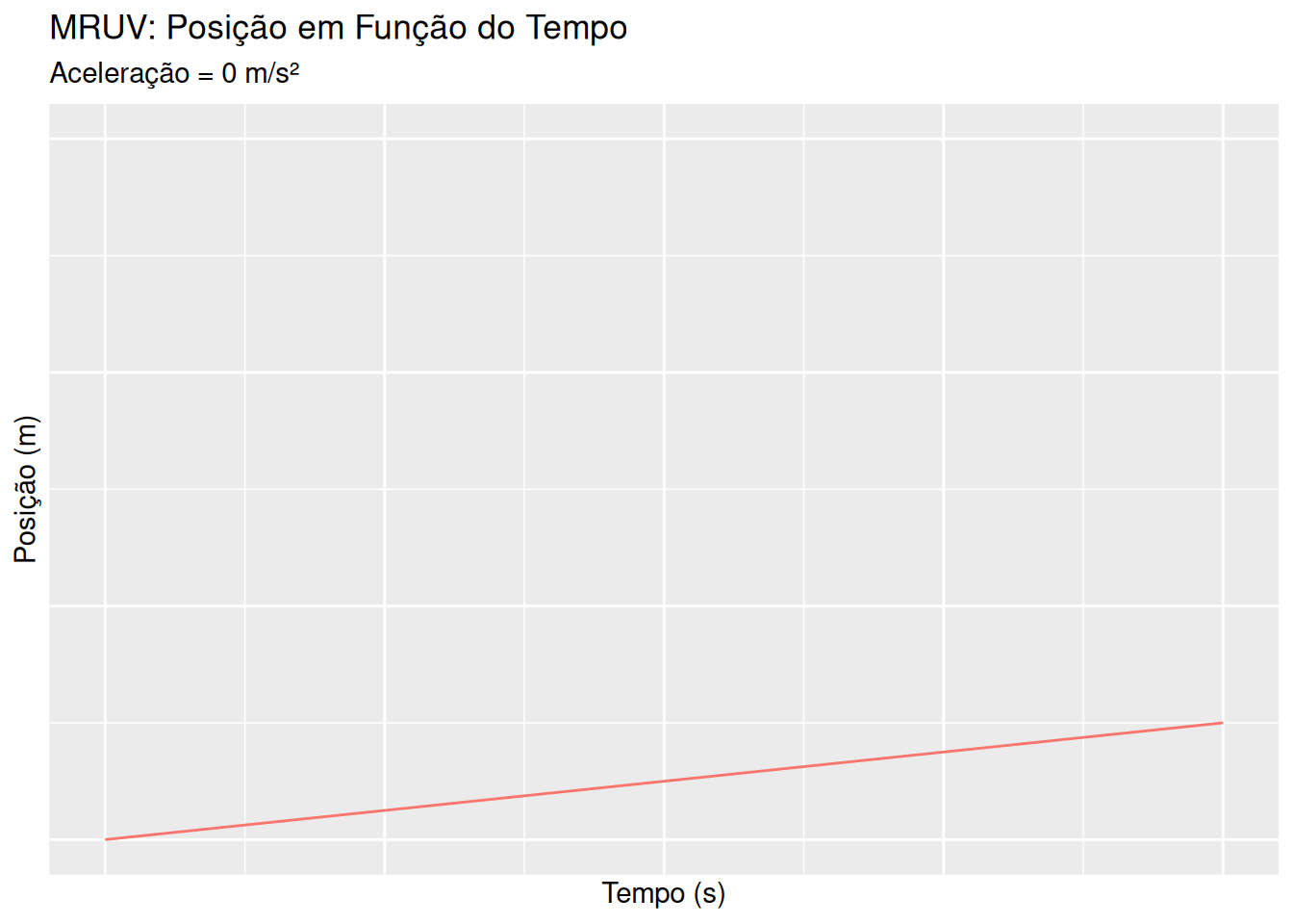
2 Uniformly varied rectilinear motion - MRUV (EM13CNT203, EM13CNT204)
library(ggplot2)
library(gganimate)

# Função para calcular a posição em MRUV
calcular_mruv <- function(s0, v0, a, t) {
  s0 + v0 * t + 0.5 * a * t^2
}

# Dados
s0 <- 0
v0 <- 5
t <- seq(0, 10, length.out = 100)
a_values <- seq(0, 5, by = 1)

# Criando um dataframe com os dados
dados_mruv <- data.frame()
for (a in a_values) {
  for (time in t) {
    pos <- calcular_mruv(s0, v0, a, time)
    dados_mruv <- rbind(dados_mruv, data.frame(Tempo = time, Posição = pos, Aceleração = a))
  }
}

# Gráfico animado para MRUV
ggplot(dados_mruv, aes(x = Tempo, y = Posição, group = Aceleração)) +
  geom_line(aes(color = as.factor(Aceleração))) +
  labs(title = 'MRUV: Posição em Função do Tempo',
       subtitle = 'Aceleração = {frame_time} m/s²',
       x = 'Tempo (s)', y = 'Posição (m)', color = 'Aceleração') +
  transition_time(Aceleração) +
  ease_aes('linear')
Suggestions:
Try modifying the graph, using/replacing the commands below in the code snippet:
# Inside the ggplot() function
scale_color_manual(values = c("0" = "blue", "1" = "red", "2" = "green", "3" = "purple", "4" = "orange", "5" = "brown")) + # Define specific colors for each acceleration
3 Gravitational force and distance (EM13CNT401, EM13CNT402)

# Função para calcular a força gravitacional
calcular_gravitacional <- function(m1, m2, d) {
  G <- 6.67e-11
  G * m1 * m2 / d^2
}

# Dados
m1 <- 5.97e24  # Massa da Terra em kg
m2_values <- seq(1e22, 1e24, length.out = 5)
d <- seq(1e6, 4e8, length.out = 100)

# Criando um dataframe com os dados
dados_gravitacional <- data.frame()
for (m2 in m2_values) {
  for (distancia in d) {
    forca <- calcular_gravitacional(m1, m2, distancia)
    dados_gravitacional <- rbind(dados_gravitacional, data.frame(Distância = distancia, Força = forca, Massa = m2))
  }
}

# Gráfico animado para força gravitacional
ggplot(dados_gravitacional, aes(x = Distância, y = Força, group = Massa)) +
  geom_line(aes(color = as.factor(Massa))) +
  labs(title = 'Força Gravitacional em Função da Distância',
       subtitle = 'Massa = {frame_time} kg',
       x = 'Distância (m)', y = 'Força Gravitacional (N)', color = 'Massa') +
  transition_time(Massa) +
  ease_aes('linear')
Suggestions:
Try modifying the graph, using/replacing alternatively the commands below in the code snippet:
# Inside the ggplot() function
theme_minimal() + # Simple theme
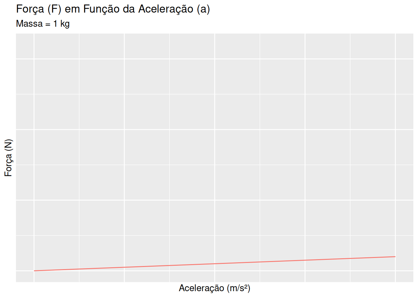
4 2nd. Newton’s Law - Mass and Acceleration (EM13CNT202, EM13CNT203)
# Função para calcular a força
calcular_forca <- function(m, a) {
  m * a
}

# Dados
a <- seq(0, 10, length.out = 100)
m_values <- seq(1, 20, by = 5)

# Criando um dataframe com os dados
dados_newton <- data.frame()
for (m in m_values) {
  for (aceleracao in a) {
    forca <- calcular_forca(m, aceleracao)
    dados_newton <- rbind(dados_newton, data.frame(Aceleração = aceleracao, Força = forca, Massa = m))
  }
}

# Gráfico animado para Segunda Lei de Newton
ggplot(dados_newton, aes(x = Aceleração, y = Força, group = Massa)) +
  geom_line(aes(color = as.factor(Massa))) +
  labs(title = 'Força (F) em Função da Aceleração (a)',
       subtitle = 'Massa = {frame_time} kg',
       x = 'Aceleração (m/s²)', y = 'Força (N)', color = 'Massa') +
  transition_time(Massa) +
  ease_aes('linear')
Suggestions:
Try modifying the graph, using/replacing alternatively the commands below in the code snippet:
geom_line(aes(color = as.factor(Massa)), size = 1) + # Lines with default thickness
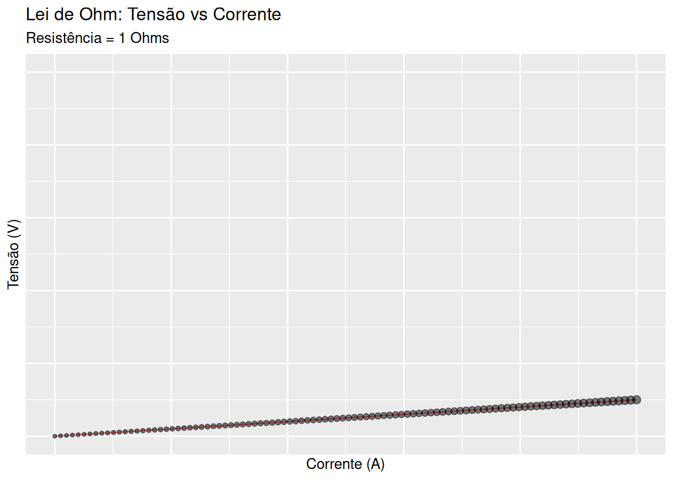
5 Ohm’s Law - resistance, potential, and current (EM13CNT303, EM13CNT304)
library(ggplot2)
library(gganimate)

# Dados
resistencias <- seq(1, 10, by = 1)  # Resistência de 1 a 10 Ohms
corrente <- seq(0, 5, length.out = 100)  # Corrente de 0 a 5 Amperes
dados <- data.frame()

# Criando um dataframe com os dados
for (R in resistencias) {
  for (I in corrente) {
    V <- I * R  # Calculando a Tensão
    P <- V * I  # Calculando a Potência
    dados <- rbind(dados, data.frame(Corrente = I, Resistência = R, Tensão = V, Potência = P))
  }
}

# Gráfico animado para Lei de Ohm e Potência
p <- ggplot(dados, aes(x = Corrente, y = Tensão)) +
  geom_line(aes(color = as.factor(Resistência), group = Resistência)) +
  geom_point(aes(size = Potência), alpha = 0.5) +
  labs(title = 'Lei de Ohm: Tensão vs Corrente',
       subtitle = 'Resistência = {frame_time} Ohms',
       x = 'Corrente (A)', y = 'Tensão (V)', color = 'Resistência', size = 'Potência (W)') +
  transition_time(Resistência) +
  ease_aes('linear')

# Exibindo o gráfico
p
Suggestions:
Try modifying the graph, using/replacing the commands below in the code snippet:
geom_point(aes(size = Power), alpha = 0.6) + # Points with size according to power
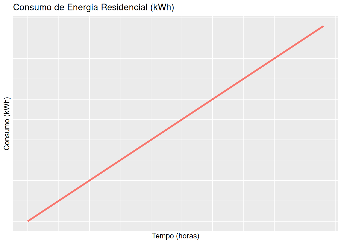
6 Electricity and residential consumption (EM13CNT405, EM13CNT306)
library(ggplot2)
library(gganimate)

# Dados dos eletrodomésticos (potência em kW)
eletrodomesticos <- data.frame(
  Nome = c("Lâmpada", "Ventilador", "Geladeira", "Computador"),
  Potencia = c(0.1, 0.15, 0.2, 0.5)  # Potências em kW
)

# Tempo (em horas) para o qual calculamos o consumo
tempo <- seq(0, 24, length.out = 100)  # 0 a 24 horas

# Criando um dataframe com o consumo de energia
dados_consumo <- data.frame()

for (i in 1:nrow(eletrodomesticos)) {
  consumo <- eletrodomesticos$Potencia[i] * tempo  # Consumo em kWh
  dados_consumo <- rbind(dados_consumo,
                          data.frame(Tempo = tempo,
                                     Consumo = consumo,
                                     Eletrodomestico = eletrodomesticos$Nome[i]))
}

# Gráfico animado para o consumo de energia
p <- ggplot(dados_consumo, aes(x = Tempo, y = Consumo, color = Eletrodomestico, group = Eletrodomestico)) +
  geom_line(size = 1.2) +
  labs(title = 'Consumo de Energia Residencial (kWh)',
       x = 'Tempo (horas)', y = 'Consumo (kWh)', color = 'Eletrodoméstico') +
  transition_states(Eletrodomestico, transition_length = 2, state_length = 1) +
  ease_aes('linear')

# Exibindo o gráfico
p
Suggestions:
Try modifying the graph, using/replacing alternatively the commands below in the code snippet:
geom_line(size = 1.4) + # Lines with a little more thickness for better visibility
7 Temperature conversion - Celsius, Kelvin, and Fahrenheit (EM13MAT403, EM13CNT205)
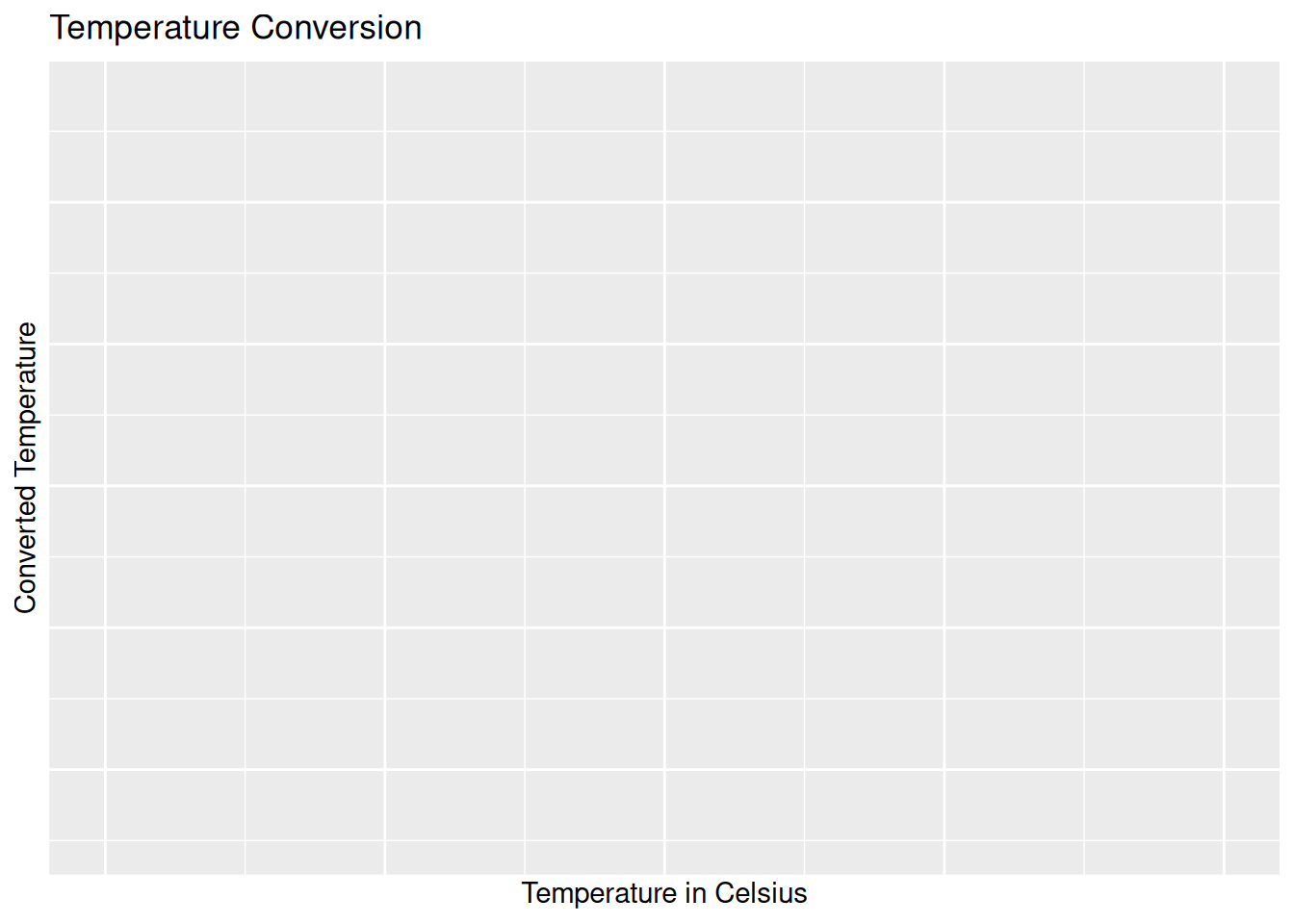
library(ggplot2)
library(gganimate)

# Temperature range in Celsius
celsius <- seq(-100, 100, by = 1)

# Calculating the conversions
temp_data <- data.frame(
Celsius = celsius,
Fahrenheit = celsius * 9/5 + 32,
Kelvin = celsius + 273.15
)

# Rearranging the data for better visualization
temp_data_long <- reshape2::melt(temp_data, id.vars = "Celsius")

# Animated graph
p <- ggplot(temp_data_long, aes(x = Celsius, y = value, color = variable)) +
geom_line(size = 1.2) +
labs(title = 'Temperature Conversion',
x = 'Temperature to Celsius', y = 'Converted Temperature',
color = 'Scale') +
transition_reveal(Celsius) +
ease_aes('linear')

# Displaying the graph
p
Suggestions:
Try modifying the graph, using/replacing alternatively the commands below in the code snippet:
ease_aes('cubic-in-out') + # Change in animation for smoother transition
8 Thermal expansion - superficial, volumetric, and liquids (EM13CNT304, EM13CNT305)
library(ggplot2)
library(patchwork)

# Valores iniciais
area_inicial <- 100  # Área inicial (cm^2)
volume_inicial <- 100  # Volume inicial (cm^3)
beta <- 1.2e-5  # Coeficiente de dilatação superficial
gama_solido <- 3.6e-5  # Coeficiente de dilatação volumétrica
gama_liquido <- 4.0e-5  # Coeficiente de dilatação volumétrica de líquidos

# Variação de temperatura (0 a 100 °C)
delta_T <- seq(0, 100, by = 1)

# Cálculo das dilatações
dilatacao_superficial <- area_inicial * beta * delta_T
dilatacao_volumetrica <- volume_inicial * gama_solido * delta_T
dilatacao_liquido <- volume_inicial * gama_liquido * delta_T

# Dataframes para gráficos
dados_superficie <- data.frame(Temperatura = delta_T, Dilatacao = dilatacao_superficial)
dados_volumetrica <- data.frame(Temperatura = delta_T, Dilatacao = dilatacao_volumetrica)
dados_liquido <- data.frame(Temperatura = delta_T, Dilatacao = dilatacao_liquido)

# Criando os gráficos
grafico_superficie <- ggplot(dados_superficie, aes(x = Temperatura, y = Dilatacao)) +
  geom_line(color = "blue") +
  labs(title = "Dilatação Superficial", x = "Temperatura (°C)", y = "ΔA (cm^2)")

grafico_volumetrica <- ggplot(dados_volumetrica, aes(x = Temperatura, y = Dilatacao)) +
  geom_line(color = "red") +
  labs(title = "Dilatação Volumétrica", x = "Temperatura (°C)", y = "ΔV (cm^3)")

grafico_liquido <- ggplot(dados_liquido, aes(x = Temperatura, y = Dilatacao)) +
  geom_line(color = "green") +
  labs(title = "Dilatação de Líquidos", x = "Temperatura (°C)", y = "ΔV (cm^3)")

# Exibindo os gráficos lado a lado
grafico_superficie + grafico_volumetrica + grafico_liquido
Suggestions:
Try modifying the graph, using/replacing alternatively the commands below in the code snippet:
# Below geom_line()
geom_point(color = "blue", size = 2) + # Adding points
9 Alternating Current - Capacitor (EM13CNT202)
library(plotly)
# Values of x
x <- seq(0.5 * pi, length.out = 100)
plot_ly() %>%
add_trace(x = x, y = sin(x), mode = 'lines', name = 'Potential') %>%
add_trace(x = 1.4*x, y = 0.9*cos(x)-0.4, mode = 'lines', name = 'Current') %>%
layout(
title = 'Voltage and Current in a Capacitor',
xaxis = list(title = 'Angle (radians)', range=c(0.15)),
yaxis = list(title = 'Value'),
showlegend = TRUE
)Suggestions:
Try modifying the graph, using/replacing the following commands in the code snippet:
add_trace(x = x, y = sin(x), mode = 'lines', name = 'Potencial',
line = list(color = 'blue', width = 2, dash = 'dot')) %>% # Blue dotted line
10 Heat engine efficiency as a function of temperature (EM13CNT102, EM13CNT103)
library(ggplot2)
library(plotly)

# Function to generate data and graph based on half-efficiency temperature (or saturation temperature)
generate_plot_data <- function(b) {
a <- 1 # maximum efficiency of the heat engine
x <- seq(0, 300, length.out = 100) # temperature range
y <- a * x / (b + x) # equation that relates temperature to efficiency (maximum = 1)
data.frame(x, y)
}

# Initialize the graph with b = 1
initial_b <- 1 # initial value of b (half-saturation temperature)
plot_data <- generate_plot_data(initial_b)

# Creating the initial graph using the ggplot2 package
p <- ggplot(plot_data, aes(x = x, y = y)) +
geom_line() +
labs(title = paste("Efficiency of a heat engine as a function of temperature"),
x = "Temperature (C)",
y = "Fraction of Efficiency") +
theme_minimal() +
ylim(0, 1)

# Converting to a plotly object
fig <- ggplotly(p)

# Defining the steps for the slider
steps <- lapply(seq(0, 100, by = 10), function(b) {
list(
label = as.character(b),
method = "restyle",
args = list(
list(
x = list(generate_plot_data(b)$x),
y = list(generate_plot_data(b)$y)
),
list(title = paste("Efficiency as a function of half-saturation value:", b)) )
)
})

# Adding the slider for the 'b' parameter (half-saturation temperature)
fig <- fig %>%
layout(
sliders = list(
list(
active = 0,
currentvalue = list(prefix = "Half-Saturation: "),
steps = steps
)
)
)

# View the graph
fig
Suggestions:
Try modifying the graph, using/replacing alternatively the commands below in the code snippet:
# Inside steps
list(
x = list(generate_plot_data(b)$x),
y = list(generate_plot_data(b)$y),
line = list(color = colorRampPalette(c("blue", "green"))(11)[b/10 + 1]) # Color range varying from blue to green
),