library(plotly)
library(magrittr) # necessary libraries

# 1) Obtaining data from the internet

url <- "https://raw.githubusercontent.com/datasets/global-temp/refs/heads/main/data/annual.csv" # defines the link to the data
data <- read.csv(url) # reads the data file

# 2) Building the animated graph

plot_ly(data, x = ~Year, y = ~Mean,
type = "bar",
marker = list(line = list(width = 10)),
frame = ~Year) %>%
animation_opts(
frame = 150, # Animation speed
transition = 0,
redraw = TRUE) %>%
layout(
title = "Global temperature fluctuation",
xaxis = list(title = "Years"),
yaxis = list(title = "Temperature difference, C"))6 - Graphic animations
Objectives:
1. Understand the potential of “plotly” for creating interactive animations
2. Create animated graphics by importing data from a database
In addition to the purely interactive aspect of graphics created with plotly, which is already a major advantage when preparing illustrative materials for educational content, the library can also run animations with the graphics!
The animation occurs through transitions from one image to another in a graph when you want to observe what happens when a variable (numerical or categorical) is changed. The key command for this is frame. Animation in plotly also works for the three types of data input, namely: equations, vectors, imported datasets.
1 Rise in the Earth’s average temperature
Needless to say, climate change caused by human activity has had a huge impact on the planet, including a rise in the Earth’s average surface temperature due to factors such as the greenhouse effect.
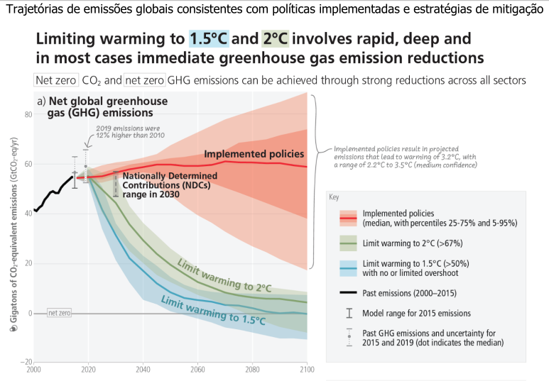
To see the graph better, click on Zoom to open a larger window. Now for the “fancy” part: click on PLAY and see what happens. You can also select any period for display by using the graph’s scroll bar.
2 Life expectancy & Gross Domestic Product
A very interesting use of
plot_ly in graphic animation is when we need to present various data on a given topic. This is called multivariate data. To illustrate this situation, let’s say we want to provide various information in a graph showing the relationship between a country’s gross domestic product and the life expectancy of its inhabitants over time.
To illustrate the interactive richness that can be obtained by
plotly on the influence of gross domestic product - GDP on life expectancy, we can import a data set from the internet and create a graph on this relationship, see:
library(plotly)

# Obtaining data from the internet
url <- read.csv("https://raw.githubusercontent.com/kirenz/datasets/refs/heads/master/gapminder.csv")

dadosExpVida <- url # assigning the data to an `R` object

# Creating the interactive graph
plot_ly(
dadosExpVida, # data converted from the internet
x = ~gdpPercap, # name of the per capita income column in the data
y = ~lifeExp, # name of the life expectancy column in the data
type = 'scatter', # graph type (scatter)
mode = 'markers' # scatter type (points)
)
Done! Simple, straightforward, and interactive code. If you hover your mouse over the points, you will see the coordinates of GDP and life expectancy. However, it is not possible to tell from this graph who is who, i.e., which country has which GDP, as well as other information contained in the original spreadsheet downloaded from the internet. To give you an idea, this spreadsheet contains, in addition to GDP and life expectancy values, the country and its population, the continent to which it belongs, as well as the year the data was measured.
Thus, we are faced with a set of multivariate data, which is very common in various databases, such as IBGE or DATASUS.
How about if we could present everything at once, i.e., GDP, life expectancy, the country, the size of the population, the continent, and the year in which all of this was measured, i.e., six variables, including numerical and categorical (classes) variables?
Impossible?! Not for
R!! Here is a snippet of code for that, with the proposed result. Don’t worry about the size or details. If you want to reproduce this code, you know what to do… just copy, paste, and run the code in an R script.
library(plotly)

# Obtendo os dados na internet
url <- read.csv("https://raw.githubusercontent.com/kirenz/datasets/refs/heads/master/gapminder.csv")

dadosExpVida <- url  # atribuindo os dados a um objeto do `R`

# Criando o gráfico interativo com animação
plot_ly(
  dadosExpVida, # dados convertidos da internet
  x = ~gdpPercap, # renda per capita
  y = ~lifeExp, # expectativa de vida
  size = ~pop, # tamanho dos pontos em função da população
  color = ~country, # cor dos pontos em função do país
  frame = ~year,    # Frame para a animação por ano de coleta dos dados
  text = ~continent,  # País como informação ao passar o mouse
  hoverinfo = "text",
  type = 'scatter', # tipo de gráfico
  mode = 'markers',
  marker = list(sizemode = 'diameter', opacity = 0.7)
) %>%
  layout(  # atribuição de título e etiquetas dos eixos
    title = "Produto interno bruto X Expectativa de vida",
    xaxis = list(title = "PIB (log), US$", type = "log"),
    yaxis = list(title = "Expectativa de Vida, anos"),
    showlegend = TRUE # possibilidade ou não de aparecer a legenda
  ) %>%
  animation_opts(
    frame = 1000,           # Velocidade da animação
    transition = 0,
    redraw = TRUE
  )
To go to the “playground” now, click PLAY and observe the temporal transition of life expectancy as a function of countries’ GDP. And note that all other data is there, separated by point size (population), color (country), continent (hover, mouse over), and year (animation frame or frame)!
One more detail! If you look at the legend, you will see that it is also sliding, identifying each country by color. Want to know where Brazil is in this crazy graph of GDP and life expectancy? Easy. Find Brazil in the legend, double-click, and notice that now only that point is highlighted.